Page 2 of 2
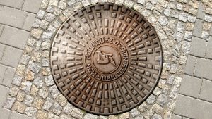
This is my banner and it is a design of a manhole cover that has my initials in the middle and surrounding it say Rodriguez design and at the bottom it says New York City. The way I got to this idea that i wanted to do a manhole cover was that I saw someone paint on the floor a fake manhole cover on the street. It was amazing that is when it hit me that I would do something similar by combing my skills on photoshop and try to add my fascinations of graffiti art. I use the initials from logo and place it at the center of the manhole cover. I research a lot about manhole covers. I mainly focus on manhole covers in New York. when I finish my cover I was amaze by how similar it look to a normal cover.
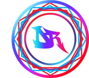
My reason for creating my logo was that I wanted to express myself. When I thinking how to make a my logo the first thing that pop into my head was a stamp. I always amaze by stamps especially the Monogram or Initial Wax Seal Stamp. So first decided to us my Initial which is DR the only downside was my initial is similar to people who are doctors. For my initial i want to be different from a simple D and R that is when it hit me that I should look for graffiti letters. once i found my Graffiti D&R I wanted to make them merge because separated doesn’t feel creative. For a while I struggle but I was able to to merge them so good that the appear the R grew out of the D. once that was done i want to make my logo look like a stamp so I made a circle around my initial. when i first look at it was still simple that is when i got the idea to use hexagons to give the illusions of a sun. Then I would make another circle to show where it stops. For the color I wanted to show cold to warm colors I started with light blue and stop at red because I saw a video that someone made a tie dye wax seal which look so colorful.
