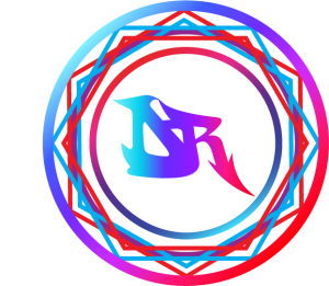
My reason for creating my logo was that I wanted to express myself. When I thinking how to make a my logo the first thing that pop into my head was a stamp. I always amaze by stamps especially the Monogram or Initial Wax Seal Stamp. So first decided to us my Initial which is DR the only downside was my initial is similar to people who are doctors. For my initial i want to be different from a simple D and R that is when it hit me that I should look for graffiti letters. once i found my Graffiti D&R I wanted to make them merge because separated doesn’t feel creative. For a while I struggle but I was able to to merge them so good that the appear the R grew out of the D. once that was done i want to make my logo look like a stamp so I made a circle around my initial. when i first look at it was still simple that is when i got the idea to use hexagons to give the illusions of a sun. Then I would make another circle to show where it stops. For the color I wanted to show cold to warm colors I started with light blue and stop at red because I saw a video that someone made a tie dye wax seal which look so colorful.
| M | T | W | T | F | S | S |
|---|---|---|---|---|---|---|
| 1 | 2 | 3 | 4 | |||
| 5 | 6 | 7 | 8 | 9 | 10 | 11 |
| 12 | 13 | 14 | 15 | 16 | 17 | 18 |
| 19 | 20 | 21 | 22 | 23 | 24 | 25 |
| 26 | 27 | 28 | 29 | 30 | 31 | |
Internship Blogs
- Book Ad
- Book Cover Front & Back
- Project Venus & Adonis Completed
- 7th Instagram Post and Venus & Adonis Progress
- Beginning Project Venus & Adonis Restoration
- Laser Cutter & Learning Rhino Program
- My ISDay Flyer Project
- First Instagram Post
- My Day at the Studio
- My First Intership
- Life in a Day
- My Banner


