


Summary
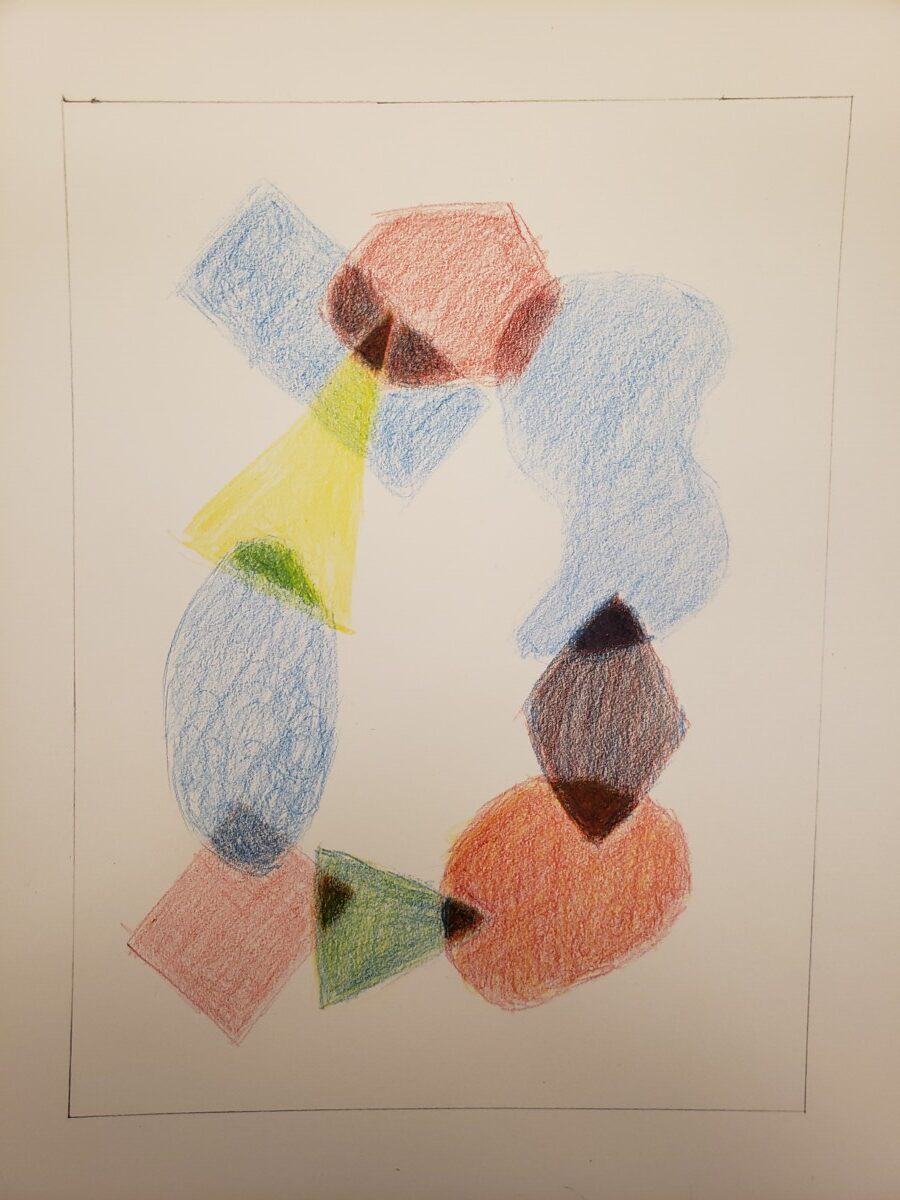
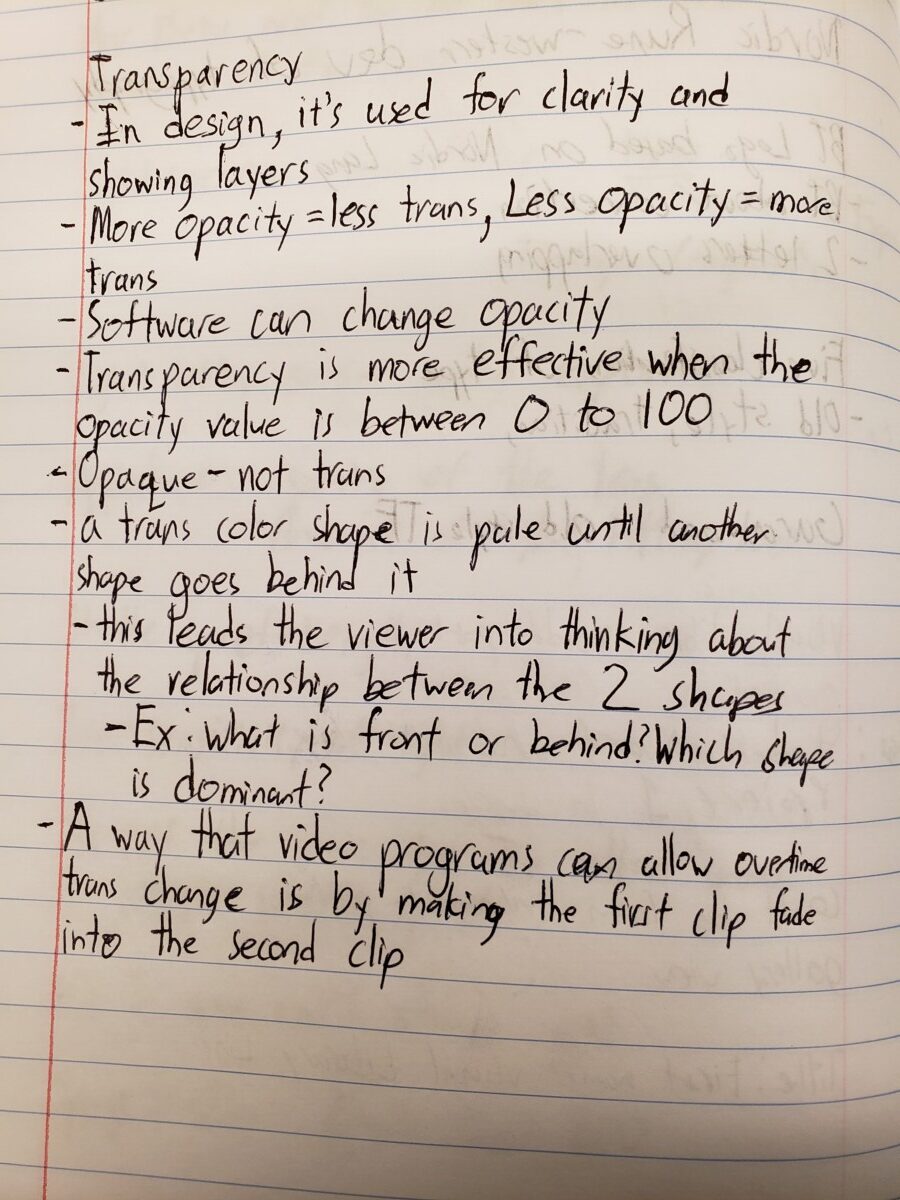
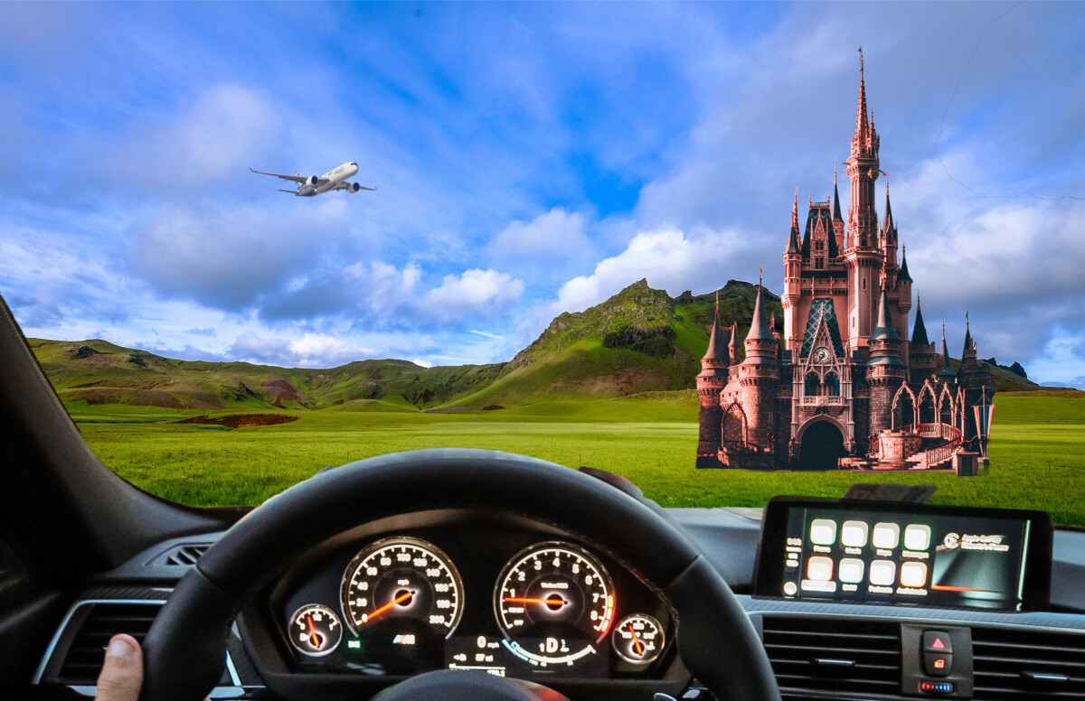
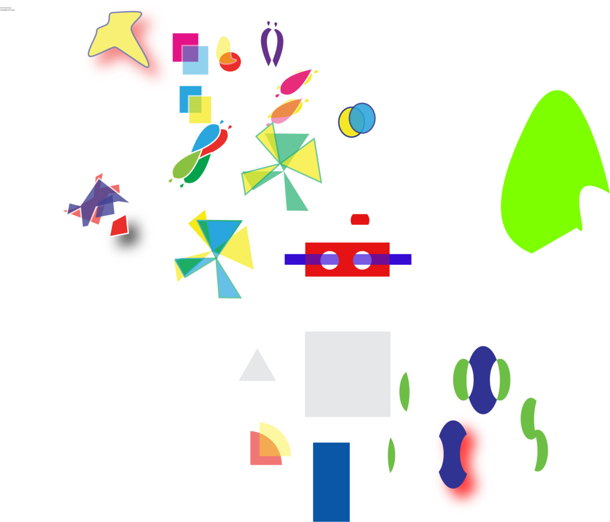
I think this project was okay. I learned about transparency and mixing colors with overlapping shapes. The feedback I got from my color pencil practice was to make my shapes a little bit darker and to add every color in an intersection. For example, in my red and green shape, I should add a little bit of red in the intersection, not just putting dark green in the intersection. I followed the feedback and the result looked good. My triad palette was about variety of shapes. On the bottom left, I manually add the overlapping colors using the pathfinder tool for experimentation. My analogous palette was about hierarchy. Mixing color in the illustrator palettes was a bit difficult at first but eventually understood through changing the opacity levels. For my ps composition, my theme was originally space, For my final ps composition, the theme is travel with discovery and exploration with the design principle being hierarchy. The car is the foreground. The landscape is the background, the plane is far back, and the castle is in the middle. The driver is driving around and exploring and wonders why a castle is there. The hardest part of making the ps composition was finding the theme and telling your story.


Leave a Reply