Table of Contents
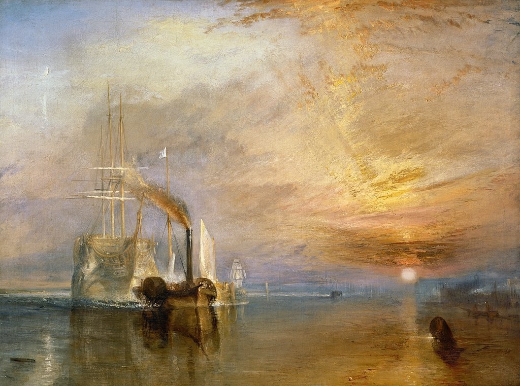
Mallord William Turner (1775–1851)
note: the word Palette is used here in two ways. The palette is a surface that you paint on, but a group of colors used for a design or painting can be called a Palette.
Project Description
Color Mixing project to develop understanding of color attributes and palettes, terminology, Paint application techniques, and sensitivity to Color Contrasts and Progressions (gradation) in creative designs.
Project Overview
Problem: Create compositions demonstrating an understanding of the range of saturation (pure, muted, desaturated) and chromatic value (light, midtones, dark) using progressions and atmospheric perspective.
Materials: Sketchbook, pencils, Bristol Board 9×12″, colored pencils, acrylic paints, brushes, palette, rags, water container, scissors, exacto knife, ruler/t-square, glue/adhesive.
Concepts: Hue, Saturation, Pure/Prismatic Color, Muted Color, Desaturated/Chromatic Gray, Achromatic Gray, Luminosity, Primary Colors, Secondary Colors, Complementary Colors, Warm, Cool, CMY, RGB, RYB color models/systems.
Technical Skills: painting techniques, draughtsmanship with ruler/t-square, exacto knife and collage, digital imaging.
Outcomes:
- Ability to recognize and define major color properties: hue, value and saturation (chroma)
- Ability to see individual hue in terms of it’s value and saturation, in relation to other hues.
- Recognition of Temperature in color palettes. Use Nature and memory as inspiration to guide you.
- Ability to determine and utilize color palettes: monochrome, analogous, warm/cool, complimentary, triads (primary, secondary) etc. using CMYK and RGB systems
- Comfortable with paint mixing, paint application, formatting page, using rulers and tape for edges.
- Use digital tools to transform photographic color into pixelated grid
Design Process:
- Discover: Research color theory, Visual Library Posts
- Define: Temperature Grids and Saturation Scales
- Develop: Atmospheric Landscapes
- Deliver: Post and Comment
Discover:
- Research Color wheels, Bauhaus Color theory, including Paul Klee, Albers and Itten
- Photograph and post on Visual Library gallery of 4 examples of Color in nature or products:
- Notice color attributes, develop vocabulary: High Saturated, Neutral, Warm, Cool, Triad, Monochrome etc.
-
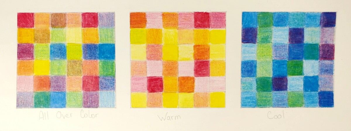
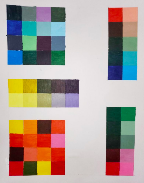
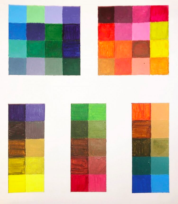
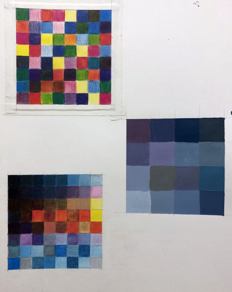
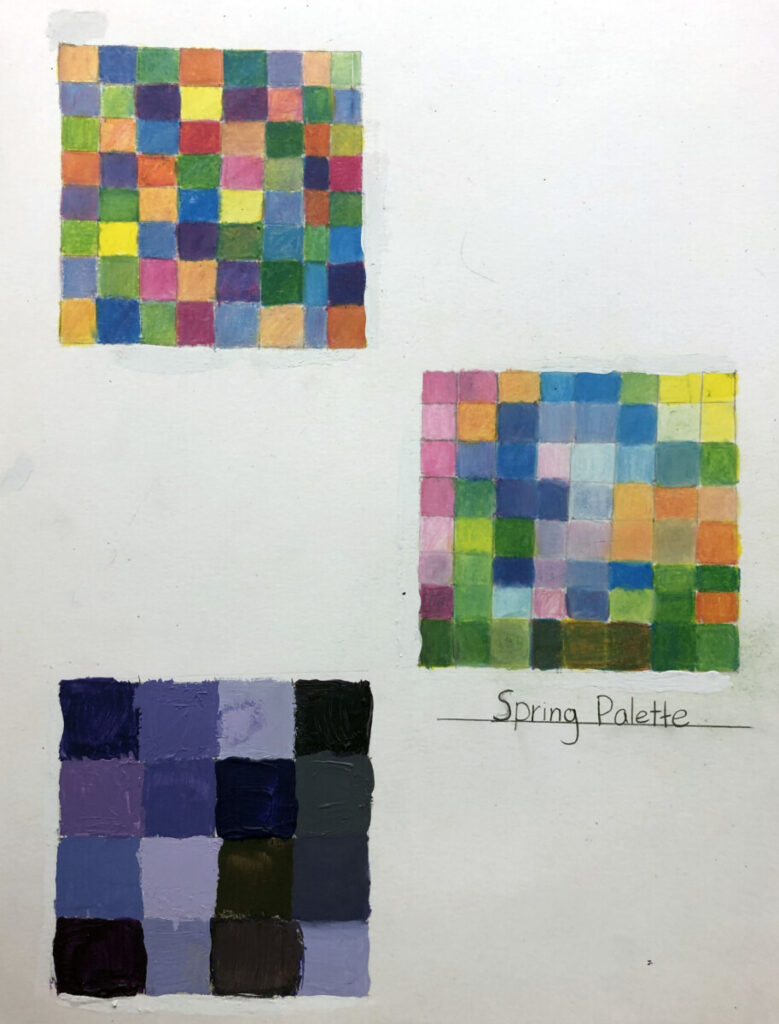
Color Exploration with Colored Pencil
- Practice on sketch paper, using hand drawn grid roughly 3″x3″ with 1/2″ divisions.
- On Bristol, use ruler to measure out 3″x3″ square, then divide into 1/2″ increments to make 36 small squares.
- Create 3 such grids, spaced nicely on your page to leave room for other work later.
- Grid 1 is allover color, broad range, Primary colors, Secondary and blends.
- Grid 2 is only Warm Hues
- Grid 3 is only Cool hues
- You will base these on landscape, memory, time of day and title accordingly. Look at photos, and take your own photos of color that makes you feel cool or warm.
- Use ONLY magenta (or red), blue and yellow, create as many unique hues by blending 2 or 3 colors together, gently overlapping layers. White of paper comes through to help create tints. Create primary and secondary blends, as well as muted colors by blending all 3 primary hues.
-
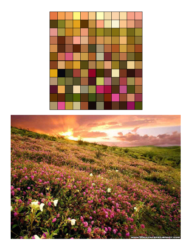
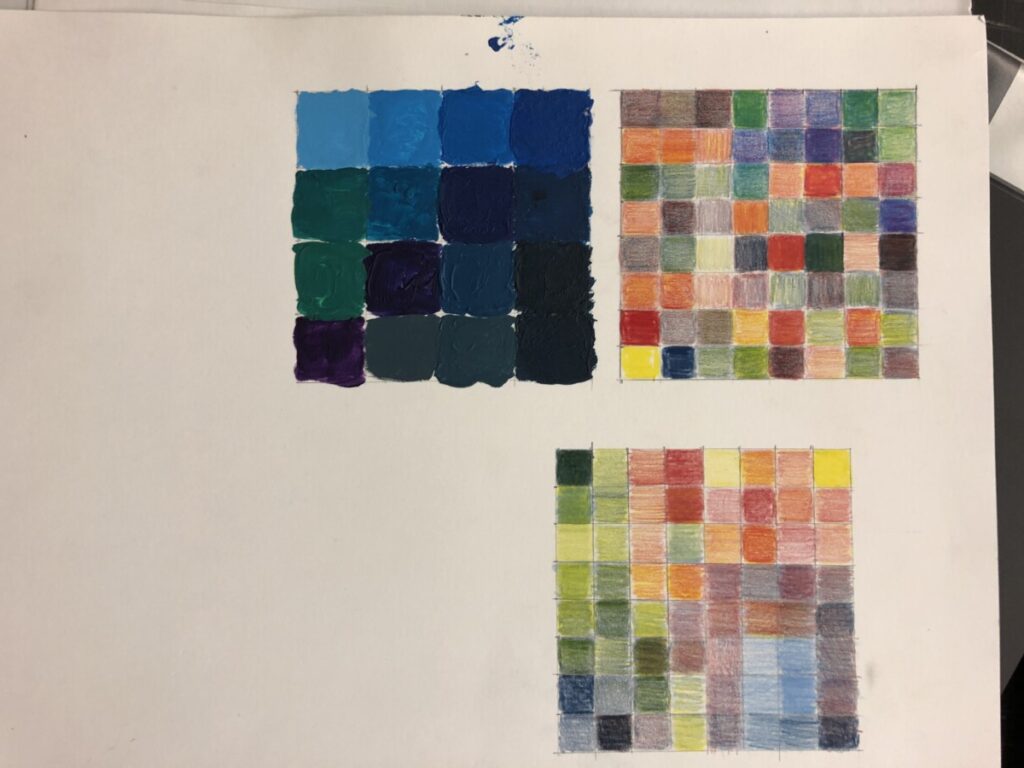
Digital Exploration
- Open Photoshop to explore Warm and Cool Nature imagery through Pixelated Filter.
- Choose 3 Nature images , from your own photos if you have, or others
- Open new document for each image. Copy layer and experiment with Filter-Pixelate- Mosaic; 200 pixel
- Crop and Save 3-4 details with distinctly Warm or Cool palettes.
- Challenge: Build your own small digital color grids using gradations and hues found from your pixelated photos:
- Study additive CMYK and RGB numbers to correlate to your subtractive pencil mixtures.
Color Background. Color Wheels


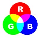
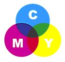

RGB lights combine to make white CMYK inks combine to create black
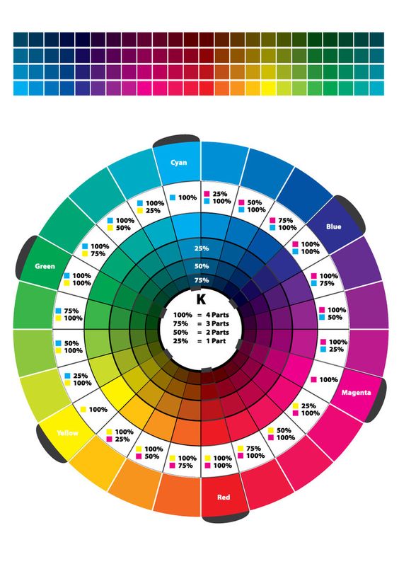
Color wheel Adobe link below
Digital color wheel for exploring palettes and terminology
Define:
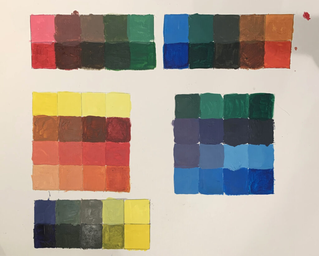
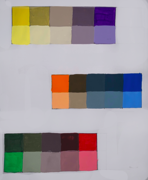
Paint mixing: Grid design with allover palette of Primary, Secondary blends
- 5″x5″ pencil grid on Bristol, upper half of page
- Use palette paper and put all primary colors out plus white and a little black.
- Use Palette knife to blend several mixtures before painting into grid.
- Use all primary hues and blended secondary hues with 4 variations of each, so, 4 reds, 4 blues, 4 yellows, etc. Arrange in any design that considers relationship contrasts between hues, values and intensities. Variations include:
- Pure hue (primaries can have a touch of white so you’re not using straight from tube
- Secondary colors are mixed from Primaries
- Tint (hue plus white, bring up the value to feel very different from pure hue
- Tone: Hue plus some gray to neutralize (gray made with white + touch of black
- Hue mixed with a bit of it’s complementary hue (across the color wheel)
- Pure hue (primaries can have a touch of white so you’re not using straight from tube
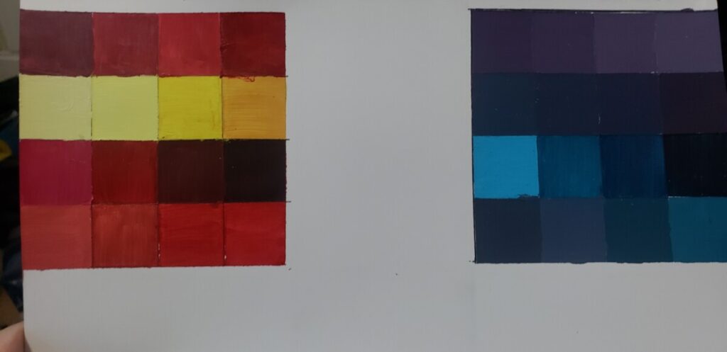
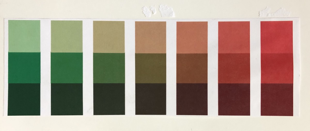
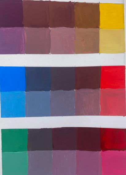
Painting Saturation Scales: Complementary Color Palettes
Process:
- Palette: Lay out clean plastic palette surface with red, yellow, blue, white and black.
- Practice using paint knife to mix colors and paint application on sketchpaper until you are comfortable
- 3 Saturation scales + tints, (see below) NO BLACK 2″x5″ one inch blocks, can be drawn vertical or horizontal on your page. Complementary color pairs:
- Red/Green,
- Orange/Blue,
- Yellow/Violet. No black for these scales. See detailed instructions below.
- Each Saturation scale has a second row (that’s why the Scales measure 2″ x5″), which is a tint of each mixed color on the first row. The tint gives you a better sense of how the muted hue looks.
Painting Saturation Scales:
Saturation scales+ tints,
On Bristol page, format your page: Use pencil to make 3 scales with white borders so that scales are not lined up against the edge of the page or touching each other. They can be drawn vertical or horizontal on your page.
Measure three 2″x5″ rectangles, with 1″ inch blocks.
Saturation Scales are made of Complementary color pairs: opposites on the color wheel, they are comprised of one Primary and one Secondary hue.
- Red/Green,
- Orange/Blue,
- Yellow/Violet.
- No black for these scales.
- Add white to make Tints: Each Saturation scale has a second row (that’s why the Scales measure 2″ x5″), which is a tint of each mixed color on the first row. The tint gives you a better sense of how the pure and muted hues looks.
- Paint full saturated hues on each end of each scale, in the first row. So, the red-green scale will have full saturation green on one end, made from blue and yellow paint. The other end will have full saturation red filling the square.
- In between those blocks will be blends of red and green to create muted hues, so that the middle square is Low saturated, and will look brown or gray.
- These are Achromatic Grays; muted tones made with color, and no black.
- The second row of each complementary pair will have white added to create a tint of each hue from the first row.
HINTS:
- Use only primary colors plus white and black for this project (Saturation Scales do NOT USE BLACK).
- To prevent streaking or weak coverage, thoroughly mix paint before applying.
- Let mixed paint dry completely on a test piece of bristol before applying to each box. Paint will dry much lighter!
- Wash your brush thoroughly after each paint application.
- Apply paint in (3) thin layers to build up a flat surface. Let paint dry in between each coat.
- Paint should be flat and opaque. No paper should show through.
- At the end of your painting session, apply extra paint to scrap bristol for future use. Don’t waste your paint.
Color Project #4 Part two–
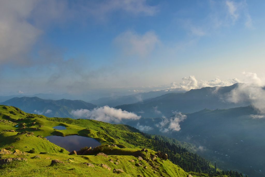
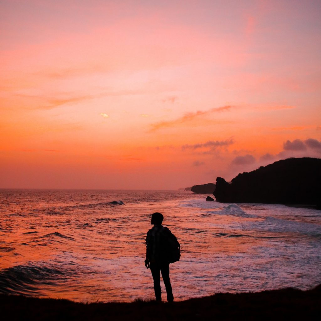
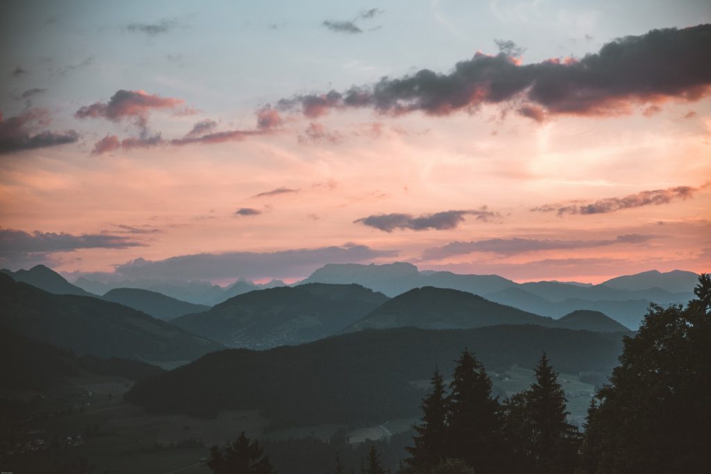
Develop Space through Color: Atmospheric Landscapes
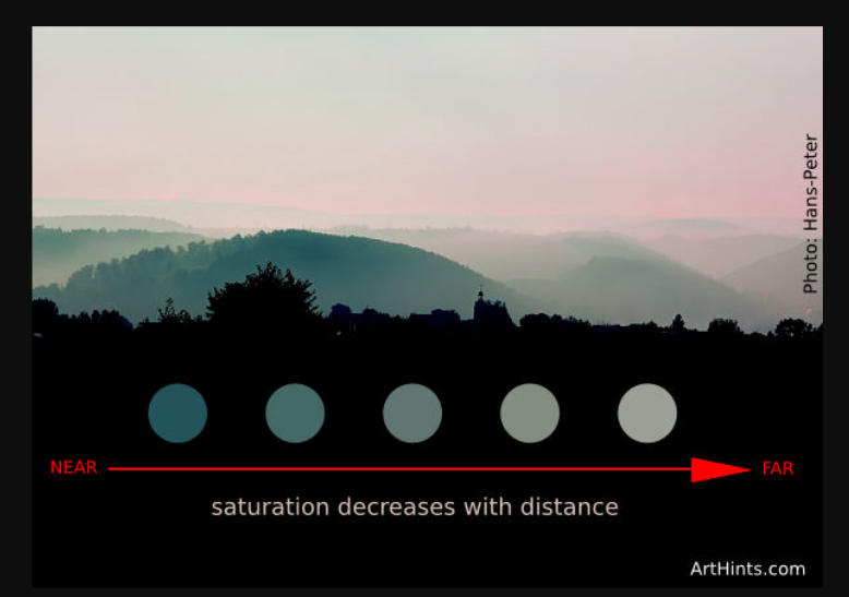
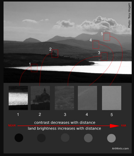
Atmospheric perspective or aerial perspective refers to how the atmosphere affects objects as they recede into the distance. As an object recedes relative to the viewer, the contrast, value, and saturation change.
- Contrast decreases with distance
- Value increases with distance, getting lighter
- Saturation decreases with distance


RESEARCH links below
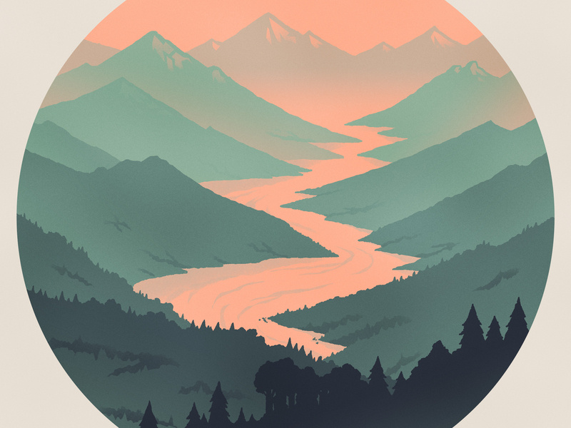
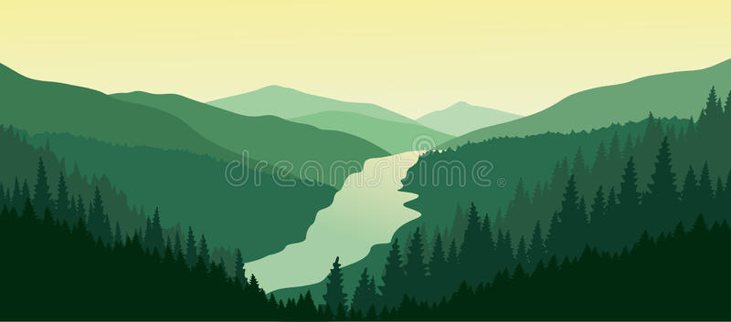
Graphic Illustration Landscape
Graphic Illustration CityScape

Guidelines
Create a 9×12″ painted collage of a landscape or cityscape of your choice (mountains, ocean, city or ?) demonstrating an understanding of the range of saturation (pure, muted, desaturated) and chromatic value (light, midtones, dark) using progressions and atmospheric perspective.
Write the following guidelines in your sketchbook:
- Research! Research! Research! Find or use existing images as visual reference. Choose a landscape that is meaningful to you.
- Consider and use Visual Hierarchy, Rule of Thirds, and Focal Point when creating your sketches.
- Post into Milanote photos that inspire you.
- Also, upload images into Photoshop and view/save in Mosaic filter to see how saturation and value change through distance.
- Create at least 6 thumbnails to start. Think about simplifying compositions you find from photo into layers of space. Create shape areas to indicate color/value movement into deep space
- Choose a palette of complementary colors – choose one pair
- Consult your Saturation Scales and Color wheels.
- Create a refined sketch, indicating the color saturation and value changes.
- Select favorite thumbnail and define color progression, colored pencil or letters to designate colors and values
- Final Painting
- Your landscape must use at least 3 changes in saturation (pure, muted, desaturated) and 3 changes in chromatic value (light, midtone, dark).
- Choose a palette of complementary colors pairs.
- Once you’ve determined your palette and sequence in the landscape, create a color swatch strip to show hue, value, saturation range, to go along with your painting.
- Mix your colors and paint each individual color in smooth, flat layers to bristol. Three thin coats work well.
- Do not overlap colors while painting.
- Using xacto knife or small scissors, carefully cut out each painted strip of bristol to create your layered collage.
- Layout your painted collage pieces on piece of bristol, using a little bit of tape on the back.
- When you are sure you like the pieces, you may glue with gluestick and put heavy books to flatten.
- Option: you may design landscape and paint in color shape areas with smooth clear edges rather than cutting layers to paste down.
- Option: you may use your own photograph if it has necessary compositional elements.
Critique
- Bring all parts of this project to (remote) class: Part one and part two. Grids, Sketches, finals.
- Be prepared to present, discuss and analyze your finished work in terms of concept, craft, what you learned, and the design process.
- State the following: your name, what you are presenting (title and design problem), which parts are successful and why, which parts are unsuccessful and why.
- Your peers and the professor will provide feedback. You will have an opportunity to revise your work based on the feedback to improve your work and your grade.
Documentation and Feedback
Submitting in your work
Follow the Submitting Your Work guidelines and include the project-specific details below:
- Post Titles: Grids and Scales, Research, Final
- Images: Organize your post to include all content from the 2 parts of the Design Process for this project.
- Create headings for each phase and include images or a gallery, where appropriate:
- Grids and Scales-Color Theory-
- Research for Atmospheric Landscapes, thumbnail sketches,
- Process – design and paint
- Final Presentation, include post and reflection
- Written Project Reflection: In your post, document your thoughts about this project. Think about what you learned, what you could have done better (planning, material use, craft), and how you will apply what you learned to your next project. Consider and respond to the comments made in class during the critique.
- Category:
- Category = Project #4,
- Color Palettes Project #4
Providing Feedback
Part of your Project grade is leaving well-written comments for at least one of your peers. Follow the Providing Feedback for specific guidelines for leaving constructive feedback.
CREATIVE COMMONS LICENSE
This site is curated and maintained by Prof. Jenna Spevack.
Except where otherwise noted, content on site is licensed under a Creative Commons Attribution-NonCommercial-ShareAlike 4.0 International License.
You are free to share and adapt the content on this site if you provide appropriate credit, provide a link to the license, and indicate if changes were made.
CREATIVE COMMONS LICENSE
This page has content curated by Prof. Jenna Spevack.
Except where otherwise noted, content on site is licensed under a Creative Commons Attribution-NonCommercial-ShareAlike 4.0 International License.
You are free to share and adapt the content on this site if you provide appropriate credit, provide a link to the license, and indicate if changes were made.
© 2020 GRAPHIC DESIGN PRINCIPLES 1