Category Archives: Uncategorized

video to check

Skillshare.com

https://www.skillshare.com/classes/Graphic-Design-Basics-Core-Principles-for-Visual-Design/1539782161/classroom/discussions?via=user-profile&enrolledRedirect=1

https://www.skillshare.com/classes/Graphic-Design-Basics-Core-Principles-for-Visual-Design/1539782161/classroom/discussions?via=user-profile&enrolledRedirect=1

https://www.skillshare.com/classes/Typography-That-Works-Typographic-Composition-and-Fonts/1694217981/classroom/discussions?via=user-profile&enrolledRedirect=1

history of type

https://www.typotalks.com/videos/


Spiekerman
https://www.designative.info/2014/09/25/watch-erik-spiekermanns-type-is-visible-language-talk/

pronuce https://youtu.be/os4lUpj3nvw
Bierut think design

At and copy

Milton Glaser: To Inform and Delight, 2009
https://youtu.be/jZ1YHqgZzGQ
Why Man Creates, 1968
https://youtu.be/ukujYXHhMxQ
bass on titles
https://www.youtube.com/watch?v=DKu6EVKiNbg
Design is one
https://pratt.kanopy.com/playlist/1988360
Helvetica


Dieter ram

Design and thinking
https://youtu.be/Tcsh4jCuLt0

No logo

Exit through the gift shop (2010, Banksy) http://youtu.be/oHJBdDSTbLw
Milton Glaser: To Inform and Delight (2008, Wendy Keys) http://youtu.be/zH-o1r7gYgc
Design & Thinking (2012, Mu-Ming Tsai) http://youtu.be/uilcaXYnluU
The Universal Arts of Graphic Design (2012, PBS) http://youtu.be/sTi5SNgxE3U
Graphic means https://vimeo.com/157620840
http://designthinkingmovie.com/

HOME


http://www.artandcopyfilm.org/
With new for 2017 Netflix series Abstract: The Art of Design
naked brand
https://www.designernews.co/stories/28774-7-graphic-design-documentary-you-should-be-watching
https://www.creativebloq.com/features/the-top-10-design-related-movies

Skillshare.com

https://www.skillshare.com/classes/Graphic-Design-Basics-Core-Principles-for-Visual-Design/1539782161/classroom/discussions?via=user-profile&enrolledRedirect=1

https://www.skillshare.com/classes/Graphic-Design-Basics-Core-Principles-for-Visual-Design/1539782161/classroom/discussions?via=user-profile&enrolledRedirect=1

https://www.skillshare.com/classes/Typography-That-Works-Typographic-Composition-and-Fonts/1694217981/classroom/discussions?via=user-profile&enrolledRedirect=1

history of type

https://www.typotalks.com/videos/


Type Talk Depero futurista

“Depero futurista”   Published 1927
Known as “The Bolted Book” because of its famous binding
By Fortunato Depero, Italian Futurist artist/designer 1892-1960
Pages can be viewed at link below

http://www.boltedbook.com/

Select two pages from the book

Compare and contrast them in terms of

Typography usage, page layout, color

The book itself is an interesting and unusual design object.
The bolts that hold the book together at its spine can be untwisted, and the pages taken out;
It is one of the rarest collectable art books around

The Bolted Book is a visual tour de force filled with ground breaking typographic experiments and bold explorations in nearly every art and design medium, including advertising and the form of the book itself

Type Games

What Typeface Are You?
http://www.pbs.org/independentlens/helvetica/quiz.html

Type Connection
http://www.typeconnection.com/

is a fun “type dating” game that helps you learn how to pair typefaces.

Kern Type
http://type.method.ac/

Kern Type is a game in which you try to achieve pleasant and readable text by distributing the space between letters, called “kerning” by typographers. You can move the letters by dragging them from left to right, and your score depends on how close you are to a typographer’s solution.

Typewar
http://typewar.com/ Typographical skill game that tests your knowledge and awareness of individual fonts.s also available, which allows you to track your progress as you level up.
to do is shoot the the Serif fonts within the time limit to move to the next stage.


Shape Type
http://shape.method.ac/

Shape Type is an addictive letter shaping game

TypeTalk 4


Type Talk
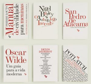
Select what you consider to the strongest cover design from the image below.
Explain why.

Due  Before Class MARCH 27

Client: Fenda Edições


Design
João Bicker

http://www.fba.pt/portfolio/projects/fenda+book+series-4

The project for this series of books is based on a self imposed restriction with the aim of exploring the expressiveness of the text. All book covers are designed using only two colors – black & red – over a white background. Monotype Modern Extended, a typeface to been seen rather than read, is the sole graphic element apart from the publishers logo. The vast diversity of subject matters and ages of the texts in this collection is reflected on the cover designs, with the treatment of type seeking to capture the sense and flavor of each text and each author.

here are some others in this series

Save

Save

Save

Save

Save

Save

Project 2: FINAL Typographic Poster

Project 2: Typographic Poster
Brooklyn Historical Society, DUMBO
FINAL March 20

D214_2427_Assign_6

Produce a final version of your poster assignment.

You will be graded on: presentation, typography, design, technique and following below instructions.

Work will be Included into project  site:

Presentation
Present your layout and description. Explain your work; research and concept as related to research and your design choices.

 Required for Project Presentation
I. Output mounted on board.

II. Written Project Brief Two Copies: Create a written description of your project. Mount to back of board.

III. Your physical job folder with all related materials: brief, concept sketches, reference etc.

IV. Uploads to Class site
A. Create blog post with tagged category Project 2

B. Single Image File of final layout saved as a .jpg
Name layout file: “lastname_firstname_p2.jpg”

C. Your digital casebook file with all related materials: page one; brief description page two; final layout, then, concept sketches, reference etc. Document does not have to be a designed document but should reflect your design process. Must be saved as a PDF.
Name casebook file: “lastname_firstname_pcb_2.PDF”


Production Materials
1. Color print out of your project mounted on board. It can be output on 11×17 color
2. Black board 15×20
Xacto knife
Metal edge ruler
Spray mount

3. Written Project Brief, Two Copies. Create a written description on your project. Include your name, project name, goals , concept and explain your solution Print out 8.5×11. Mount to back of  board and have one extra print out.

4. Your Job folder with layout, brief description, concept sketches, design work, research and reference.

Save

Type Challenge 2

Type Challenge 2

Class Exercises in Typography
.

1. Use two initials of your name create four 4×4 inch compositions
Combine the letters in a dynamic way. Explore scale, contrast repetition, and rotation within the composition, do not stretch, or distort the original forms. Black and white.
Do three versions 12 total individual studies

2 Use InDesign, Illustrator PS create a document
 export it as jpg
“last name_Firstname_typeC2.jpg”

3. Save your work to class Openlab page named:
Firstname last name Type Challenge 2
tag it Type Challenge 2:  
insert jpg “last name_Firstname_typeC2.jpg”
4. If you prefer to sketch first you can do that.


Type Challenge

Type Challenge 2

Due at the end of class time uploaded  to OpenLab

1. Pick  the  (bad) logotype  you selected for this week’s homework

Create a version that improves the logotype’s design.
Explore scale, contrast. repetitions. Black and white.

You can sketch first  if you would like

2 Use InDesign, Illustrator, PS create a document
export it as jpg
“last name_Firstname_typeC2.jpg” 3. Save your work to class WP page named:
Firstname last name Type Challenge 2
Give it Category “Type Challenge2”
insert jpg “last name_Firstname_typeC2.jpg”

  Keep In Mind the principles below:

Logotype design principles
SIMPLE
Remember, less is more.
This is one thing to keep in mind when creating a logo. Know your message. Tell your message in a focused and clear concept. Make it simple and clean. Do not distract with unnecessary elements. A good logo possesses few elements which are integral to the message.
APPROPRIATE
Your target audience will an important role to play in creating your logo. Logos need to be appropriate for its audience. For instance, the color or font type used in creating a logo for a children’s store will be inappropriate if used to create a logo for a bank.
Your logo needs to be appropriate for its purpose. Take for example , the Walt Disney logo is beautiful. However, it is beautiful for its audience but highly inappropriate for as a bank logo.
MEMORABLE
A logo should be more than graphic design. It serves as your identity, and symbolizes all that it stands for. It is your brand in design. When people forget your logo, they most likely have forgotten you.
TIMELESS
Trends come and go. Don’t follow the pack. Stand out.
Trends are trends. As a brand, you want your logo to stand out all day every day. As a brand you want your logo to stand the test of time. Pay attention to the font type, shape, balance of specific elements and capture the relevant features.


Assignment book

2427 Eats  Restaurant Guide  Book Design

“2427 Eats”  Multi Page Document Design
Design, print  and mockup a 20 page booklet plus cover.
Design a 5.5”x 8.5” page booklet using InDesign.
Can be BW or 4/C
You will set up master pages, guides, type style sheets and printer spreads.

DUE DEC 1

BRING PRINT OUT OF ONE SPREAD AND COVER LAYOUT


Prepress_Export_indesign Guide

GRID_SAMPLES

Sample Layout

Vignelli_Canon

2427 Eats Grids

2427 Eats Cover grid

2427 Eats grid single Page

________________