The difference between Luminosity and Inherent light is that luminosity refers to light bounced or reflected off a color by an external source where as Inherent Light is the perceived lightness from radiating from within a color.
Design Journal entry #27
Process Color – Refers to the CMYK color model used in offset printing to blend colors in such a way that it appears as a solid color to the human eye. https://www.webopedia.com/TERM/P/process_colors.html

Spot Color – a spot colour is an ink that is premixed to the colour required and printed from a dedicated plate, rather than being simulated by overprinting dots of ink from the cyan, magenta, yellow and black plates. https://graphicdesign.stackexchange.com/questions/9397/what-is-a-spot-pantone-colour
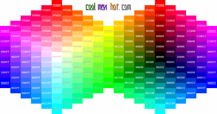
Hex Triplet – A hex triplet is a six-digit, three-byte hexadecimal number used in HTML, CSS, SVG, and other computing applications to represent colors. https://en.wikipedia.org/wiki/Web_colors
Posted in Uncategorized
Leave a comment
Jason Griffin

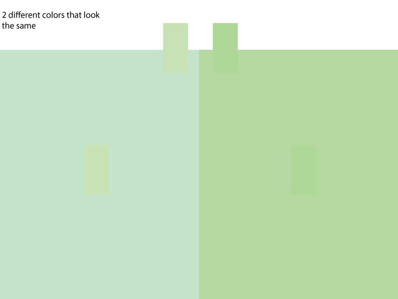
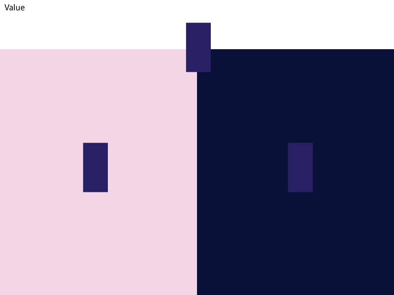
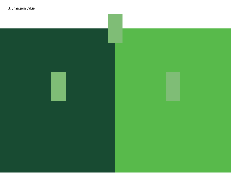
Value

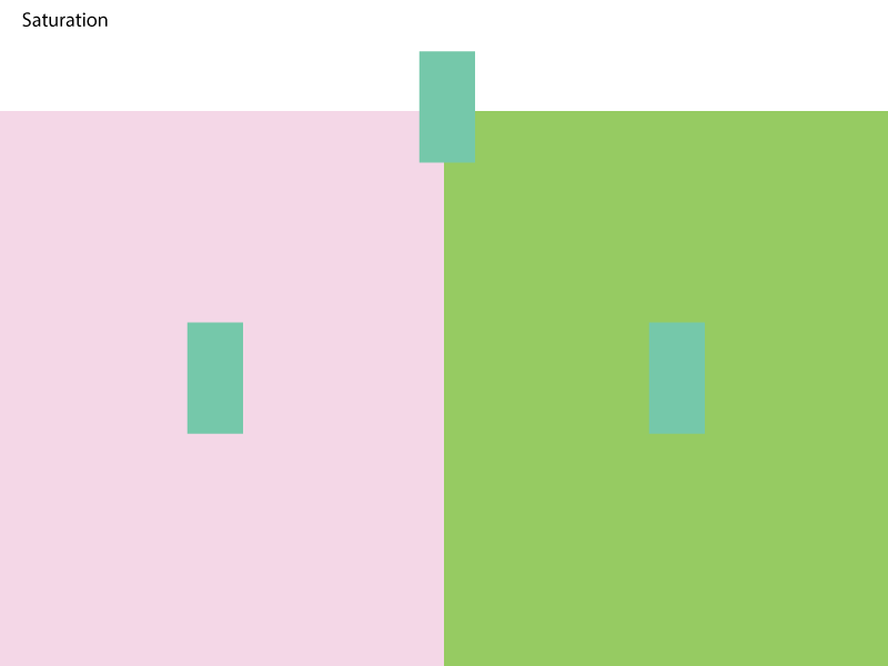
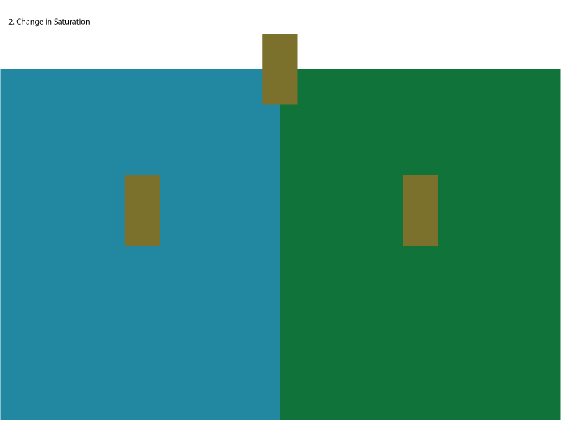
Sturation value
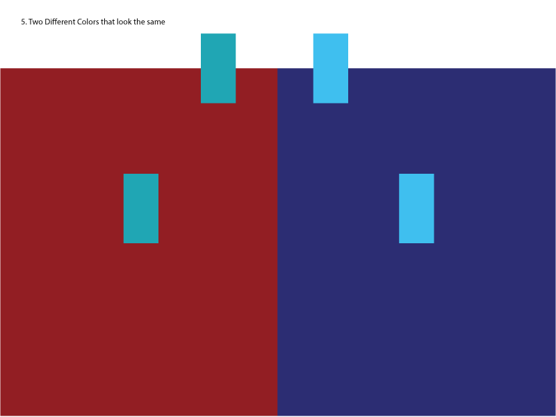
2 Different colors that look the same

Value
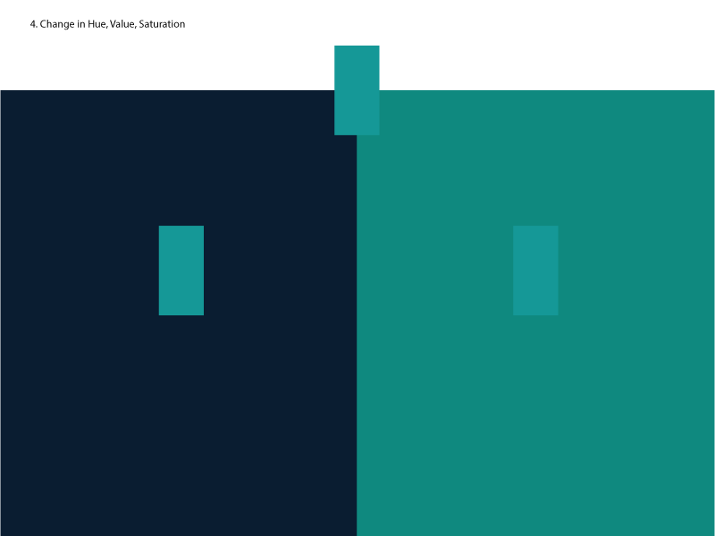
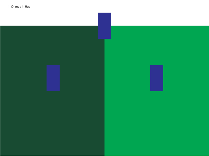
Change in Hue
Posted in Uncategorized
Leave a comment

Design Journal entry #24
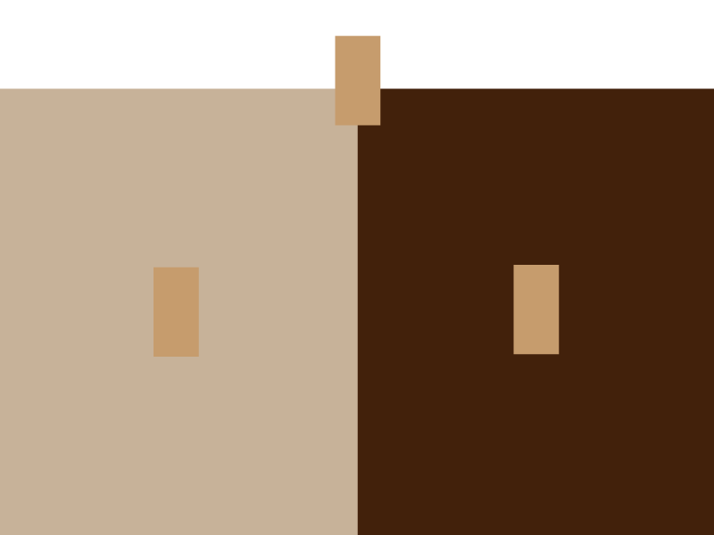
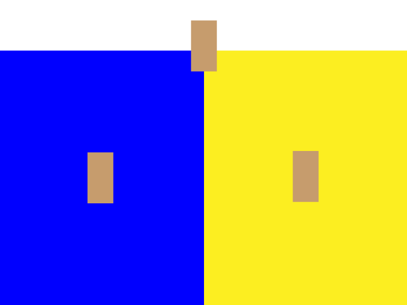
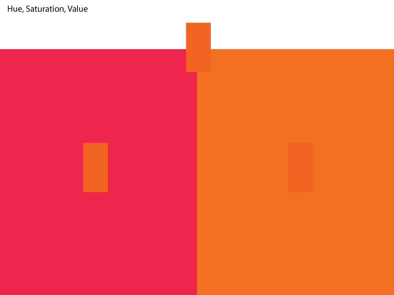
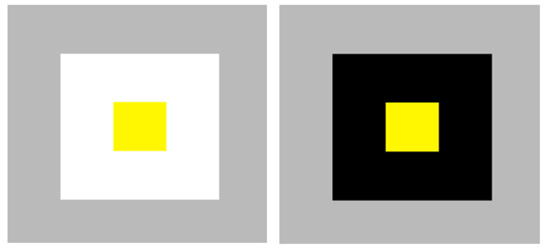
Bezold Effect – The Bezold Effect, also referred to as the “assimilation effect,” is an optical illusion where a color’s hue or value is affected by the color or colors surrounding it. http://www.newworldencyclopedia.org/entry/Bezold_Effect
When looking at a specific hue, it can appear to change in appearance depending on the colors that surround it.
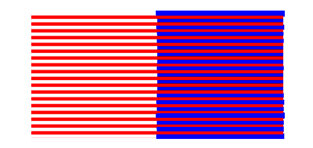
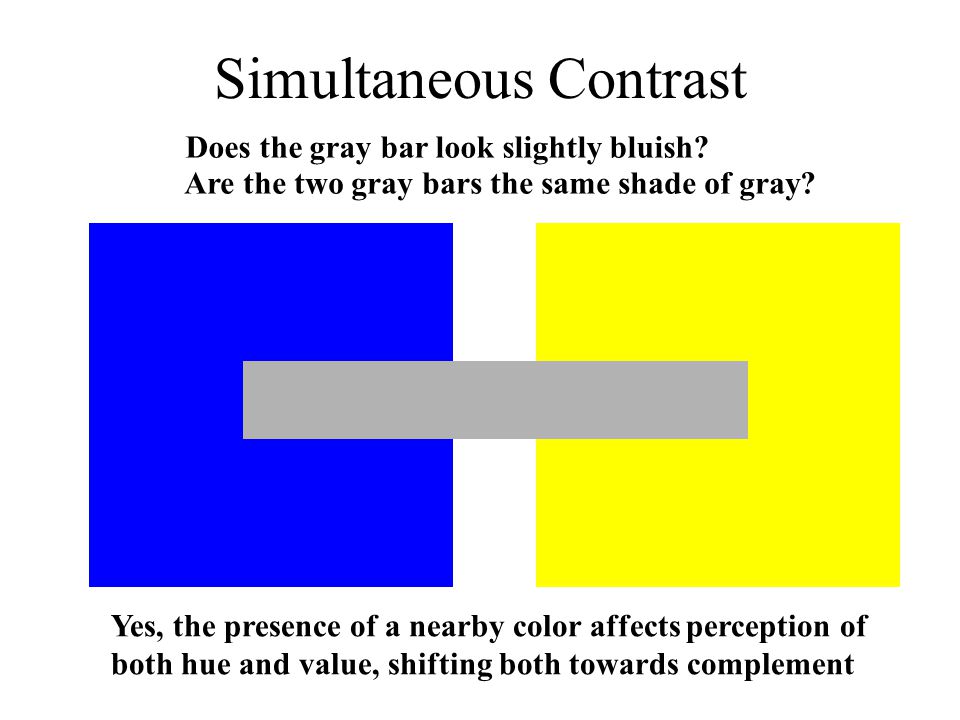
Simultaneous Contrast – The way in which two different colors affect each other. The theory is that one color can change how we perceive the tone and hue of another when the two are placed side by side.
Color Interaction – A color’s expressive character can be changed by placing it in a context with other colors. http://portfolio.newschool.edu/stillmas/files/2015/03/Color_Interaction_lr-r5qjlj.pdf
The way colors exert an influence on each other.
Posted in Uncategorized
Leave a comment
Design Journal entry #23
Prismatic Colors – The colors that can be seen when white light goes through a prism. Examples of the prismatic colors are red, orange, yellow, green, blue, indigo and violet.
www.yourdictionary.com/prismatic-colors
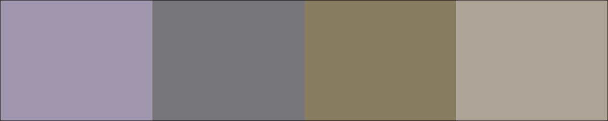
Muted color – When any color is mixed with black it is called shading which lowers the “value” and makes the color a bit more “muted”. https://graphicdesign.stackexchange.com

Achromatic gray – An achromatic color is a one that lacks hues such as white, grey and black, and a chromatic color is a color which has even the slightest amount of hue. Achromatic colors (white, grey and black) have lightness but no hue or saturation. They can be created by mixing complementary colors together. art-design-glossary.musabi.ac.jp/chromatic-and-achromatic-colors/
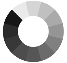
Chromatic gray – A gray color in which the red, green, and blue codes are not exactly equal, but are close to each other, which is what makes it a shade of gray. https://en.wikipedia.org/wiki/Shades_of_gray
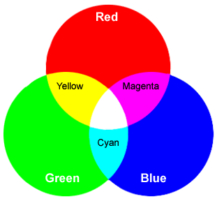
Additive Color – A method to create color by mixing a number of different light colors, with shades of red, green, and blue being the most common primary colors used inadditive color system.
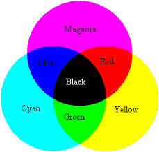
Subtractive Color – Subtractive color mixing is the kind of mixing you get if you illuminate colored filters with white light from behind. Subtractive color involves colorants and reflected light. It uses cyan, magenta and yellow pigments or dyes to subtract portions of white light illuminating an object to produce other colors. When combined in equal amounts, puresubtractive primary colors produce the appearance of black.
Posted in Uncategorized
Leave a comment
Design Journal entry #22
Josef Albers – He was a German-born American artist and educatorAlbers’s 1963 book Interaction of Color provided the most comprehensive analysis of the function and perception of color to date and profoundly influenced art education and artistic practice, especially Color Field Painting and Minimalism, in the twentieth century.
Johannes Itten – Johannes Itten was a Swiss expressionist painter, designer, teacher, writer and theorist associated with the Bauhaus. He defined 7 strategies for color combinations: contrast of saturation, light and dark, extension, complements, hue, primaries, warm and cool.
Albert Henry Munsell – He was an American painter, teacher of art, and the inventor of the Munsell color system. Munsell’s work in developing a systematic approach to teaching and communicating was influential in evolving color science theory at the turn of the century and served as the basis for today’s color matching technology.
Posted in Uncategorized
Leave a comment
Entry # 20 color info
one thing that i learned was that hue is the determination of colors determined by there wavelengths.
Posted in Uncategorized
Leave a comment
Design Jounral Entry #18
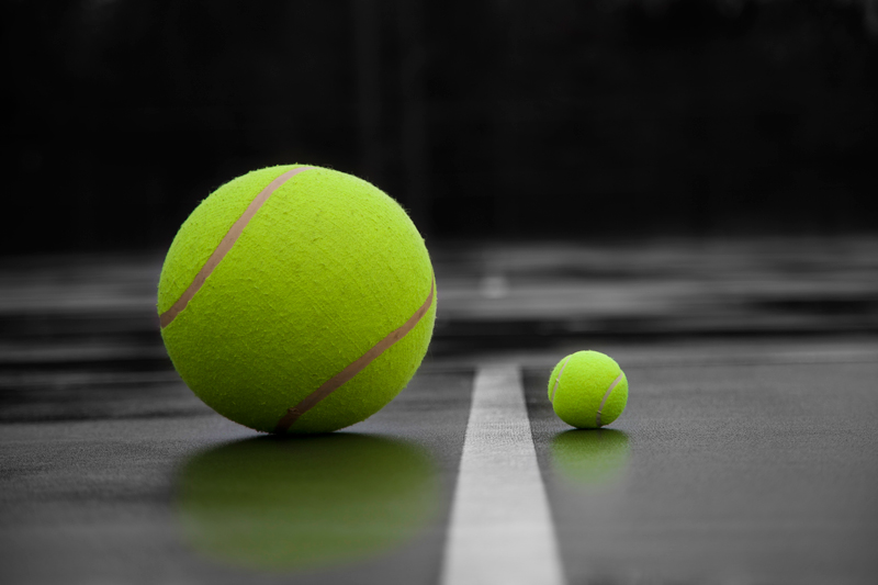
Proportion – Proportion refers to the relative size of parts of a whole (elements within an object). https://www.sophia.org
Relation of objects in an image with respect to individual size.
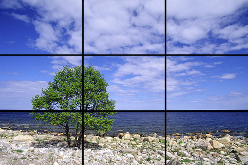
Rule of Thirds – A guideline which applies to the process of composing visual images such as designs, films, paintings, and photographs. https://en.wikipedia.org
A rule that helps with the placement of objects in an image to create more visually interesting compositions.
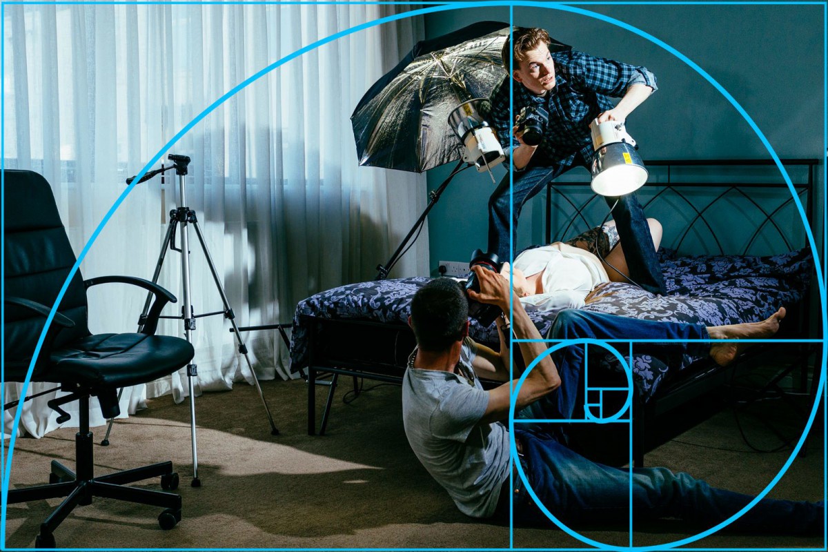
Golden Rule – The Golden Ratio is a term used to describe how elements within a piece of art can be placed in the most aesthetically pleasing way.
Posted in Uncategorized
Leave a comment

