Design Journal entry #17

Low Key – A low key scheme contains a range of dark value colors. www.sensationalcolor.com/

High Key – A highkey image consists primarily of light tones, without dark shadows. https://en.wikipedia.org/

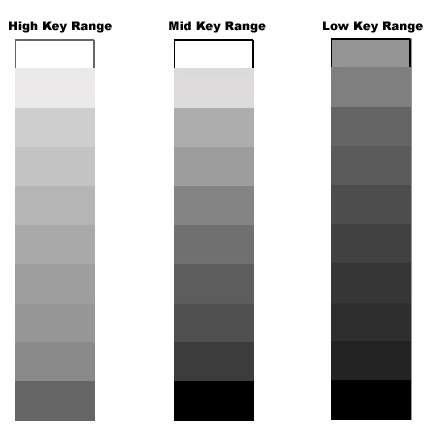
Narrow Range – Restricted in color value range https://en.oxforddictionaries.com

Broad Range – Covering a large number of color values. 

Posted in Uncategorized | Leave a comment

Transparency & Layering

Poster for Emigre Graphics Magazine.
Multiple perspective but intended viewpoint is when color field is on right edge.   Made to resemble draft printed from computer. Space for inventory information at upper left corner. Side-way reproduction of enlarged computer screen of graphics program using layering of dark military green, pink, and faint military green. Top left is in dark military green while bottom left and bottom right are in faint military green.  Majority of poster is pink.  File name is "Time Page 1" on left center with rows of icons such as cursor, hand, text box along left side.  Guide ruler at bottom. Image on computer screen seem to be blurred camera with pixelated image of lens. Across center, imprinted in white: "(DRAMATIZATION)/ 1/ PLEASE, DO NOT ATTEMPT/ THIS AT HOME".Promotional poster for "Fact TwentyTwo", album from Emigre Music. Intersecting circles in pink, black and yellow in various diameters throughout poster with either simple text or photo of daisy superimposed.  At top, large partial pink circle with superimposed photo of daisy at upper left overlap with small blank black circle and large yellow circle with image of daisy. Small black circle overlaps smaller black circle with "Energy" imprinted in white.  At center "Fact/Twenty/Two" imprinted in black. Around title, title repeated in pink and all other text repeated in yellow, in circle formation. Yellow circle outlined in pink with "cd" imprinted in pink at lower right.  "Energy" in upper right, "Work" in upper middle at left; "Power" in lower left. Design plays on circle motif as well as layering.  Black is top layer while yellow and pink are equal.  Emigre logo, pink slanted ellipse with "EMIGRE" in white, at lower left corner.Poster for the outdoor exhibition, Works in the Open Air, at the Gyeonggi Museum of Modern Art, Ansan (2010). "Works in the open air" appears in a staggered vertical composition. The words are printed in varying shades of blue, with different textures (lined, dotted, etc.). They are integrated into a larger composition of abstract designs (yellow and purple) and Hangul text (red), as if in layers. Beneath these layers, small human figures are lightly outlined against the white background. They are shown in various poses of relaxation and play.

These are successful examples of layering and transparency through there use of varying colored shapes on top of objects with a transparent fill.

Posted in Uncategorized | 1 Comment

Design Journal 10/30

Value – The lightness or darkness of tones or colors. www.oberlin.edu/

Gouache – a method of painting using opaque pigments ground in water and thickened with a gluelike substance. https://www.oxforddictionaries.com

Posted in Uncategorized | Leave a comment

Journal Entry 10/25

Layering – a thickness of some material laid on or spread over a surface. www.dictionary.com

the action of arranging something in layers


Transparency –  a picture, design, or the like on glass or some translucent substance, made visible by light shining through from behind.

A condition of being see through.


Spatial depth – the distance in space from the top or surface of something to its bottom.


Posted in Uncategorized | Leave a comment

Textures

Posted in Uncategorized | Leave a comment

New York Times Article

Nike Chief of Design Doodles All Day

In this article NYT goes behind the scenes at Nike with designer, John Hoke, the chief design officer of Nike. John discusses among other things how his dyslexia made him look at the world differently, his design process and how he manages 1,000 designers.


Posted in Uncategorized | Leave a comment

Textures


With these pictures I would show different examples on how light effects textures.  As a project I would make into a collage with alot of different textures that contrast.

Posted in Uncategorized | Leave a comment

Texture pictures entry # 7 carmen Diaz

when looking for texture it was very interesting to know that there were many different images that show texture which i found pretty amazing. one of the things i enjoyed most about finding texture is that once i took the picture it seemed like it changed into something different.

Posted in Uncategorized | Leave a comment

CUNY Perks

One of the most intriguing CUNY perks that I came across is discounted broadway tickets. I have lived in nyc almost 10 years and have never gone to a broadway show. Knowing that I get a drastically reduced discount encourages me to buy tickets now.

Posted in Uncategorized | Leave a comment

Perks

As a student having the NY  Times membership is a very using tool to have.  It’s something that I can use for more than just one class and just for myself as well.

Posted in Uncategorized | Leave a comment