Ethnics Design Entry 2

The readings that I read have changed my perspective on my own design work since it gives a full understanding of what to do to ensure that what we’re designing has one, gives us full rights to us as the artist and the full process of learning how to use credits and security over artworks correctly. Copyright is important since it shows the limits to how much I can protect my own work to make sure when creating something for a client how much they have full rights to it, whether they can claim commercial rights or if the artist still carries the protection of their work. Since it’s against the law to copy someone else’s work and claim it as their own and it’s more important than when a higher-up company steals from an artist around for their own purposes, the artist can use the copyrights as a way to gain their poverty of work back. So even if this was something we artists might know sense that stealing is wrong without copyrights it makes it hard to claim your work which in a way tells people around that the work created by us artists obviously is claimed by us.

Personally, when it comes to work I do for myself and others I don’t really reach out for ideas from other artists themselves, but I’ll see more of their ideas and just get an idea of my own. Overall I probably only got to that point when it involves clients who like an idea of another which is something similar to theirs. But when I do, I have to make sure to properly do my background research on what social media to even where the original image source came from. This includes the name of the piece and the artist name of who created it, as well as where it came from. And when citing the source always make sure to have it near the reference and to clearly show your own work separate from it. Not doing something like this can cause a huge misunderstanding due to the fact no one won’t knows who created the original work unless someone knows but by then it would seem stolen since the artist itself wasn’t aware and can use the copyright rule against them. That is why it’s important to make clear who and what ideas were inspired by who.

The “Case Study on Fair Use and Fair Dealing: The Hope Poster Litigation” shows the importance of not properly crediting someone and the consequences behind the actions of those who don’t respect copyrights. Mr. Fairey started out ignorant of the rules and then, later on, tried to use makeup evidence to make it seem like they weren’t wrong when in reality it was. I don’t understand why it was so hard to just simply credit the original photographer, but it came to the point they just needed to have common ground with it. I think this gives a huge awareness to others to understand the importance of copyrights and how far it can go resulting in some jail time, but it can be done simply by just showing your audience who was the true person behind the idea of the reference used.
Ethics Design Entry 1

I had to input the information that I learned from this style guide into my internship experience. In the illustration guidelines shown in the style guide, I was able to create different ideas for my internship in order to give it a personality that can represent the organization while not making it too basic at the same time. Overtime during this internship, I began to improve my own style and branch out as an illustrator and understand different perspectives and visions that go into design. Such as the use of different logos for the organization, the type of color used, and simple designs needed to show consistency and give a message that exceeds the expectations of the client and the organization.

During my time at the internship, it was up to the interns to reference and research our own ideas when creating graphic design advertisements. Personally, I mainly focused more on the research to get an idea for a new project. When it was needed to use reference, it was for small things that I needed to know how to draw, so they can look as real as possible. However, mainly the work I had to look up to and think of ways to put into my own style is looking at some ideas made by some past interns that decided to leave it behind for the organization to reuse. When it comes to using the organization’s logo and trademarks, they provided those in order for me to add that type of poverty to the projects we interns have done since it shows their audience it was created and made for them to use whenever they want.

For this internship, I never had to sign a confidentiality or non-disclosure agreement.

The End of The Road, #13

   Image: iStock

I feel that this experience dealing with the internship has made me more aware of how is it to be working in a professional workplace and how to maintain time management as well as multitask. At first, my experience in job hunting was really stressful since it takes up time and I had learned to have a backup plan when the first or second jobs don’t accept me even if I submitted everything they ask for. Even finding a job in my field is rare and hard to find since my preference is something that isn’t easy to spot. However, regarding my internship as a design intern, I feel that I sometimes struggle to speak up, in the beginning, so I wasn’t really asking much or at times felt behind in certain things. This experience taught me it’s my responsibility to catch up and ask whenever I’m confused since it’s not their job to be on top of me like that, so I learn to be actively involved more than how I was in the beginning. I also learned multitasking due to the fact that I was doing projects from my other classes along with my internship and many times I actually got many things done despite the work in a short period of time. With my skills in using programs like procreate and Clip studio, I managed to create professional graphic design pieces as if I were using photoshop and InDesign itself, and I felt my skill improve in terms like I know how to adjust a size without changing much of the original work to reducing work to something simple and I feel these skills may come in handy later on in future projects.  Overall, I really learned a lot and I feel that through this experience, I grew and am able to prepare myself when I get a job in the future.

Accessibility Options:

The End of The Road, #13

The End of The Road, #13.en.ja

Finishing Up, #12

Image: Dreamstime

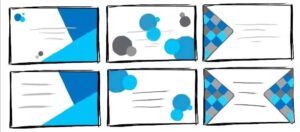
When I felt I had enough thumbnail sketches with enough information, I went ahead and did the design for their website first since I felt it would be faster in terms of coloring since they have mostly two colors. Once I was slowly getting that done, I was also trying to finalize my other set of projects that described a theme for each. I did three and it wasn’t easy, but eventually, I got them done one by one. I didn’t get much feedback in terms of what words I need to say, so I thought of simple slogans that can get the attention of the viewer with the knowledge I know when it comes to advertising with words. Now that I got those done, my last thing to do is to gather everything single thing I have done from thumbnail sketches to them being finalized and it needs to be put together in a way for me to present my progress to my supervisor. Lastly, I also need to submit my papers, but now I’m currently going to start on that since they aren’t showing me anything else but to get this done.

Research, Research, Research, #11

Credit: Me

So with the business card project, I had three solid ideas which my supervisor liked at least, so I quickly finalize it with more feedback in making sure for any other work I keep consistent with their designs. So mainly the last thing I had to do was actually two things. One is having to include a couple of designs surrounding what the winner can spend their prize money on and just a graphic design advertising the website they own. Though I have to say through the process of this I felt I didn’t get much feedback due to many communication delays, so some things I had to research myself, and one thing was figuring out the size files to use on websites. However,  one major feedback I felt was a huge help was when they told me to go research the top places people would love to go and include that in my first project to go along the trends and capture many viewers who can understand that better, so that includes searching up and gathering info through hashtags which was an interesting way of researching, but help in creating more interesting thumbnails.

My Biggest Hurdle, #10

Image: Webstockreview

So for the next project, it involves me designing a business card for my internship and I have to say it was something I felt I was going to struggle with the most since I have never done one, especially in a professional manner such as this.  Also, I realized as I was beginning to work that I would have to communicate and ask a lot of questions to my supervisor every time I felt confused. I felt that I was bugging them at first, but I realized it was because I really didn’t want to mess anything up. So I started with some sketches, but soon those ideas got rejected because the sketches wouldn’t really match up with the style of the company, so I had to keep redesigning. My main issue was since they prefer simple designs, they wanted me to apply that to the business card which makes sense since I tend to put in so many details. So until now, I’m still currently working on it until I get the approval to finalize it.

My Time to Shine (World’s Art Day), #9

 Image: The Dispatch

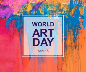
For this one, it was on me to ask for permission to start ahead on an opening for creating a graphic design surrounding the world’s art day. I requested to do this since I had some creative ideas that I thought would be interesting to put down for them and when they agreed right away, I started on some thumbnail sketches before I forget my thoughts.  As usual, I did mostly 8 thumbnail sketches and instead of finalizing three, I did two since I felt many of the designs I did wouldn’t capture what it’s advertising really well. My favorite one has to be the one I did that shows a kid’s hand spread around like paint since it is something I feel doesn’t get recognize as much related to art since it’s more kiddish. However, it works out perfectly with the company’s colors being included around the hands. Personally, I feel I did a good job with this project I have done since it’s something I do and can apply that to this project giving off more of a realistic feeling with art.

Finishing Up St. Patrick’s, #8

Images: Google Images

I had my deadline for my first project which involved the holiday called Saint Patrick’s Day and managed to get it done before the deadline. However, soon after, I started on another project. This next project involves multiple general graphic designs advertising the company’s name and its whole purpose of it. Instead of doing one design, I had to this time get three done in the same style and colors they want for every project so I quickly started on some thumbnail sketches. After getting mostly 6 thumbnail sketches and showing my ideas to my supervisor they wanted me to pick three that I prefer and finalize them which I did this time using some references in hand and such. At the end of the day it wasn’t too complicated in terms I did take my time as well as ask for feedback until I was ready to move on to another project so this marks four projects done so far.


Jumping into another Project, #7

  Credit: Me

On Wednesday I actually got my first project done early with the right corrections and with no complaints, so I had time to rest before asking for my next project. My next project was to create a post just advertising the organization by showing what exactly they do and how it benefits them in joining. So on the weekend instead of four thumbnail sketches, I just simply created eight to show more. They also wanted me just in case to look back on some previous projects to make sure mines give a simple vibe to it. This project is due next Thursday again so I hope I can get it done early, but at the same time, however, I want to take my time so I don’t make mistakes in my work.


Officially my First Project, #6

  Credit: Me

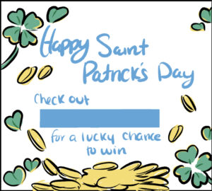
This week I got in contact with the head of the designing department of the organization and briefly explained where I can go to see previous projects and to get the correct colors and fonts they want. They also gave me my first project to work on which was due on March 17th, on a Thursday which was also the holiday, St. Patrick’s Day.  I pretty much had to create a Facebook or Instagram post that had a theme revolving around St. Patrick’s Day, but also still advised their organization. Like always I needed to start with the thumbnail sketches which I did and got a lot of feedback like the color choices needed to match their style and to keep the type of fonts the same. Overall I’m just refining based on the feedback I got and hope I have it done by then.

« Older posts