Metropolitian Museum Interior, Mark Innerst.
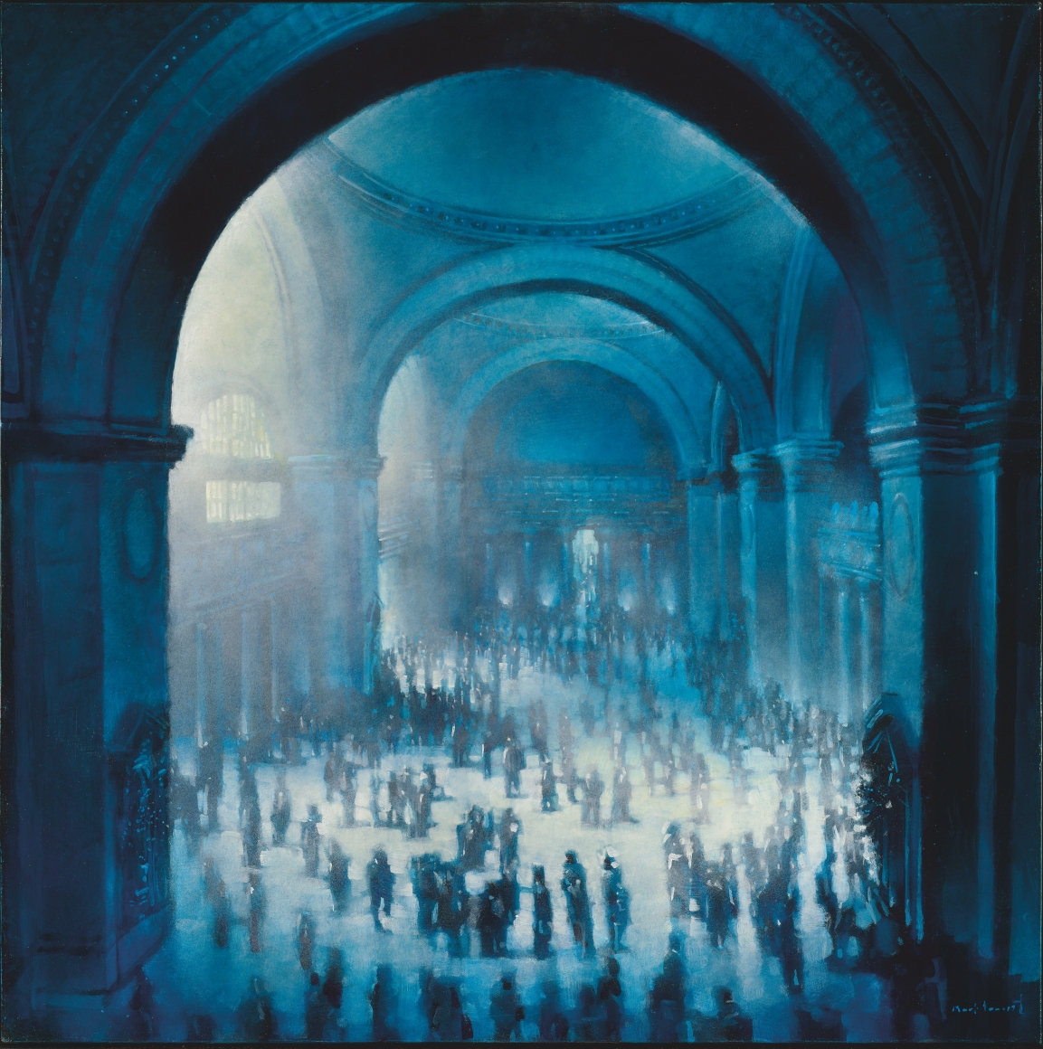
In the Nassau Museum “Blue” exhibit, I chose Mark Innerst, Metropolitan Museum Interior. What amazes me most about this painting is the lighting and mood it’s setting off since the main color is blue and it portrays different emotions. Another thing that interests me is the details that it has, since there are many people in one environment. One thing that bothers me is how hard it gets when viewing the background since the lighting gets a bit brighter from the middle to the back. Also, it’s mainly blue and I felt that they should have added maybe more dark colors like purple or gray.
Blue Nude, Henri Matisse.
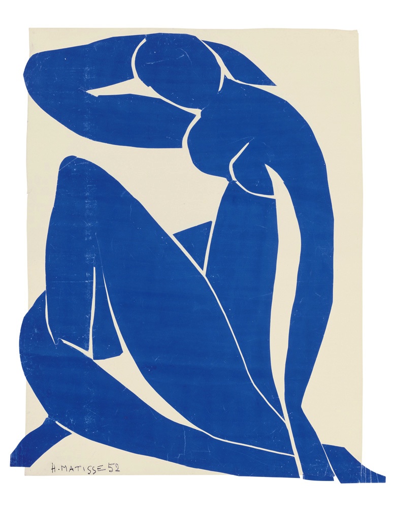
In the “Blue” exhibit, another painting called Blue Nude by Henri Matisse caught my attention due to the way the figure is displayed because the anatomy of it doesn’t look right and it’s confusing. One thing I would say that’s good about it is the way the color changes from light to dark from the top of the model heads to down below, but besides the color, everything else bothers me especially the legs,but I guess that’s just part of the art.
The Huxley Guide to Switzerland, Christopher Winter.
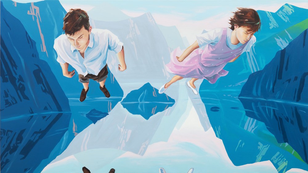
The last painting I saw in the “Blue” exhibit was called Christopher Winter, The Huxley Guide to Switzerland. What caught my attention about this one was the perspective and how it looks like two images are in one within the background. Even when looking at the way the two characters are positioned, it looks like they are in a different background when really they’re not. However, the one thing that I don’t like about it is how the characters aren’t standing in the same line, like they’re slightly a bit in different angles to each other and I felt that the same little characters added to the character shouldn’t be added as well to make it look like the people are related to the background.

