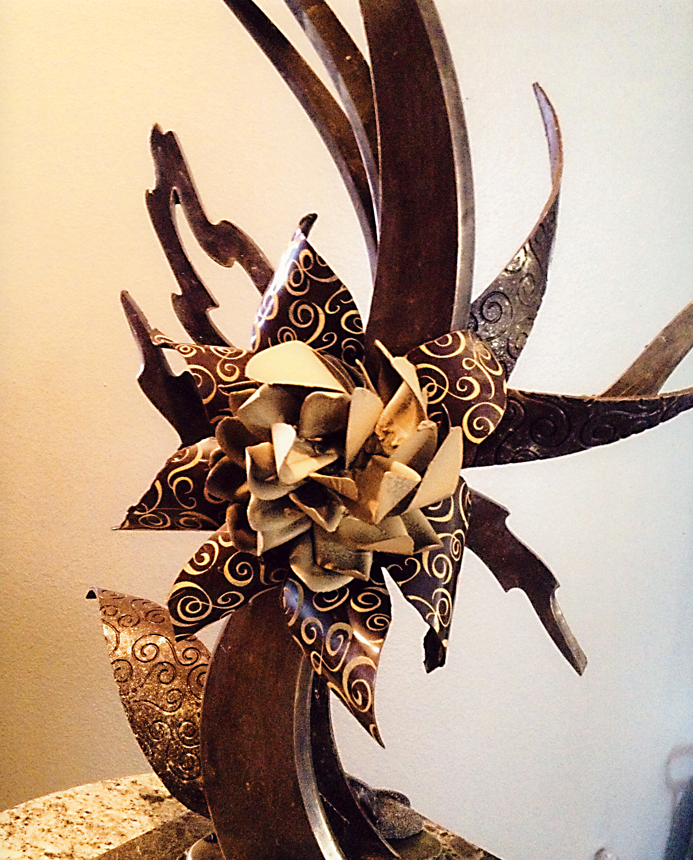
This beautiful center piece is made out of pure chocolate, I chose this piece because I really loved how it had a large flower in the center painted with a lot of detail in gold. The way that it is designed really brings you eyes to the flower so you could get a good look at its intricate design. The center piece also consists of chocolate that is in many shapes and sizes, and the petals at the edge of the flower have a nice curve, along with other parts of the center piece. This was made by a chocolate artist named Robin Robins

I think that this one maybe my favorite, it was designed by Peter Gyorgyicsek and it has a nice theme and idea that really help it. First it has a very intricate design that consist of many colors and shapes, giving it a really intricate design. The theme is time line and it shows the life of a plant. It shoes the theme of time well by creating gears on the middle to the left to illustrate a clock.The bottom is a tree trunk then further up a flower and up on top a pulled sugar tree. I love the design and the thought and story that goes behind it.

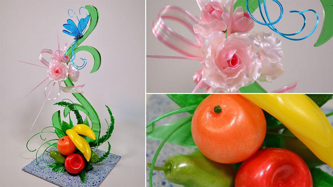
This is a center piece of isomalt this one stands out to me because of how it has these long jagged spikes coming out of the flower, and how the flower is placed stands out to me too, with it on the edge with very detailed petals that seem very fragile and with a nice crumpled effect . The butterfly also looks great with the bright blue color and long antennas on it giving it a elegant design. At the bottom you see the fruit made of pulled sugar, I personally like the bright saturated colors of the fruit and its simple design.

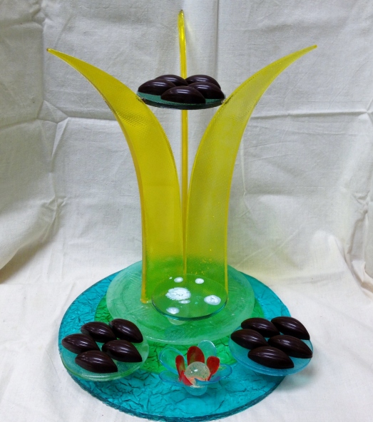
I know that this is simple but the symmetry was really appealing to me. I thought that by having the 3 long pieces of casting sugar holding up the circle in the air was creative and the colors complemented each other nicely. I appreciate the 3D effect and the long base and how it transitions to a long slim design then splits apart and expands.


I really love the pieces you chose you have a really wide variety on topics and techniques throughout each piece some are quirky while others are more formal. I gotta say my favorite piece has to be the fruit and flower piece. Although it seems pretty classic and simplistic in theme; there is such a wide amount of different techniques and it almost put what we had done in our fruit baskets in a more natural and abstract form.
Nagid, I agree with all you say about that last pc which is so symmetrical. Normally I resist symmetry, but the simplicity of that last amenity is refreshing to look at after all the complex and intricate work on the first 2 large showpieces you chose. The last pc is also of the size that it would be called an amenity. thanks for finding some cool things. You realize that two of these pieces are too big to be considered ‘amenities’ right?