Here are a few sugar and chocolate show and center pieces that stood up to me
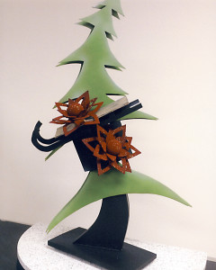
This amenity a piece work with chocolate only, inspired by a winter wonderland and Christmas, even though is a extremely simple piece, is really effective in terms of design and theme, the tree up top doesn’t have much 3d dimension, as for the flowers/ribbons. are really good in the layering, and the angels between the train and the sleigh
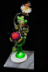
I decided to include this piece because of the many techniques shown in it, blow the blownm sugar bubbles, to the cast sugar for the based, the pull sugar flowers, the frog itself is a beautiful piece seems to be made out of sugar as well as the bee, the detail in the bee’s wings is stunning and the ribbons in different sizes just give another layer of technique and color
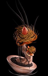
this piece was one of the first ones i found when i was researching at amenities, even though is a quite simple piece i like the nest/ flowers beacause they look really intricate, even the center bud which seems to be only one piece, and the difference in shades of browns give a contrast in the color palete which stands out, i also appriciate the large wavy dark pieces because they are clearly fragile gives it more height and delicacy.
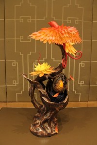
This amenity is supposed to represent easte, i like the attention to detail in the small parts of the piece, as well as the sculpting on the tree, this amenity is a chocolate piece, the bird remind a little bit of a pheonix because of the colors, is a warm piece the shades of browns, yellows and orange complement each other beautiful, the one detail that this piece looked intersting to me, and i wonder if the used a mold or hand sculpt it is the big structure egg shape, surrounding the egg. This piece actually won the 2nd place a couple years ago in the Callibut competition
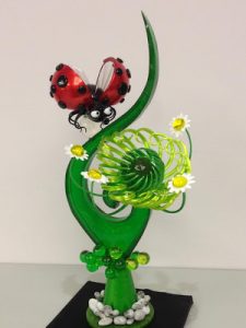
I decided to focus on this pull and pour sugar piece since remind me of spring, after working with hot sugar this semester i have an admiration for sugar work, the different shapes and techniques in this piece bring an astonishing vibrancy, and the ladybug which seems to be made from sugar as well is beautiful, and it seems to be done piece by piece before putting together, the bottom piece however seems to be cake or chocolate since it doesn’t have the shine that sugar does, the flower it self seems to pull sugar one by one which makes it more impressive at least to me


Yovi, do you know who the artists are that made these pieces? The one with the frog looks like the work of Stephan Glacier. It is more of a Showpiece than an Amenity. Same for the one w/ the red insect on it.
Good morning Chef H, the red insect was made by an italian artist back in 2013 by the name of Emmanuele Forcone, i realized the frog one was a bit large for an amenity but i really enjoy the details as for the red insect one i thought it would fit the amenity sizing but i guess i was wrong !
As for that sugar piece with the frog desing i found the picture in the Harold’s Academy but it didn’t specify the artist name. For the chocolate tree witht the egg and nest was created by pastry chef Amaury Guichon, meanwhile the one with the bird and the egg on a tree was created bie Hieu Ho and was awarded 2nd place 2015 CALLEBAUT CHOCOLATE SHOWPIECE COMPETITION, the christmas tree was made by Robin Art Chocolate in 2014. Sorry i didn’t put the names on the artist on the post Chef.
I agree with you that the nest looks very intricate and this is one of my favorite pieces out of what you posted. I love how the bottom of it has a representation of the dirt to really sell that it is a tree growing out of the ground. The nest looks like it was put together by actual birds with thin pieces to represent the twigs each added separately.
This piece yells spring and it is very unique. The lady bug brings a pop of color in contrast with all the shades of green.
I love the lady bug piece. The colors are awesome and bright. I agree with Kayla, it does scream summer. Its very dainty looking and the placement of the wings makes it look like its actually floating seamlessly. Great choice!
Lots of screaming here. Which is good. Spring has arrived and that deserves a good scream. Think I will go outside and let out a “spring scream”!
Whew, that was good. Did you hear me?
Color schemes on all these pieces are exceptional. The composition of both the bird pc and the egg/flower piece are tilted in a way that adds interest and a little more energy than a straight piece.