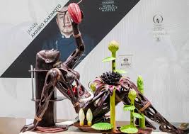
Piece 1 Akihro Kakimoto
This is by far my favorite piece. Chef Akihiro Kakimoto won in the 2018 Japanese Chocolate Master competition. Perhaps it’s because it’s because the woman in the center piece is holding a cacao bean and she too is made out of cocoa, but I’m getting the impression that this piece is supposed to signify genesis or a form of it. The flowers on the bottom of her body seem to spring up from her, and she herself is naked but it seems very primordial to me. There’s something sort of futuristic about her body, perhaps it’s the holes in her body or the fact that her body seems to be connected by something. It seems like Kakimoto was trying to depict a sort of robotic genesis out of chocolate. We didn’t necessarily discuss chocolate deeply but I can tell that the petals of the flowers were airbrushed. There is a seamless transition between the purple and green colors creating a hyper realistic look to the flower. The shine is incredible. The muscles seem to be shaved down while the hair area seems to be carved out. The use of height in this sculpture was well executed. The sides of the piece are tall which draws the eyes to the center of the piece where either a heart or another cocoa bean is placed. The right hand of the sculpture holds most of the bright colors of the piece which create an interesting transition from left to right. The left is dark and transitions to the right where the light green color catches the light. I think the colors work with the sculpture because they almost tell a story. The biggest obstacle I see is constructing the whole piece. It’s a large scale piece and the body which is also the base of the structure has holes in it. I wonder if Kakimoto made the structure in pieces and fused it together or if he made it all in one. The bands that seem to hold the woman together gives the impression that it was made in pieces and then placed together. However, it doesn’t look bad. Think the artist created support systems that would make sure the structure stays glued for example the hair, or the woman’s butt. I notice that the chef placed the woman’s butt on a platform that creates height and support for her arms and legs. By triangulating the arms and legs it makes sure that the top parts have enough support at the bottom. If he hadn’t created bases in the legs, arms, and base, the weight would have not been equally distributed. This piece is an absolute masterpiece. The use of height and color, the attention to detail, the concept, it’s all incredible. The woman in the sculpture is shown surrounded by flowers holding a cocoa bean. I like the story the piece tells. I’m sure everyone would interpret it differently which is fascinating. It is truly a piece of art. I can look at it for hours and find something new. Kakimoto’s attention to detail is remarkable. The hair as well as the arm detailing blows me away. There is something so real about this chocolate structure yet out alien-like and robotic. This is part of the world chocolate masters competition. But honestly, put it in a museum please.
Piece 2- Chef Stephane Glacier
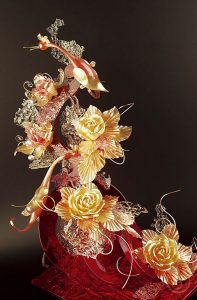
This sugar piece was created by chef Stephane Glacier. He is a french pastry chef who is in charge of a pastry school for beginner and professional chefs who want to get into the catering business. He also owns the establishment called Pâtisseries et Gourmandises in Colombes, France. Some of his achievements include obtaining the title of Meilleur Ouvrier de France Pastry Chef in 2000 and publishing several books. I’m not exactly sure what the theme is but it seems to be related to spring or summer.This sugar sculpture shows a small bird of some kind perched on top of what seemed to be a bush of flowers or a blossoming tree. The main colors used are bright red, orange and gold. The red is a bright maraschino cherry color, but remains clear while the gold color is faint but opaque. The chef uses a good mixture between delicate transparency mixed with strong opacity. The use of the clear almost water-like pieces add dimension and fill up empty spaces without taking away from the attention of the bird or flowers. I think Glacier does a great job of contrasting the colors and the opacity of the sugar. The red base is strong in color but see through while the center pieces, aka the flowers and the birds are opaque. The use of the clear pieces is great in adding texture to the sculpture but i’m not exactly sure what it represents. Beautiful nonetheless. The shine throughout is remarkable.
The base of the structure seems to be made of casting sugar and is basically what holds this piece together. It seems to be strong yet delicate. The biggest issue I see is the attachment of the flowers or the clear bubble wrap looking thing. I can definitely see how they could shatter when you are attaching it to the base and some of the flowers seem to be sitting on them which could pose a problem if they are too heavy. This piece is a true work of art. I like the height, your eye naturally gravitates towards the top because the base is larger at the bottom and ends in a peak. The flowers are formed beautifully. The leaves themselves seem to have been made using a stencil, the flowers are formed through sugar pulling. The bird seems to be made by blowing sugar. I like how delicate the bird looks but it for sure would be difficult to create. I’m not exactly sure what the clear things are but they do a great job in filling up space. This is for sure a show piece and can function as a piece of art in a wedding or a big event. It would probably also be found in a competition of some sort.
Piece 3- by Stephane Treand
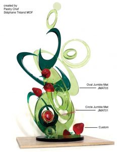
Stéphane owned the Pâtisserie Tréand located in, South of France. He was titled “Meilleur Apprenti de France” Best Apprentice in France, and then “Meilleur Ouvrier de France” Best Craftsman in France. He is currently the Executive Chef Consult For Occitanial in Tokyo Japan. The theme of this amenity seems to be a modern rendition of strawberry fields. I’m not sure what this truly represents but there are green circular structures and strawberries. This amenity is made out of blown and poured sugar. The green circular structures are layered on top of one another which would best be achieved by using casting sugar. The strawberries are most likely blown. The leaves in the strawberries were probably pulled sugar.
I like the use of color in this sculpture. They only used 3 different colors but the two different shades of green nicely compliment each other and create the illusion of shadow while the red brings contrast. Speaking from experience, making sure that the sculpture is structurally sound seems to be a big issue. I can imagine the chef had to make sure that the weight was equally distributed throughout the structure. There is one specific spot on the right hand where a smaller light green circle touches a larger light green circle and the transition is so seamless which is awesome. The colors were well executed in this structure. I liked the use of space, the little circles fill out the empty spaces without making it look cluttered. The structure also gives the illusion that some parts are floating which is super cool. The strawberries look like they are floating or falling gracefully as well. It’s a piece of art, would probably be in a showroom.
Piece 4 Dean Gibson-
Dean Gibson is an Australian pastry chef and has worked in the industry for almost 40 years. He has appeared on master chef australia, masters of chocolate, and pastry battlers. The piece is part of a larger scarecrow structure. This is a structure of a crow-like bird. It is completely matte black. Parts of the bird form spikes while other parts form feathers. I think Gibson carved out some of the chocolate like the head area while the tail area he attached and melted other parts onto the piece. The piece is one solid dull black color but I think it works well with the dark theme. There is some shine on some parts of the bird which creates dimension, however; i’m not sure that was intentional. This structure seems to have been put together so over time I imagine that the feathers might come apart. I noticed that the base of the bird’s body was sitting on top of a metal structure and if it got too warm it could potentially melt the chocolate. This piece gives me some serious emo vibes. It’s so dark and dreadful and I love that about it. It’s like looking at a modern depiction of a grim reaper or something. The piece transitions well from left to right. Like some of the other ones, it tells a story. The left of the structure starts off very abstractly then forms into a deteriorating crow form. The feathers are delicate and beautiful and the detailing around the head makes it look like it’s about to burst into ash. This is chocolate piece that would work well in a halloween party.


The amenities you chose were all so spectacular and different. I really love the Akihro Kakimoto piece I can see why this would be your favorite piece. It truly is a show stopping piece and looks like it had used to much techniques and skills to accomplish.
Gabriella, great selection of pieces. Crow is the best for me because it is so free-form. Work by Treand so often looks like it came from a kit because he uses a lot of molds from Chicago Mold co. thanks for showing these to us
I really appreciate how you found very elaborate pieces with a very ambitious design I can’t tell which one I like more the crow, flowers, or the human body.
Gabriela your comments on the Glacier pc are really good. His piece is pretty baroque — so romantic and a little over the top. Agree that the leaves look ‘cookie-cutter’. Funny how that stands out in a pc.
You realize that these pieces are too big to be considered ‘amenities’ right? Everybody did that. Amber had a few amenities. A couple other students too.