COMD3504 - Section HD61 - Spring 2022

Month: March 2022 (Page 1 of 9)

Assignment 9 for April 6

Our reading for next week is Roland Barthes’ 1977 essay, Rhetoric of the Image. Here is the PDF:

As you read, please make note of all important terms (ie. polysemy, linguistic sign, connoted, denoted, etc.), especially if their meaning is unclear.  Also make note of important points that you don’t completely follow. Record a brief list of questions you have concerning the essay. When you’ve completed the reading, drop these notes and questions into a post; this will be your submission for the week.

You do not need to write lengthy paragraphs for this one. Scattered notes are perfectly fine and encouraged.

The second 2-3 page paper, due April 13, will be a response to this article. In this paper, you’ll critically examine a contemporary advertising image in a manner similar to Barthes’ approach. You will be expected to employ the logic and terminology that Barthes uses in this text.

You should begin to consider the advertisement that you would like to address for your essay. It should be a recent full-page print advertisement organized around a single photograph. Please bring ideas to class next week.

Assignment 8 – Jennifer Humala

I saw this on the train for a wedding planning website called Zola.
This is a campaign film for Burberry called ‘Open Spaces’. The film explores the definition of freedom and by defying gravity being to capture new perspectives.
I have seen this commercial on tv and when watching videos online. It states ‘I’MPOSSIBLE’ as I’m possible, but there is also the reference of “Impossible is nothing”.

Assignment#6- Rifatara Yasmeen

We may create a wonderful design when we design with an aim and include elements that increase efficiency. There are a few areas on which our three designers complied. After reading these texts I learned that designers express themselves by their work. 

Jan Tschichold believes that the design should be based on the differences between old typography and the new typefaces. His work is primarily in red and black colors. The goal of old typography was to be appealing and clear, yet Tschichold points out that new lettering was also simple and clear. Tschichold wanted to move away the dull symmetry of old typography and acknowledge the asymmetrical form of new typography. One aspect of asymmetry was its look, which he thought was visually more impressive than symmetry.

Karl Gerstner on the other hand was a designer who combined art and science in his work. He believes a good design requires combinations of different elements. He also stated there are a lot of alternatives to create a quality design. If one doesn’t work, go with a different idea.

According to Josef Muller-Brockmann, a designer’s works should be clear, understandable, usable and attractive to the audience. He suggests using a grid because it demonstrates a certain positive approach to the work. overall designers should be able to clearly articulate the message of their work.

Assignment8_Giulia

In Hall’s essay media are defined “as important sites for the production, reproduction and transformation of ideologies”. As they are representation of the social world, I chose three brands that are slowing introducing a transformation of ideologies.

Maybelline, L’oreal and Il Makiage (as I am aware) are slowly adapting to the new society’s standards promoting inclusiveness in  a longlasting history of differentiating products according to gender. They are normalizing the idea of the use of concealer and makeup in general not only for women, but for any gender, race and skin tone.
https://www.celebexperts.com/snoop-dogg-remixes-with-dunkin-do I think Snoop Dogg was hired by Dunkin’ after his IG ad for Beyond Meat and his own beyond meat hot dog launch. In any case, the iconic Snoop Dogg is changing the heavy meat based soul food tradition (even though falls again in the stereotype of junk food makers targeting African American customers), introducing black veganism.
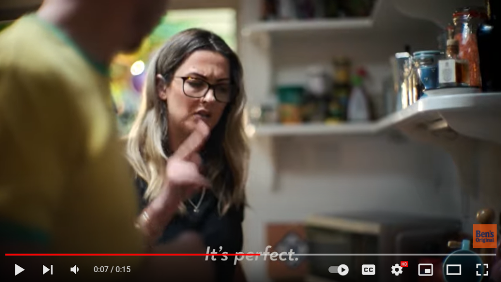
https://www.youtube.com/watch?v=j-Q-zepduUw This is an example of inclusiveness (a pushed one) after facing the imagery and name stereotyping accusation by Ben’s Original, where multiculturality is promoted (and the ASL community is targeted).
https://www.youtube.com/watch?v=LQomXYnbqsM This is negative example, since I was born and earlier Mulino Bianco (barilla) keeps putting an happy family sitting altogether for breakfast in their ads and there is no multiculturality or any adaptation to the new societychanges. I am quite sure that the tradition of sitting altogether at the table in the early morning (everyday) is almost faded in Italy and also that there have been so many intercultural marriages that this ad doesn’t represent anymore the country where it is showed.

Assignment#7- Rifatara Yasmeen

McLuhan discusses how technology has become a sort of extension for humans. Even back then people thought about how machines would eventually replace people at work. It will influence people’s behavior or provide more opportunities. people will look at themselves from a different perspective. A person’s thoughts are no longer isolated from others, they are no longer alone. However, as we know everything has positive and negative sides. Besides all of the benefits of technology and media, it also has a lot of disadvantages. As it can be an extension to an individual by enabling more capabilities, it can also result in a reduction in particular jobs where machines seem more capable of replacing. I strongly agree with his theory about media and technology being extensions of our body. According to McLuhan we give up our senses in order to be the target of media and technology. Media and technology are entirely dependent on what consumers prefer and need. They create content, and we admit it without any inquiry. As a matter of fact, we are more open to manipulation and being influenced.

Assignment#8- Rifatara Yasmeen

ThirdLove is a women’s undergarments company found by Heidi Zak and her husband David Spector in 2013. The brand is well known for promoting body positivity. Here’s an example of ThirdLove’s Facebook cover, which features an older woman and a younger woman wearing lingerie from the brand’s collection.

Coca-Cola’s aim was to show that even though people can come from different backgrounds, race or ethnicities, everyone has something in common. Coca-Cola has continued to develop campaigns that bring diverse people together through the power of a simple bottle of Coke.

Bumble is a dating app. It also allows searching for friends and business connections rather than just dates. In this video campaign, Bumble explains that the app sees a variety of Bumble users around NYC and the company wanted to celebrate them. To do this, the company sought out some of Bumble’s most interesting New Yorkers and brought them together to tell their stories.

Assignment #8 (Winnie)

The first ad is an advertisement by Dove for their multicultural campaign. The second is a multicultural ad by Airbnb for Superbowl 51.. The third is a controversial ad by Protein world in which other companies in response to this ad created ads 4 ,5 and 6.

Assignment 8

Groupon Ad

This first ad from Groupon shows a male relaxing which I think was intented by them.

Chase Ad

The idea of showing a same sex couple watching a movie together in an ad was a deliberate choice made by Chase.

TD Bank Ad

This third ad from TD Bank shows a father with his children and I think it was intentional.

Week 8

History of American Indians in Beer Advertising.

  1. An appeal to history and a symbol of purity are seen as a guarantee of quality

 2. The second paradox is that KAB(Keep American Beautiful) is made up of leading beverage and packaging companies.

Keep America Beautiful – (Crying-Indian) – 70s Commercial

Kristine Danielsen commented that she never forgot the ad, respecting nature from a very young age and passing it on to her children and grandchildren.

Ads 3,4)     About “Equality in conditions”(Hall.pg.2)

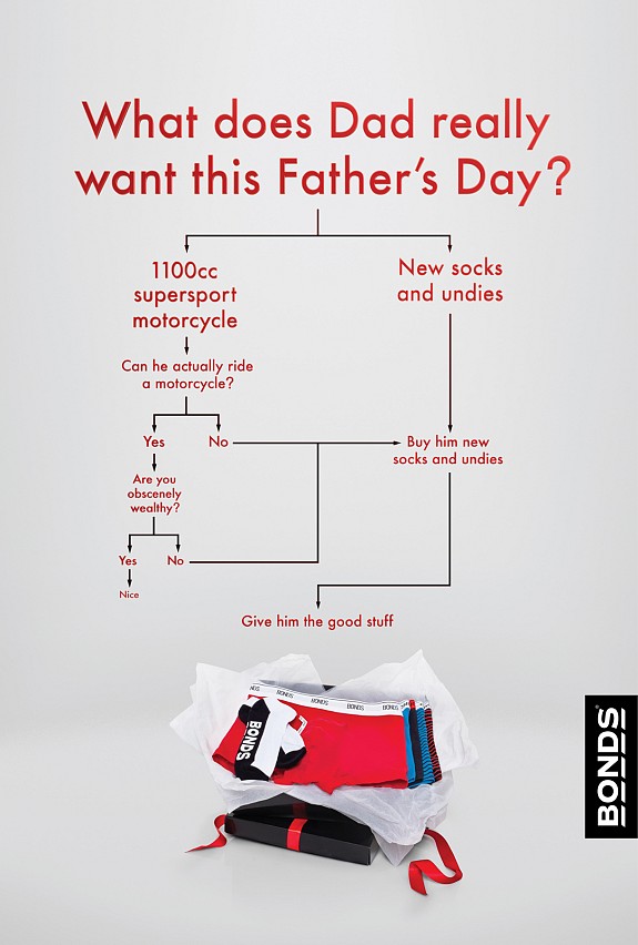
Diapers are now the test, not the dads . Huggies uses the example of “funny fathers”—that is a campaign to incompetent male parents who seem to have no idea how to change a diaper or care for an infant in advertising—as an example of these traditional roles. A funny father is often contrasted with a loving, capable mother. Final ad is about Bonds: Motorcycle. An ad on TV

https://www.goodbeerhunting.com/blog/2021/9/21/chiefs-maidens-and-myth-making-a-history-of-american-indians-in-beer-advertising. (n.d

https://youtu.be/8Suu84khNGY

Bonds: Motorcycle. Best Ads on TV. (n.d.). Retrieved March 30, 2022, from https://www.bestadsontv.com/ad/31605/Bonds-Motorcycle

Luis Quijano – digitalcommons.liberty.edu. (n.d.). Retrieved March 30, 2022, from https://digitalcommons.liberty.edu/cgi/viewcontent.cgi?article=1779&context=honors

Watts, A. (2012, March 15). Huggies listened to dads – why it matters. The Good Men Project. Retrieved March 30, 2022, from https://goodmenproject.com/families/huggies-listened-to-dads-why-it-matters/


« Older posts