Author: Delia Gil-Galvez
TD Bank Ad
This third ad from TD Bank shows a father with his children and I think it was intentional.
From what I have gathered from the three readings is that people or designers should be able to design in a way that they can express themselves. That they shouldn’t just restrict or hold themselves to the rules that have been set for design or the old typography that’s overly used. The main idea is that designers should be able to be more flexible with their work and create a variety of designs. The designers in these readings, however, state that there are still some solutions that should be followed in order for the design to be understood. The aim of old typography held a sense of beauty and clarity but Tschichold points out that new typography also had a sense of clarity. Tschichold wanted to break away from the symmetry that old typography held and thus new typography was predominantly asymmetrical. It was stated that an advantage of asymmetry was that its appearance is way more optically effective than symmetry. When used correctly new typography can have order and clarity. Designers can be more flexible when it comes to design and still communicate with the public.
Gerstner was a designer who combined art with science and came up with a variety of design solutions. The process of designing is in Gerstner’s eyes trying to come up with a solution to a problem. Gerstner comes up with “the morphological box of the typogram” which contains a variety of design solutions. This “box” of solutions, is meant to help with design problems and what can be combined with one another or what doesn’t work. Gerstner also used grids as it was a solution to be flexible and creative with design. Gerster really used many scientific ways to create solutions for designers so that their work could have order and clarity. Muller-Brockmann also popularized the use of grids as a way to help create space, order, and clarity when it comes to designing. In the reading, it stated, “the designer’s work should have the clearly intelligible, objective, functional, and aesthetic quality of mathematical thinking.” When it comes to design it should really be able to communicate its message clearly and it makes that design successful if it can do that.
One of the takeaways that I was able to grasp from the Gropius reading was that teaching of art, theories, and principles was lacking in art and education from the past. The reading emphasized the point that the art that was being created lacked a “vital connection with the life of the community” and “had no relation to the realities of materials, techniques, or economics.” There was in other words a loss of connection between art and the community. Art was being taught in a way where it was all about techniques and no correlation of the past or principles was being discussed. At the Bauhaus, every factor was considered in its educational system “practical and theoretical studies are carried on simultaneously in order to release the creative powers of the student, to help him grasp the physical nature of materials and basic laws of design.” With this type of curriculum, there wouldn’t be a loss of connection between the art and the community and I think it’s important to understand and learn about art not just its techniques.
In art and design communication is one of the main points that you want to execute. Moholy-Nagy saw a future with technology and advocated for the integration of technology into the arts. He saw a future where different forms of communication would be combined which is what he did. Moholy-Nagy created Typophoto which is basically the combination of typography and photography. This gives a different way of communicating as Typophoto is combining two different forms of communication into one.
The readings demonstrated authors who each have different envisions for the future. They each had some sort of new rules which they believed should take over the rules that they were living in or with. All three authors also seem to have an interest in using some sort of technology for the future of design. Although I was a little confused with the first reading “The Founding and Manifesto of Futurism ”, I was able to grasp the idea that the author isn’t interested in the past or past achievements but rather what achievements can be done for the future. The author stated,” Do you want to waste the best part of your strength in a useless admiration of the past, from which you will emerge exhausted, diminished, trampled on?” The author thinks that looking at the past is useless and that focusing on the future and what can be done with it is where the main focus should be. As for the future, some ideas the author seems to emphasize are the use of automobiles, railways, and factories or industrialization.
Unlike the futurist and the first reading, the second reading seems to show the idea that looking at the past and reflecting on it is important. It is important because people are able to use their previous knowledge as a foundation and will be able to build on it with the new things that they learn or are learning. Unlike the futurists who really only really think about themselves and the beauty of their art. The constructivists are opposite where they work with the public and for the public because it’s really the public needs that lead the direction of their work. Rodchenko stated an interesting quote, “Work for life and not for palaces, temples, cemeteries, and museums. Work in the midst of everyone, for everyone, and with everyone.” It goes to show that the constructivists are with the people and among them.
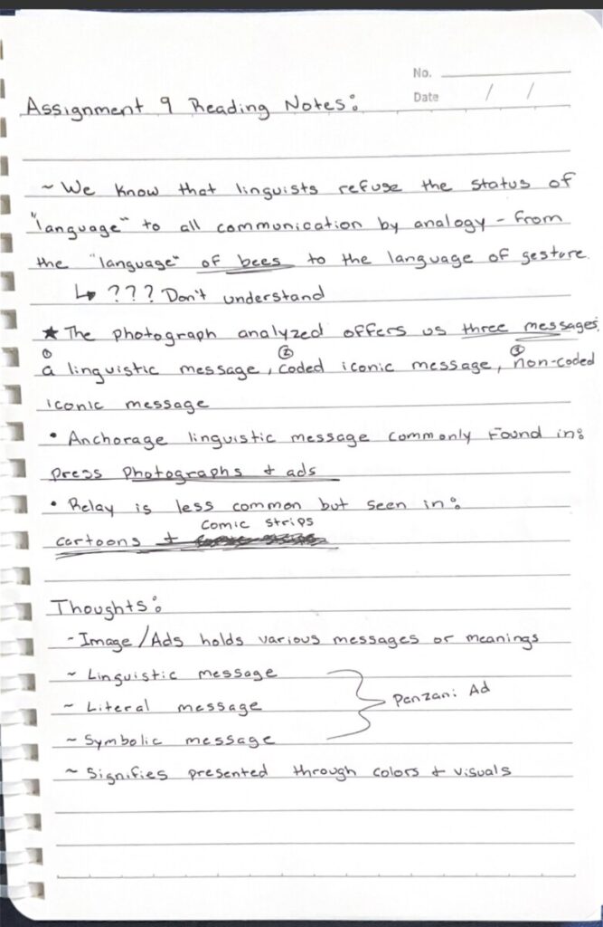
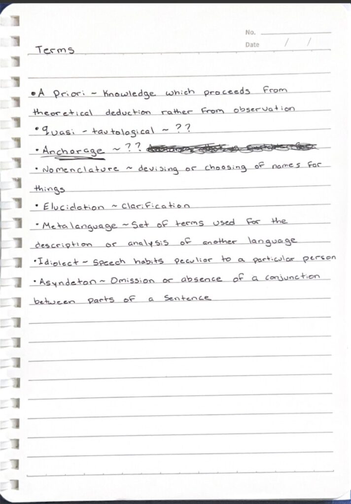
The readings for this week focused on language and forms of communication. The reading suggests that in some parts of language, the linguistic sign is arbitrary because there is a lack of a natural relationship between the signifier and the signified. This more or less means that the word doesn’t really associate with or is linked with its sound. However, there were some objections risen to this idea because onomatopoeia words associate with the sound that they make. This idea was rejected in the fact that there aren’t really many authentic onomatopoeia words and are just an approximation of what certain things may sound like.
Language is something that cannot be changed by anyone as it is a fixed system for everyone and for future generations. No matter how far we look back or what period we choose to look into language has always appeared as a heritage from the previous period. This is a tool of communication that we have inherited and can’t manipulate but understand and use it.
The symbols are the signifiers that aren’t fully seen as being arbitrary. When it comes to symbols there is some sort of relationship and bond between the signifier and the signified. The symbol isn’t empty as it has a significance for something and once that symbol is established no one can change its significance. For example, as demonstrated in the reading the symbol that is associated with justice is a pair of scales and no one can change it afterward. These symbols or icons are important because they are another form of communication. This is a visual form of communication, unlike language which is auditory.


Recent Comments