Edvard Munch: Between the Clock and the Bed – Extra Credit

The Edvard Munch: Between the Clock and Bed exhibition is taking place in the 3rd floor of The MET Breuer located at 945 Madison Ave. Edvard Munch was a Norwegian artist who grew in popularity due to his artistic skills and how he captures human anxiety through his work.

The exhibit consists of 43 pieces of work also including 16 self portraits that’s never been seen before in the United States and you can only see it exclusively in the MET Breuer. Out of all of the pieces of art I’ve seen throughout the entire exhibition, one that I have to say that caught my full attention was this artwork Munch made that was called “The Night Wanderer”. First thing I noticed was the way how Munch was standing and the way how he’s staring at us.

You don’t see him as an artist in this self portrait, but more of an old man walking around his house late at night. His eyes looked like as if they were pitch black in a way, making them seem hollow. One thing that made me wonder was if his eyes was the night sky behind him embodied within him making it seem as if there was darkness on the inside.

Posted in Uncategorized | 1 Comment

Best Photo- Portrait

This shot of Gaby looks great! She looks like a cover of a magazine. I really like how I capture her expression (her eyes are smiling) the photo is slanted but I actually think it makes the photograph interesting. We took this photo using a three point lighting, with an ISO of 100,  a shutter speed of 1/250, and an aperture of f/5.6


Posted in Uncategorized | Leave a comment

Modernism of the Ganges by Raghubir Singh – Extra Credit

Exhibition

Modernism of the Ganges by Raghubir Singh


The Raghubir Singh, Modernism of the Ganges, Exhibition is held at the MET Museum on the second floor. When entering the exhibition you are stopped by a large wall in front, where you find the name of the exhibition and the photographer’s name. On your right you have a map of India with the names of all the cities and villages in which Singhs photography took place. Right next to it there is a three paragraph biography of Singh. the room is divided into different sections, each sections tells a different story about the location, Singh’s inspiration, and his journey. The first room on the right has a collection of Singh’s early work in which he explores the villages, cities, and sacred sites along the Ganges river. The work in this room is in color and the photos vary in size.


Singh’s photography takes place at his native country, India. His work was done with a camera in hand. You are able to tell the freedom that this gave him when it came to capturing the streets of India and the decisive moments. His Photography in this room shows a variety of techniques. Some were taken using a top view, a low view, diagonal lines, the rule of third, the blur effect, etc. Singh’s photography tells the story of what it was in the 70’s to live in India, the day to day life. He Explores the deep picture of India’s political, religious, and economic situation during that time period. In his photographs you can appreciate that special moment in which the subject becomes the main character and the environment becomes the story. One photograph is just as important as the next one and so on. Every image it’s its own story.


My favorite photograph was Catching the Breeze, Hathod Village, Jaipur. In this photograph Singh captures two girls swinging on a rope while some of the people in the village observe and others are just going about their day. The beautiful thing about this photograph it’s all the information the viewer is getting from this one shot. We can observe the happiness of the two girls and how it is being shared with some of the villagers, you can see how some are laughing a long while others are amused by it, especially the children. While looking at this photograph I myself shared a laugh, Singh caught the decisive moment in this photograph Some of his techniques include, freeze action photography, diagonal lines, rule of thirds, and wide shot.  


Posted in Uncategorized | Leave a comment


Posted in Uncategorized | Leave a comment

William Wegman Dressed and Undressed exhibition

Nipa khan COMD 2330

Digital photography 10/11/17

Homework: William Wegman Dressed and Undressed exhibition.

William Wegman Dressed and Undressed the exhibition focuses on the dogs into many different characteristic and focus on what it means to be human. Willam wegman gave each dog a personality. The photos are 20X 24 Polaroid. The exhibition took place in sperune westwater, 257 Bowery New York 10002. The exhibition took place in two different floors of the gallery. There are different kinds of photos some describe humanistic, classic, abstract and some just create illusion. Each dog is different dog he had in the past and he start taken photos with Polaroid camera in 1979.

There were about 30 images both floor together and it was divided by different categories. The dogs are photographed by 20X24 Polaroid and each photos is taken differently. Some had contrast and some have sallow of depth and some has foreground and background. Each of the dogs were given very different personality. William wegman : Being human this exhibit is about giving the dog human characteristic and dressed up the dog in different outfit and some has human body part and some are just playing human role. Only feet and hand is the human body are replaced in the dog. I think being human is about the dog not about the human because the photo ” What to do ” shows the dog in human situation just to show how it feel to be human or to be in human condition.

I think this exhibit is also about transforming the dog various character to show emotion. Also it shows giving the dogs human condition or human characteristic makes the dog more like humanistic and each of the dogs has particular rule that fit them the best. One photograph that I love the most in the exhibit is “Garden”,2002. I love this photo because it shows shallow of depth. It shows contrast and exposure and this pic is foreground and background images and this image fill up the space and this image is a close up image. The depth of this image gets narrow. This picture also include natural frame and also this image have strong vertical line and this image has deep space. Overall this image just draw my attention right away. It create a strong connection with the audience.

Posted in Uncategorized | Leave a comment

Extra Credit – Modernism on the Ganges

On display at The Met Breuer is Modernism on the Ganges, an exhibition showcasing the works of Raghubir Singh, who beautifully captures India during times of evolution between the late 1960’s and late 1990’s. Upon exiting the elevator on the second floor, we are greeted with by large white wall that separates the entrance and the full gallery, blank except for the name of the exhibit which is in an orange and blue sans serif typeface. Though crowded on a Sunday afternoon, the space was able to accommodate guests with enough breathing room between pictures and enough room between descriptive text to not take away from the eye-level photos. In addition to the photography, the gallery has a seating area towards the back lined with comfortable benches and chairs – a petite window lines the back wall. Another section of the gallery houses a small theatre which shows two different cinematic pieces related to Singh’s show, both taking place in India.


The topics and subjects of Singh’s photographys vary greatly. Some are of weddings and parties, others of merchant and buyer. In some images we see some of the most difficult struggles India has faced while others give us beaming examples of pride and happiness. Singh uses a lot of different elements to add depth and curiousity to his work – including the use of motor vehicles. Not only does he use reflective surfaces of cars, he also uses them as a frame to set the tone of a piece – this coupled with Singh’s eye for detail and the colorful allows us a glimpse into a world unknown to us.

I had several favorite images from this exhibit but the one that caught my eye the most was Vendor and Clients. This photo played with my eyes and continues to – it’s almost impossible to tell flesh from reflected. Singh plays with light and shadows in this image, making it very difficult to see the faces of three of the four subjects. A beautifully mute blue sky hangs in the background against brown and tan shrubbery and mountains while a car door juts out from the forefront into the mid ground. One side of the composition features a woman and a young girl, the other side consists of an older gentleman and a young boy. This split in the composition makes it feel like we’re in two different places, despite the interaction between the subjects. For me, this photograph highlights Raghubir Singhs eye for composition, framing and detail that makes his imagery so dynamic and sums up the experience I had attending this exhibition.

Posted in Homework | Leave a comment

Met Breuer

When I went to see the exhibit of Raghubir Singh modernism on the Ganges at the MET Breuer I had to go to the second floor of the museum. The exhibit was very pretty because of all the photographs that were displayed in the room. One of the photos that reallt caught my eye was Man Diving, Ganges Floods, Benares, Uttar Pradesh. The picture was 12 5/16 × 18 3/8 in.

This photo that Raghubir Singh took caught my eye because of the kid in the background looks like he is flying but he is actually diving into the flood of water. It’s either that or the pyramid like sculpture in the middle that could be one of the things that could capture your eye. The kids are swimming and diving in the flood of water not knowing that it’s actually a huge flood that could damage their country. Also another thing that captured my eye is that all the buildings that use to be around the area are all flooded under water and you can only see the tips of it. It seems that all the way in the back that there’s a beach in the distance if you look closely.

The Raghubir Singh exhibit was really beautiful and I enjoyed going to it. Almost all the photos had emotion in it and made you think what’s happening in India. The culture is captured in every photo Raghubir is taken.

Posted in Homework | Leave a comment

Frozen and blur motion

This picture of Ivan shows a blur as if he is disappearing on the picture. This shows that the shutter speed is really low and makes the effect of Ivan disappearing in thin air. This is why I chose this picture

Posted in Homework | Leave a comment

Portrait Reflection

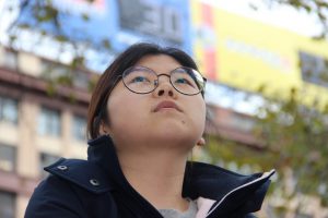
I picked this photo of Yimei because I was able to get her in focus while everything behind her is all blurry giving the portrait a shallow depth of field.

Posted in Uncategorized | Leave a comment

Motion Blur & Frozen Motion

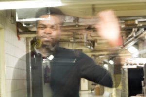
For this picture right here, Tramain was waving his hand while the camera captured him with a short shutter speed. In doing so, while he was waving, his body was moving as well. If you look closely, you can see the background through him, exposing the fire extinguisher where his chest is.

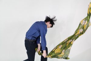
As for this picture, Henry was caught in a frozen shot, showing him waving the scarf as if he was smashing a guitar at a rock concert. You can even see some of his hairs sticking out of his head like a porcupine. The shutter speed for this picture was 1/640.

Posted in Uncategorized | Leave a comment