portrait basics

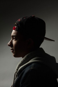
IMG_9741

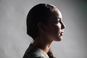
I chose this side profile photo because the short light contours his face nicely a his eyes focus straight ahead and the light gently touches pieces of his clothing as well while the shadows are extremely dark. The background also creates a beautiful gradient

Posted in Uncategorized | 1 Comment

Portrait

IMG_0330

I like this photo because the profile view is very dramatic. The dark shadows on her cheek and light under the eyes creates a contrast. The light also brings out the reflection in her eyes. This photo is centered creating balance.

Posted in LL7-Portrait Basics | 1 Comment

Portraits


IMG_0312

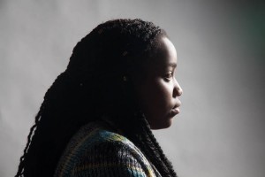
I chose this photo as my favorite because even though I know she has a super sweet personality, this photo gives off a sense of seriousness and mystery. The lighting is short light and it works really nicely on her face while everything else is dark.

Posted in LL7-Portrait Basics | 1 Comment

Portraits

IMG_0312

I like this photo because it feels as though it has a serious/deep feel to it. The way the light hits the front of her face and a bit of the clothes. This shot was taken with a very short light. Overall I like this photo a lot.

Posted in LL7-Portrait Basics | 1 Comment

Portrait Basics

IMG_9749

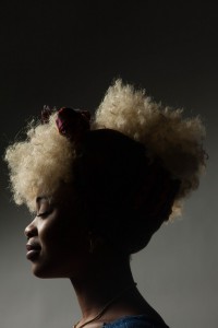
The photo I took of Hajara really stood out to because this portrait gives off a calm and peaceful tone. Having her eyes closed in this shot makes the photo more interesting since she is not focused on anything there for we can only guess what she is thinking about.

Posted in LL7-Portrait Basics | 1 Comment

Portrait Basics

IMG_0420

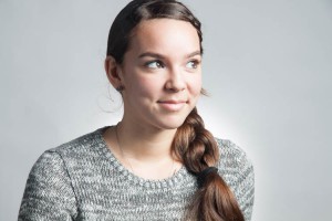
I like the picture because she looking into the light instead of the camera, which is mostly short light. This photograph was the background light which is creating a little separation from the background. And the fill is also nice.

Posted in LL7-Portrait Basics | 1 Comment

Portrait Basics LL7

IMG_9781The verticle shot is spot on radient. The fill light brought the subjects face out more. The depth of the background light is giving an aura a little over the shoulders. The broad light is strong on the left side of the subject.

Posted in Uncategorized | 1 Comment

Favorite Photo

21304931029_abb92903af_zI really enjoyed this close up of this hole in the wall. It looks like you can look through the hole and see something on the other side. Also what grabs my attention is the cracks in the wall and also the form of the circle that was created.

Posted in Uncategorized | Leave a comment

Salvador’s hw #1

Salvador Garcia Sanchez

Professor Michals

Digital Photography

September 03, 2015

Eugene Richards

     The photograph that caught my attention the most was “An oil rig and gas flare” which was in the section of “The Landscape Of Oil.” This photograph was taken by Eugene Richards in North of Watford City, ND. in the year of 2012. Not only was Eugene a photographer, but he was also a writer and a filmmaker from Massachusetts. The photograph  An oil rig and gas flare” caught my attention because of the mood it sets. You can picture yourself sitting outside at night looking into a beautiful city that stands out due to all its lights. Also the water and grass sets a calm tone, which can also relax you due to the water waves.

     Eugene Richards used the rule of thirds for this picture because the photograph sets a mood and gives me interest in wanting to look at it. He also uses contrast from dark to light which you can see in the photograph, top to bottom is light to dark. He also uses figure ground because the city pops out more and draws your attention to it since everywhere else in the photograph is dark. These elements help create the mood to the photograph because they work together to grab the viewer’s eyes. People are able to cherish photography’s depending they sceneries and how they were taken. Mainly what is the photograph trying to tell you and what mood does it bring to you personally.
Photography Link: http://eugenerichards.com/the-landscape-of-oil/

Posted in Uncategorized | 1 Comment

Favorite (Paragraph)

IMG_0720

I chose this photograph as my favorite one from all five photographs. This photograph shows elements of diagonal, leading lines and median shot. The ceiling and ground shows the diagonals in the photograph. The diagonals in the floor show leading lines to the subject in the photograph which is the chair. The median shot is shown by the distance of the chair. I really liked how this photograph came out.

Posted in Uncategorized | 1 Comment