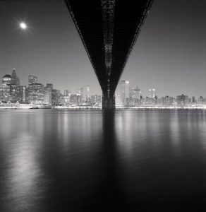
This image is titled “Brooklyn Bridge” and was captured by Michael Kenna. In this image we see the titles namesake, the Brooklyn Bridge, in the fore ground with the Manhattan skyline lit up in the background as well as the moon shining brightly in the upper left hand corner. In my opinion, this image evokes peace and melancholy. The calmness of the water induces a sense of peacefulness. However, seeing the skyline lit up makes me aware that there are thousands of people potentially burning the midnight oil.
In this image, there are a few compositional principles that are prominent. The initial principle that made this image stand out to me is Leading Lines. By utilizing the Brooklyn Bridge, Michael directs your attention to the Manhattan skyline. Secondly, the darkness of the bridge contrasts with the brightness of the skyline. According to Steve McCurry, this is known as Figure to Ground. I also noticed the reflection of the water. As the bridge leads up to the skyline, the reflections on the water go from dark to light. Lastly, the skyline itself is not symmetrical however the bridge is centered in this image. By doing so, Michael definitely utilizes Symmetry. Not only does this make the image aesthetically pleasing, but it gives balance to the overall image.


Good description. Symmetry is very important to Michael Kenna’s compositional style. Note that the horizon bisects the photo in two. I would argue however that the lines of the bridge create a strong sense of depth. this is really a use of perspective rather than leading lines. The subject of the photo is really the Brooklyn Bridge, not the skyline.the perspective makes the bridge feel like it is balancing on a point across the river.