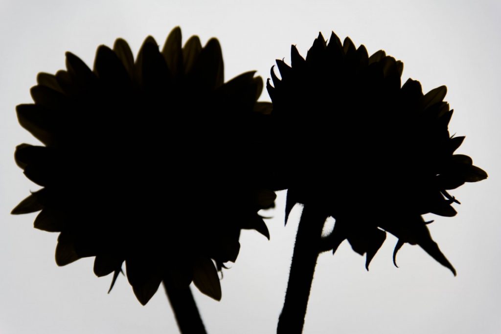
This is my favorite image that I took because of the silhouette that it creates of the flowers. To create this image, I used a back light and a more diffused light to create this effect. As a graphic designer, this looks simplistic enough to become a new design or logo for a company. I really love this photo because of just how much light is absent on the flower as opposed to the background as a whole.


This is a graphic designer’s dream. Remember how easy this is to do and use it in your work going forward!