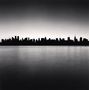
“Manhattan Skyline” – Michael Kenna
I’m not too sure where this photo was taken of but judging by the direction of where the empire state building is, it was most likely New Jersey. Titled Manhattan Skyline is this photo by Michael Kenna which captures the essence of waking up in the morning and looking out your window to look at the busy but welcoming skyline of New York City. It makes me feel at ease since I’ve spent all of my life in this city and seeing it in different perspectives is always something I welcome as I don’t have as much time to explore on my own anymore.
Michael had utilized a few formal elements in this composition. Figure to ground, diagonals, and a slight variation of symmetry. Figure to ground is present because the skyline of New York City is completely dark compared to the sky above and the water underneath it; emphasizing the skyline from the rest of the scene. Diagonals are present because if you were to place a 3×3 grid over the photo, you’d notice that most of the direction is only horizontal on the grid as opposed to a mixture of horizontal and vertical. Finally, there is symmetry but a very slight variation. I say this because you can ‘fold’ the photo in half horizontally and it’ll somewhat look the same as the skyline looks a bit similar from one end to the other.
With these elements at hand, the mood of the photograph is altered a bit. Although I still feel at home with this photo, it also makes me believe that there was a story behind the shot as well. Michael could have been awake all night anticipating for the sun to awaken just for this shot and he’s prepared his camera at the right angle and height to capture New York City in this POV. It enhances the mood with a slight backstory that could help others enjoy the photo more.


I think you are right that the photo was shot from New Jersey. The buildings tell us that and so does the direction of the light. The sun is rising behind Manhattan. If the sun was setting the lights in the buildings would be on.
I agree that figure to ground and symmetry are important here. Michael Kenna creates very formal compositions. I don’t see any use of diagonals. the photo is really composed of three horizontal bands.