This agenda provides a detailed outline to give a clear vision of the day’s class.
Category: grid
-
- Goals: Direct your audience’s attention
- Objectives: Understanding hierarchy
To-Do: before class
-
- Post your homework
- Prepare to describe your work in terms of hierarchy
Let’s chat
How many iterations did you make?
Add your answer to the chat
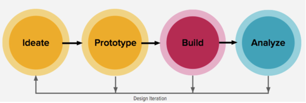
Design Process:
Topic
Proportion systems and grids
Goal: Create images that communicate
Objective: Create forms that signify essential qualities
Lecture
Review how we see
see: https://www.linkedin.com/video/live/urn:li:ugcPost:6821094794379501568/
start at 3 minutes – 9.30 minutes
Proportion
watch until 5:40
Review alignment
Proportion systems: design precedents of grid design
https://www.typographicposters.com/
Activity
Workshop: use proportion to position text
grids, proportion, and hierarchy
Proportion
1 Use a grid
-
-
-
-
-
-
-
- golden ratio proportion (your 5-column grid) (image below)
- rule of thirds proportion (your 3-column grid)
-
-
-
-
-
-
2 Add dummy type to emphasize the grid
You should have a sense of the grid, even when it is not showing
3 Use hierarchy to create a composition based on each proportion system
• use at least 3 levels of hierarchy
• where do you place hierarchy to emphasize the grid?

Use alignment
Make sure your text is not centered
check that you do not have the same space above and below
Mass your white space
make sure you have a large group of white space
Review & critiques homework
Activities
Revise your sketch, upload it to Miro
Due Next Class
-
- Read and Comment On Online Discussion
Use these terms: figure-ground, continuity
- Read and Comment On Online Discussion


