I honestly feel that all the sketches truly work as a figure ground representation. The equaling of white and black is spot on. Everything just works perfectly together in these sketches. You can clearly distinguish what’s in the figure and ground spaces.
I enjoy your thumbnail sketches especially the last one that you inverted. You have a decent amount of variety when it comes to showing equal amounts of negative and positive space. You can really see that they’re no longer letters but indeed shapes.
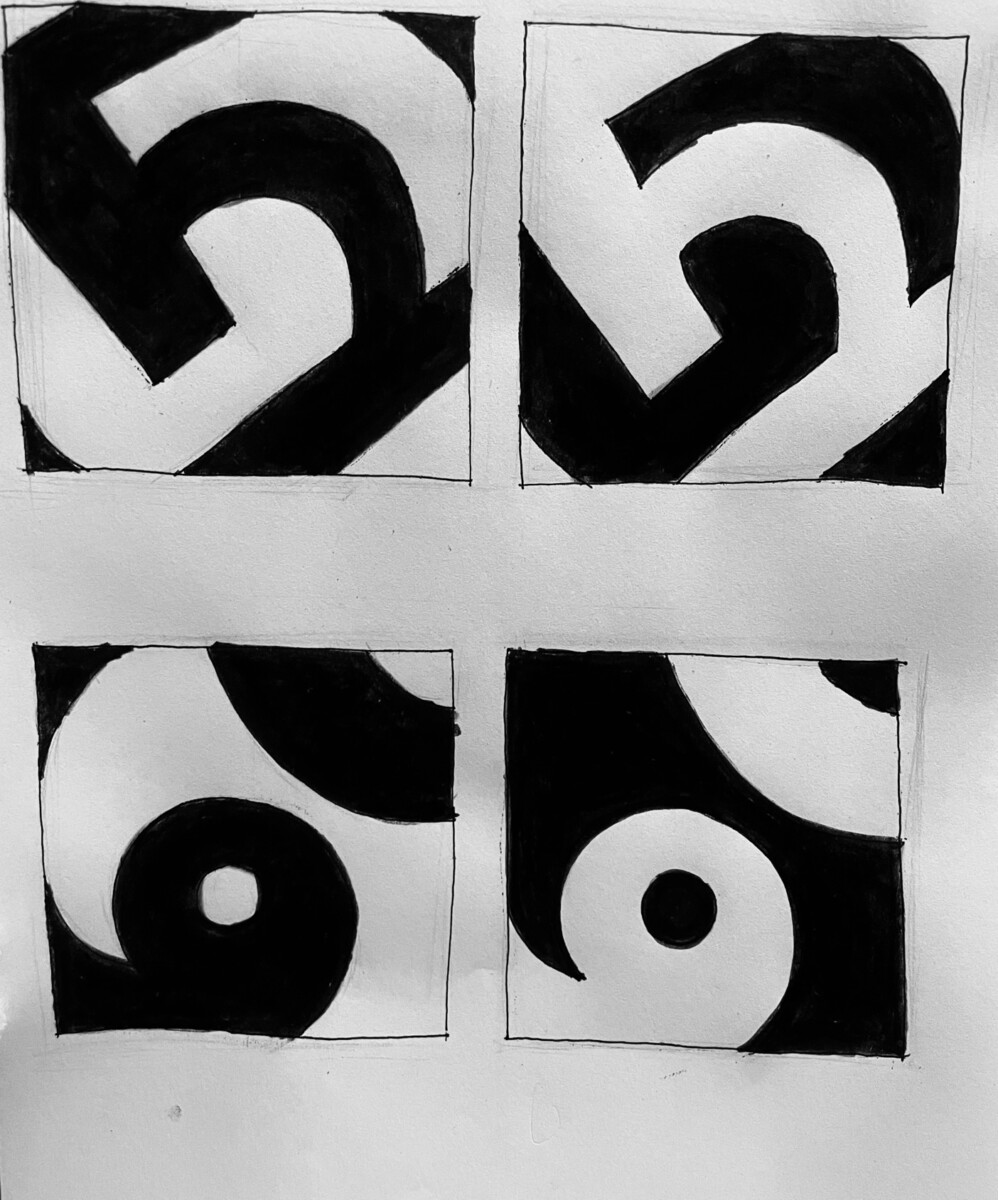
I think that the ones you chose for negative and positive have a really good use of balance between the black and white. Not only that but the shapes have a flow which made my eyes move around while looking at the two images.
It looks so neat that it seems like you did this on the computer. For the first one, I feel like the negative one is more balance than the positive one, since it looks like there’s more white than black. For your 2nd one, I like the positive one more since there’s black on the top left but there’s no white on the negative one.
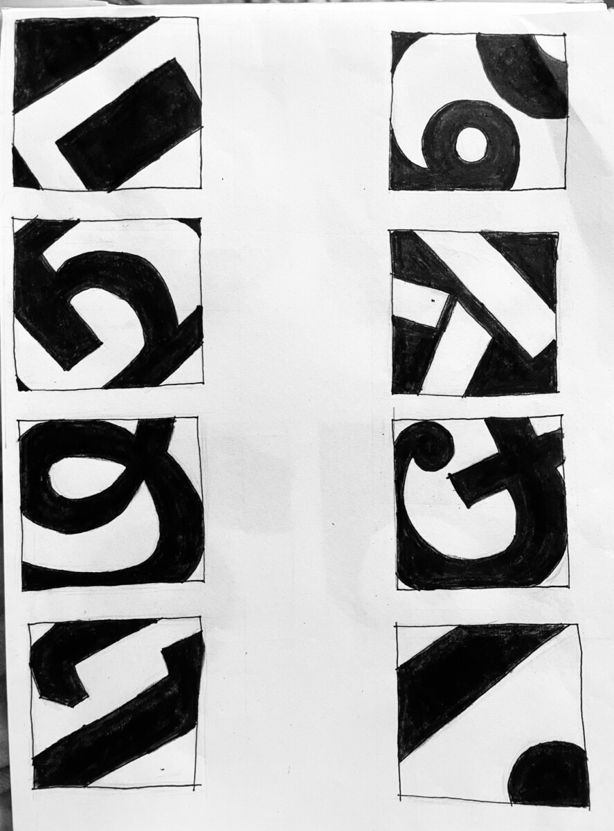


I honestly feel that all the sketches truly work as a figure ground representation. The equaling of white and black is spot on. Everything just works perfectly together in these sketches. You can clearly distinguish what’s in the figure and ground spaces.
I enjoy your thumbnail sketches especially the last one that you inverted. You have a decent amount of variety when it comes to showing equal amounts of negative and positive space. You can really see that they’re no longer letters but indeed shapes.
Such interesting shapes going on here. Can’t wait to hear about it in class!
I feel an equal amount of black and white in your Positive/ Negative thumbnail.
I think that the ones you chose for negative and positive have a really good use of balance between the black and white. Not only that but the shapes have a flow which made my eyes move around while looking at the two images.
It looks so neat that it seems like you did this on the computer. For the first one, I feel like the negative one is more balance than the positive one, since it looks like there’s more white than black. For your 2nd one, I like the positive one more since there’s black on the top left but there’s no white on the negative one.