I believe 0:15 -0:17 is the most purposeful because it emphasized each letter after the phrase “typography is letters.”
Leave a reply
From 00:27-00:45, the video shows how the each motion the text has, its related to the music thats playing. Every time a new note is played, the motion continues making … Read More
The transition from printing paper to a flickering screen on 1:02-1:12. It’s like telling people typography can be used on anything we read daily. Also, I think it’s a metaphor … Read More
February 24
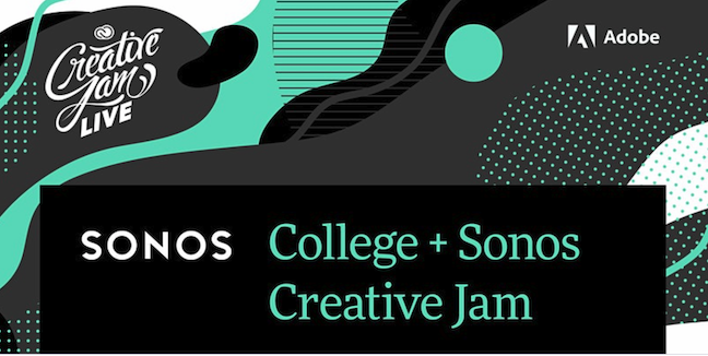
You’re invited to a Creative Jam. Learn new design skills. Be inspired and challenged, creatively. Work as a team … Read More
The OpenLab is an open-source, digital platform designed to support teaching and learning at City Tech (New York City College of Technology), and to promote student and faculty engagement in the intellectual and social life of the college community.