Due: 11:30, Monday, 3/14
Goal: Examine proportions.
Objective: Explore proportion using a grid structure.
Category: proportion
To Do
-
- Proportion
- Icon and Letterform
1. Proportion
Using the same 5 groupings of text
one quote
designer’s name
designer’s medium/genre (print, web, furniture, etc.)
date/era
location
Process
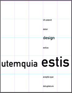
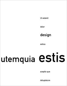
1 Exaggerate hierarchy
• use only 3 levels of hierarchy
2. Position your top hierarchal element in an area that emphasizes proportion
• see example below
3 Group text into several units
4. Position the units so that they align with each other
5 Create 4 different compositions
6. Make a screenshot of each composition
• each composition with the grid
• each composition without the grid
Post on Miro
• you should have a total of 8 (4 with the grid, 4 without the grid)
-
-
- Example
-


2. Icon and letterform
-
- revise both studies
• make sure that you do not have “background”
• make sure that you do not have any “anomolies
• use a square format - outline the squares with a 1 point rule
- make a positive and negative version of both
- add to Miro
- revise both studies


