Due: 11:30, Monday, 3/9
REVISED
Objective: Explore the diversity of alignment to a grid structure.
Goal: Examine proportions.
category: alignment
To Do
-
- align with scale
- post to Miro
- prepare to give your 2 minute presentation
1. Alignment with scale
Revise your alignment
4 pages
Same instructions as last week (see the bottom of this page to review)
Add:
-
-
-
- use a typeface that your designer would choose
- use scale (different sizes) to create hierarchy
- think about figure-ground
- Text
one quote
designer’s name
designer’s medium/genre (print, web, furniture, etc.)
date
general location
- Text
-
-
Process
1 Use a 5 column grid
2. Group elements using alignment
3. Create at least 3 levels of hierarchy using scale
Remember
-
-
-
- Do not center
- Group items
- Remember figure-ground!
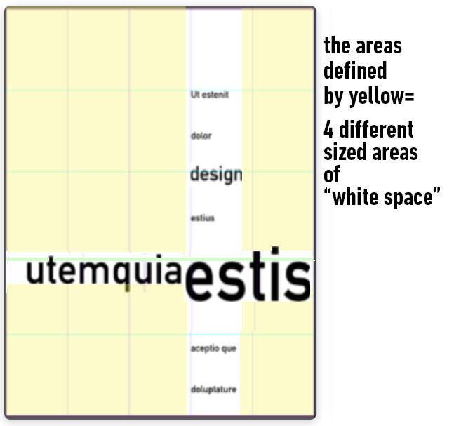
Don’t spread items all over the page, create a mass of white space - Do not use the same amount of white space at the top and bottom of your page
-
-
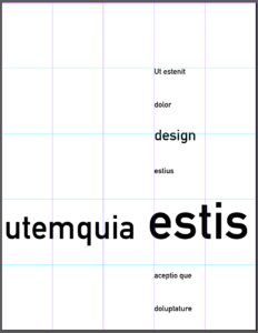
example of scale, hierarchy, and alignment
different scales of circles

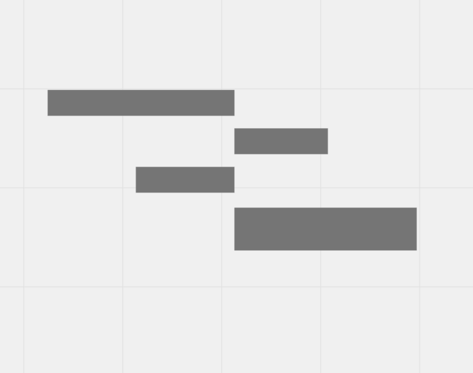
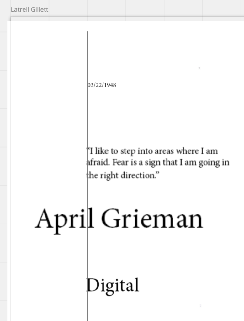
examples of alignment from class



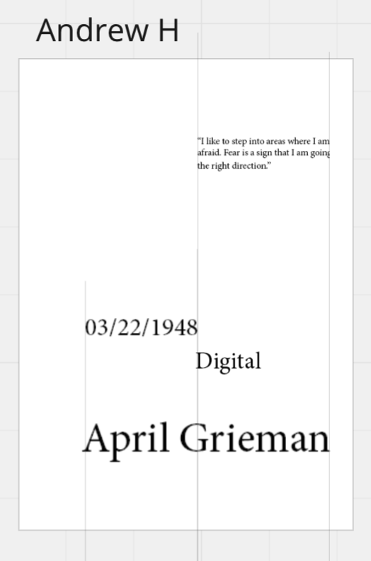
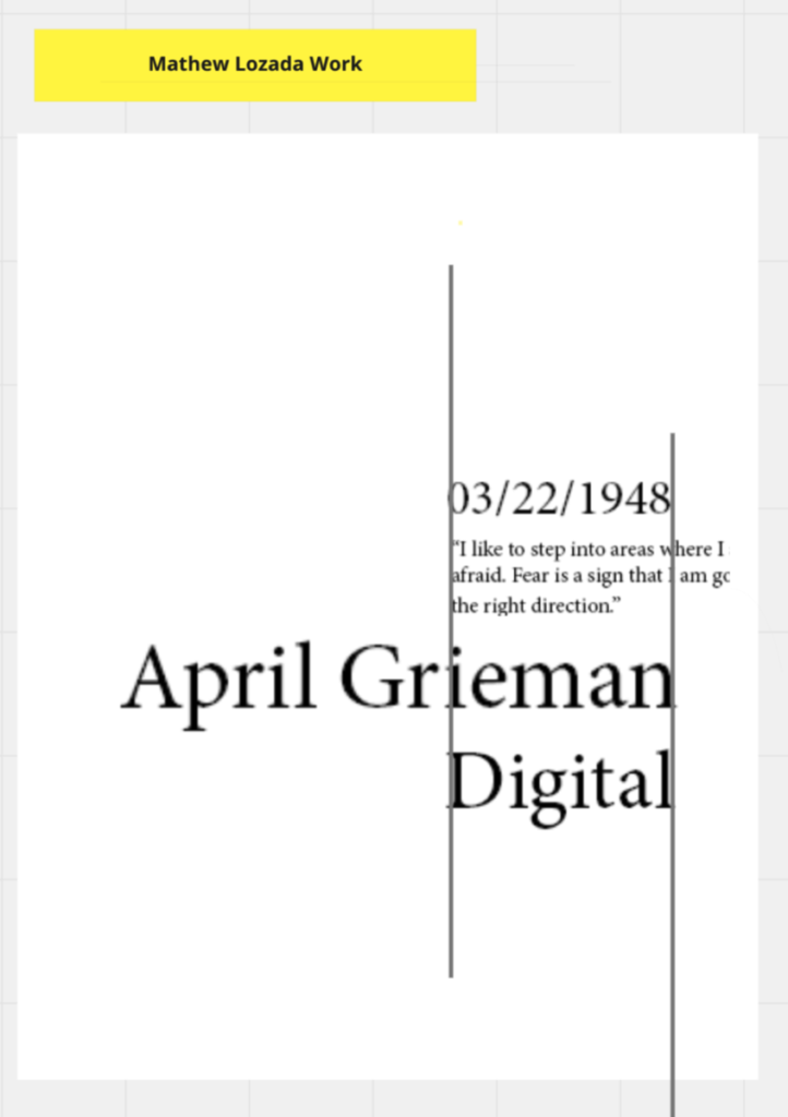
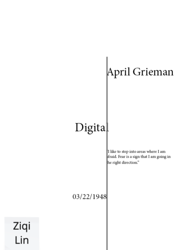
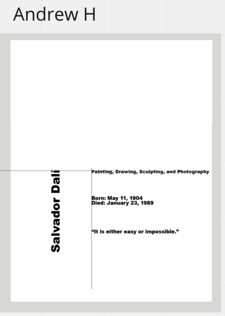
DON’T DO THIS:
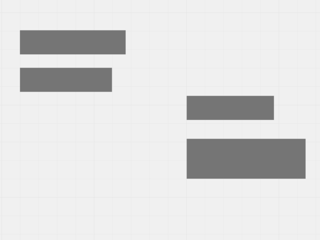
This is aligned but it creates 2 separate groups
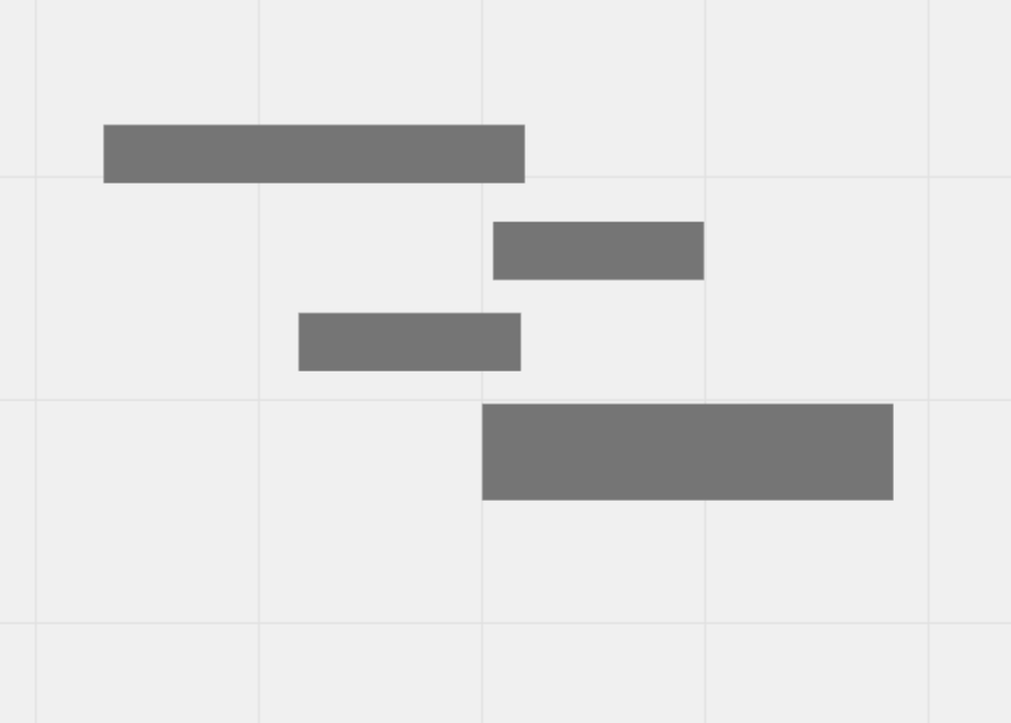
These are NOT aligned
2. Post on Miro
Only post when you have completed the following:
-
-
-
-
- Use a typeface that your designer would choose
- Use scale to create hierarchy
- Text
one quote
designer’s name
designer’s medium/genre (print, web, furniture, etc.)
date
general location
-
-
-
-
-
-
-
- 5 column grid
- 2 levels of alignment
- 3 levels of hierarchy using scale
- Do not center
- Group items by similarity
- Don’t spread items all over the page, create a mass of white space
- Do not use the same amount of white space at the top and bottom of your page
-
-
-
Comment on 2 students work
3. Prepare to present your influences
________________________________________________________________________
Last week’s assignment:
Use your Influence text to create 4 pages of text
Each page must have at least 2 left alignments
Text
one quote
designer’s name
designer’s medium/genre (print, web, furniture, etc.)
date
Process
Open InDesign
-
-
-
-
-
-
-
- Create a 5 column vertical grid
Follow these directions EXACTLY - 8.5 x 11 inches
•. Pages: 4
•. Start#: 1
•. Columns: 5
•. Column gutter: 0
•. Margins: 0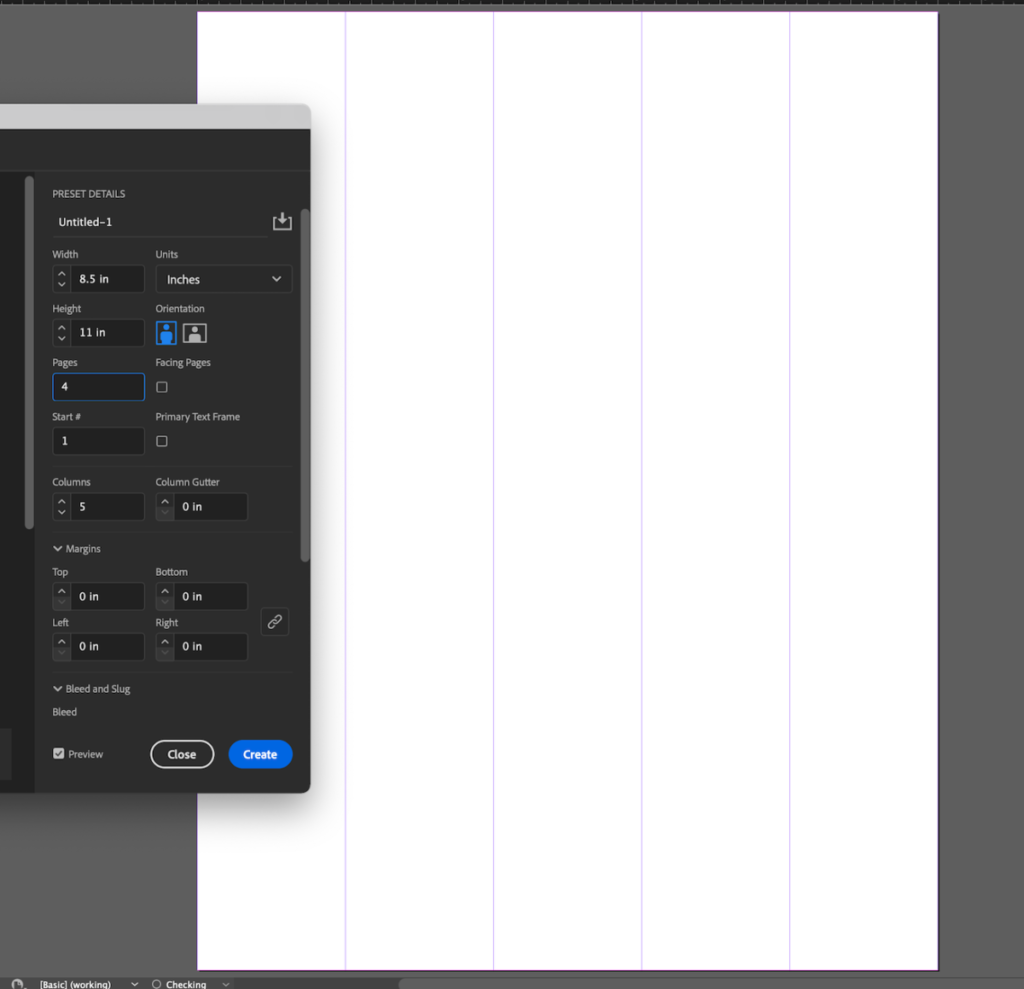
- Create a 5 column vertical grid
-
-
-
-
-
-
Begin Layout
-
-
-
-
-
-
-
- Add your text
- Use the grid to define the placement of your elements.
- The left edge of your type MUST TOUCH the grid line to show alignment
- Create 4 different compositions
- Make screenshots of each composition
1: with the grid - Upload to Miro
- Comment on 2 different student compositions:
Does this grid show alignment
-
-
-
-
-
-
-
-
-
-
-
- Example
-
-
-
-
