Category: icon digital
To Do
-
- review
- make
- comment
- begin research
1 review
Your images should “speak visually.”
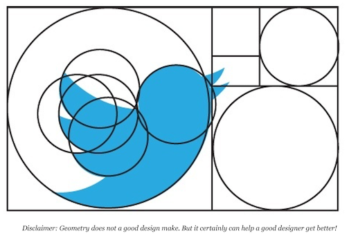
Use simple, geometric shapes

![]()
Begin by creating the rough shape of the major shapes with simple circles, rectangles, and triangles.
Start with the shape tools in Adobe Illustrator, even if my icon is going to end up being mostly organic in nature.
Geometric shapes:
• makes the edges more precise (especially along curves)
• adjusts the relative scale of elements within a design quickly,
• ensures following the grid and form.
The human eye can detect very slight variations in precision, human hand-eye coordination cannot always achieve a high level of precision.
Slight variations in the edges that result from being hand-drawn make an icon look less refined.
2. By The Numbers: Edges, Lines, Corners, Curves, and Angles
Corners, curves, and angles should be mathematically precise, as much as possible without making your designs look overly mechanical and boring • follow the numbers and don’t try to eyeball or freehand the details • inconsistency in these elements can diminish the quality of an icon.
3. Angles
Use consistent angles.
-
-
-
- In most cases, stick to 45-degree angles, or multiples thereof.
- Anti-aliasing on a 45-degree angle is evenly stepped (the active pixels are aligned end-to-end)—the results are crisp.
- The perfectly diagonal nature of this angle is an easily recognized pattern, which the human eye likes very much.
- It builds consistency and unity within a single icon.
- If you must break this rule, try to do so in halves (22.5, 11.25, etc) or in multiples of 15 degrees so that the stepping in the anti-aliasing is still fairly even.
-
-
4. Curves
Curves can make the difference difference between professional and amateur-looking are the curves.
-
-
- Rely on shape tools and the numbers to create curves rather than try to draw them by hand. When you must create curves manually, use Adobe Illustrator’s constraint modifier key (Shift)
- If you are interested, try VectorScribe and InkScribe by Astute Graphics for even more refined control over my bezier curves. They offer a free trial period.
-
2. make
Variations
Refine 1 icon
In 4 steps, progress from you current icon to a solution that goes “too far.”
Your 4 final pieces will show variations on your refined icon.
Make several variations that explore alignment angles, proportions
-
-
-
- Choose your best icon, revise 1 icon in Illustrator
- Copy that version and make a variation
- Copy your second version and make another variations
- Copy that and “push” your variation “too far”
- copy it, and refine it.
- You should have a total of 4.
- Upload to Miro
-
-
criteria: Carve your icon from the letter—do not add to the letter
•Carve your icon from your letter’s negative space
•Do not add to your letter
•Focus on figure/ground, and balance in your studies Work in black and white
Resources
Need help? How to quickly build shapes in Illustrator | Creative Bloq
For icon reference, look at icons in The Noun Project for ideas: thenounproject.com
Use negative space in logo design; https://www.youtube.com/watch?v=wzvJWWLTuEM
Icon reference: https://www.pinterest.com/sharp/icon-inspiration/?lp=true
Symbol reference: https://www.designspiration.net/search/saves/page/1/?q=icon%20symbol
aaa How to quickly build shapes in Illustrator | Creative Bloq
aaa How to Use the Pathfinder Palette in Adobe Illustrator – Melissa Carter Design copy
aaa Simplify your logo design process _
3. comment: on 2 different students’ variations in Miro
Which version is the most readable?
Which version looks the most professional?
Has the icon been simplified geometrically?
4. research, due Wednesday March 2: design interest
Choose 3 design influencers to investigate this semester
-
-
- Open a Padlet account, padlet.com
- Create a different page for each influencer
- Add basic information about your designer
-
-
-
-
-
-
- name
- dates
- location
- medium
- quote
-
-
-
-
4 Choose 3-4 images of your designers work
4 Be prepared to discuss on Wednesday 3/2
Resources:
-
-
-
- https://www.peoplesgdarchive.org/
- https://www.commarts.com/webpicks/graphic-design-archive
- https://archives.design/
- https://www.politicalgraphics.org/
- https://www.aiga.org/resources/design-history-resources-and-archives
- http://www.designhistoryteachingresources.org/resources.html
- https://docs.google.com/document/d/1KiW2ULDFeIm_OuvwhM2lygxwhoNddrEFk5tYI9zbldw/edit
- https://www.rit.edu/carycollection/graphic-design-archive
- https://designarchives.aiga.org/#/home
- http://www.designhistoryteachingresources.org/resources.html
-
-


