to do
-
- refine your poster
- watch and comment
1. poster
Fine-tune your poster
Create 2 different versions
Upload to Miro
Criteria, 10 points each for a total of 100:
-
-
-
-
- • Size: 11 x 17, with excellent craft. (no bitmapping unless it is part of the design)
- • Is ANYTHING centered?
- • Are you using a typeface that your designer uses?
- • Does your poster emphasize typography, not image?
- • Check all spelling and make sure you have NO hyphenations and No quote marks
- • Do you have clear hierarchy?
- • All type units relate to each other? (they do not all have to align)
- • No extraneous information? (birthdays or the town where they were born)
- • You didn’t place your type “around” the image, your typography is “in” the poster and not stuck to the edge.
-
-
-
2. Watch and comment
-
- watch video: https://vimeo.com/69375692
- Comment (below): What type of transitions or specific actions make the animation feel like it had a “purpose.”
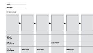
3. sketch: Storyboard a “non-stop” motion gif
Your animation should help to covey your influencer’s philosophy?
Use your final poster design
What aspect of your influencer will you emphasize?
-
-
- use the template below
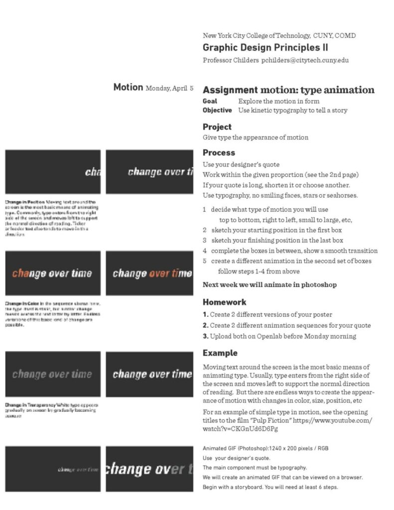
- sketch by hand to show 2 examples of motion
- your last frame should lead to your first frame.
- each animation has 6 steps
- your last cell should lead to the beginning.
- Upload to Miro
-

need ideas? Hold your phone over this icon to see an animation
![]()
Example of animation sketch:

Want to try to create your own? Try Biteable. it’s free


