
This agenda provides a detailed outline to give a clear vision of the day’s class.
To-Do: before class
Prepare to describe your work in terms of hierarchy
Topic
Topic: Proportion
Goals: Experiment with proportion
Objectives: Use proportion to balance design
Critique
-
- alignment, grid, https://www.youtube.com/watch?v=BQEVqWiD304
start at 3:25
2. type tests: https://www.youtube.com/watch?v=Ta5hywdHPWU
amateur vs pro: https://www.youtube.com/watch?v=6dDlkawN3s0
hierarchy, focal point: https://www.youtube.com/watch?v=MlsV3hu84as
beginning to 6:23, 6:30, 7:19-7:40, 8:27 to end
grouping, scale: https://www.youtube.com/watch?v=_Pp0JHEswMk
beginning to 4:45
swiss design
golden ratio grid https://www.youtube.com/watch?v=2xP6TBnfP7M&list=PLI-hlugutGThyjqSduEj8AxNEWgVcp9Q1
start at 1:40
grid:
axial grid, start at 8:10
start at 1:21
https://www.youtube.com/watch?v=2xP6TBnfP7M&list=PLI-hlugutGThyjqSduEj8AxNEWgVcp9Q1
Typography rules: https://www.youtube.com/watch?v=za8ERlMchUE
Review text compositions
Prepare to describe your work in terms of hierarchy
type test: https://www.youtube.com/watch?v=6dDlkawN3s0
Lecture
Review
how we see: https://www.linkedin.com/video/live/urn:li:ugcPost:6821094794379501568/
start at 3 minutes – 9.30 minutes
Proportion
watch until 5:40
Composition
Proportion systems: design precedents of grid design
https://www.typographicposters.com/
Activity: Proportion
Workshop: grids, proportion, and hierarchy
Use proportion to position your type
-
-
-
- Use information about your designer
-
-
-
-
-
-
-
-
- name
- dates
- location
- medium
- quote
-
-
-
-
-
2. Align type to the grid
3. Create hierarchy
Remember:
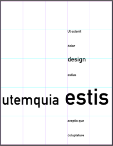
Use a grid, 5-column
golden ratio proportion (your 5-column grid) (image below)
Use alignment
emphasize the grid: we should have a sense of the grid, even when it is not showing
Use hierarchy
create a composition based on each proportion system
• create at least 3 levels of hierarchy
• where do you place hierarchy to emphasize the grid?
Make sure your text is not centered
check that you do not have the same space above and below
Mass your white space
make sure you have a large group of white space
process review:
Open new InDesign doc
8.5×11″
NO MARGINS
NO facing pages NO automatic text box
5 columns NO GUTTERS
InDesign: Layout > create Guides
5 columns NO gutter
5 rows NO gutter
Use your text tool to create a new text box
Align your text in the grid
Activity
Demonstration: Deconstruct your designer’s work
In Miro, describe the grid and typographic system your designer uses by visually tagging similar items
Homework
Finalize your designer’s deconstruction that we began in class
Revise your typographic compositions
Investigate your designer’s typeface

