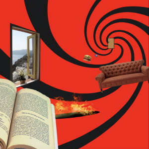
The poem I chose is called “Things to do in Hell”. In the poem, the writer listed a mixture of things you would guess hell has for you and everyday things like grabbing lunch or even smoking weed. I feel like this related to us in the situation that we all find ourselves in. Hell right now is like being locked up at home and the only thing to do is what you have been doing every day since lockdown. Its torture and drivng us crazy. Having the book bigger and on top of the window makes the illusion of the window being further bad or closer to the door and that being the furthest thing in the picture. The lines in the background play a big role in making the picture seem like it’s into space. Where the lines meet is also where the door is. The door symbolizes freedom for us in our situation.
Author Archives: chantal gomez
Bezold Project
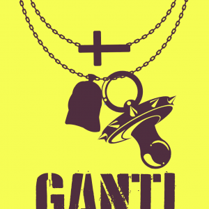
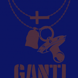
For my bezold project I chose things that represent me like a cool pacifier for my past, my two necklaces for my present, and the name “GANTI” for my future. There are only 3 colors used in this image. I chose yellow, blue, and brown. By playing with colors I saw that the same brown looks like two different shades of brown when it’s next to two different colors.
Song Project
News Story Project Chantal
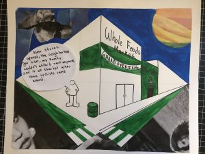
The news story I chose was an article on city bikes and how they contribute or even start gentrification. I think my focal points are the words. If you read the text bubble and the store’s names, it is pretty clear what my topic is. I connected the color green with what is new that makes changes in a neighborhood. The new whole foods, new Starbucks, new bike lanes, and the recycling bin are all green. The side where the stores are at, it’s sunny and where the kid is at, its cloudy.
Imaginary Being Project
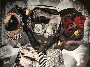
For the imaginary being project, I created a three-headed monster. He’s part cyclops, part angel in disguise, and part cartoon. I set the monster in front of rays of light resembling the iconic Virgin Mary look. That’s where grayscale and value come im. The further away from the creature the darker it is, for example, the corners are the darkest. The artwork is made completely out of magazine cutouts. Almost the whole creature is made from all kinds of texture from clothing. Ranging from scarfs, plaid suits, trench coats, dresses, and even lingerie. It also has life in it like butterflies, a plant and an eyeball. I feel like that makes it contact to actually living things. I decided to add color only to eyes, noses, and mouths. The focal point is the whole creatures itself, just like a Virgin Mary picture. I think I did a pretty good job not losing the creature into the background, that was my biggest concern. The details are the most important to me like the halo, the ocean in the sunglasses, or the shine on hair resembling a smile. The overall artwork has a good balance, one side is not overpowering the other. 