TL;DR:
- Brand Guidelines
- Project #3 Deliverables
- Branding Exercise
Contents
Class Info
- Date: Friday 10/27/2023
- Meeting Info: P-112
- Lab Due Date: 10/31/2023
To-Do Before Class
- Share:
1) Creative Brief + Target Audience
2) Working Mood board
Project #3


- This is a great example of how a design ecosystem starts to form across mediums:


- The third asset can explore other mediums we see on social media, take for example this Feeding America AR filter that ties in their campaign strategy “Impossible Choices”.

- Or these Giphy stickers created for World Blood Donation day, stickers can be uploaded via Giphy and used on Instagram:

- Or take for example this Mental Health Campaign leveraging Instagram Guides:


- Project #3 is not a rebranding or relaunching project. It will be a project that challenges us to work within an existing design system and how we can build around one.

- Here’s a great example of a campaign that Headspace created using a different font but still maintained the brand guidelines.

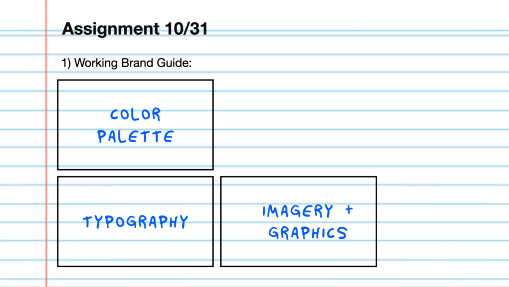
- For next class start building out your selected organizations color palette, typography and a working mood board of the vector style you are inspired by to use for this project.

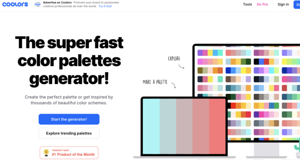
- If you want to include some new colors to your project, add the Brands hex codes on this site and scroll through the recommended options. Note* you need to lock the layers you add your colors to in order for this to work. Then proceed to use the space bar to go through the generated colors. http://coolors.co

For typography, if you are unable to find the font your organization uses, download the Google extension “What Font” to identify a font on a website:
https://chrome.google.com/webstore/detail/whatfont/jabopobgcpjmedljpbcaablpmlmfcogm


Leave a Reply