This Week’s Topics
Research Project
- Initial topic ideas are due next week
- Project outline and proposal are due in 2 weeks
Consider these questions.
-
- How do we change the commercial design field to include a diversity of voices and visions?
- What will the commercial design field and the study of design history look like in 20 years?
Activities
Silas Munro https://www.youtube.com/watch?v=QGqfvb1iTs0
Introduction: Next Week’s Topics
Discussion: Mainstream America
At the end of this session, students should have an understanding of the following:
-
- How the Avant-Garde movements of rebellion and rejection of the past (Futurism, Construcivism, Desjil, etc), culminated in the Bauhaus and were further refined in Swiss Typography/International Style found the mainstream in the capitalist version of Modernism in the American corporate identity design.
- How advertising has influenced society and culture.
1. Mainstream Modernism + American Corporate Identity
Last class, we saw the evolution of influences from the Constructivists, De Stijl, New Typography, and the Bauhaus that led to the mainstream adoption of the modernist International Typographic Style/Swiss Style in the mid 20th Century. This week we look at the American version of Modernism as corporate identity design and advertising in the 1950s-1960s began to take shape.
Modernism in the United States showed a commitment to “less is more” and a strong reliance on images and geometric forms. The approach was impartial and direct. Corporate identity design came into being during this time and favored a simplification in visual approach. Simple, sharp, and clean, designers developed cohesive brand identities. Commonplace today, designers like Paul Rand, started to used acronyms for logos and corporate brand identity. The identity manuals used today for fully branded company identities came into being.
Below are a series of videos that take you through the history of advertising, corporate identity design, and mainstream designers that influenced the field.
The New York School
Watch the Graphic Design History section on The New York School on LinkedIn Learning (this is the best option to view the work clearly!).
Or, if you must, watch the YouTube video below. NOTE: In the following video, watch from 1:18:14 to 1:18:55
American Corporate Identity
Watch the Graphic Design History section on American Corporate Identity on LinkedIn Learning (this is the best option to view the work clearly!).
Or, if you must, watch the YouTube video below. NOTE: In the following video, watch from 1:25:45 to 1:30:32
Paul Rand
Branding and Belonging
Discussion
Review Debbie Millman’s AIGA Lecture about the history of branding and respond to the prompt
Watch Debbie Millman’s AIGA Lecture “The Complete History of Branding in 20 Minutes” about the history of branding and respond to the prompt below.
-
-
- If branding is how we designate meaning through language, symbols, and words, how do the brands (in the broadest sense) that you affiliate with connect you others and what is the meaning behind them?
-
Branding turned into belonging: belonging to a tribe, to a religion, to a family. Branding demonstrated that sense of belonging both for people that were part of the same group and also for those who did not belong.”
“The most powerful brands we are creating today are not created by corporations, they are movements created by people for people.”
for 2 weeks:
Discussion 8a: Media as Message
1. Watch the presentation for Week 8: Media as Message
2. Leave at least one question or comment on that post. You are also encouraged to respond to your peers’ comments
3. Watch the Final Presentation Guidelines Video
4. Comment on that Post with any questions or concerns that you may have.
Assignment / Homework
5. Read the PDF attached in this week’s Assignment
6. Respond with a new Post, following the instructions on that assignment
7. Comment with any questions you may have, and feel free to comment on your peers responses
Our next reading will be from the media theorist Marshall McLuhan. For this reading, you have two options. Please read one of the following:
Chapters 1 and 7 from McLuhan’s influential 1964 book Understanding Media: The Extensions of Man. This is a fairly straightforward text. Here is a PDF:
-or-
Selected paged from The Medium is the Massage: An Inventory of Effect, co-created by McLuhan and Quentin Fiore in 1967. This is an experimental text that relies heavily on image-text interactions. Here is a PDF:
Please take a look at both, to get a sense of the material, then choose one or the other to really focus on.
Please consider the following:
McLuhan describes technology and media as “extensions of man.” How do media extend human beings, or humanity in general? What hazards might technological progress bring for individuals and society? If “the medium is the message,” what role can artists and designers play in creating new messages? How is the work of a designer subordinate to the media they use to create or distribute information?
You also have two options for this response. You can write 3-4 paragraphs. Or you can create another visual or “typophoto-graphic” response, combining images and text in the style of McLuhan and Fiore’s collaboration.
3 weeks
Our next reading is from a 1981 essay by the cultural theorist, Stuart Hall. In this article, entitled The Whites of Their Eyes, Hall examines the ways in which mass media have perpetuated racist ideologies. Here is a PDF:
Your post for this reading will be a little different. Instead of writing 3-4 paragraphs, please identify and document 3-4 advertisements in recent magazines, web pages, posters, billboards, etc. where race, ethnicity, gender or cultural identity play a role in shaping a brand’s message.
Note that race, gender and identity can be used in a positive, embracing way, or in a cynical, negative manner; or it may be difficult to tell. The most interesting ads are probably the most subtle.
Post ads that you encounter this week, after completing the reading. And please note that they do not need to be racist or sexist per se. We’ve all seen some of the widely publicized missteps from companies such as H&M, Dove, Sony, etc. …These are all very obvious. They really don’t require critical examination and we really don’t need to see them again. Do not post them.
Look for nuanced ads in which it is clear that the advertising is aware of identity and representation. Try to find ads that show diversity in a productive and celebratory light.
Post phone pics, scans or screenshots of your selected ads with short captions describing the image and the source from which the image was found.
Here are three examples of ads that I have found recently, which I think are very interesting…
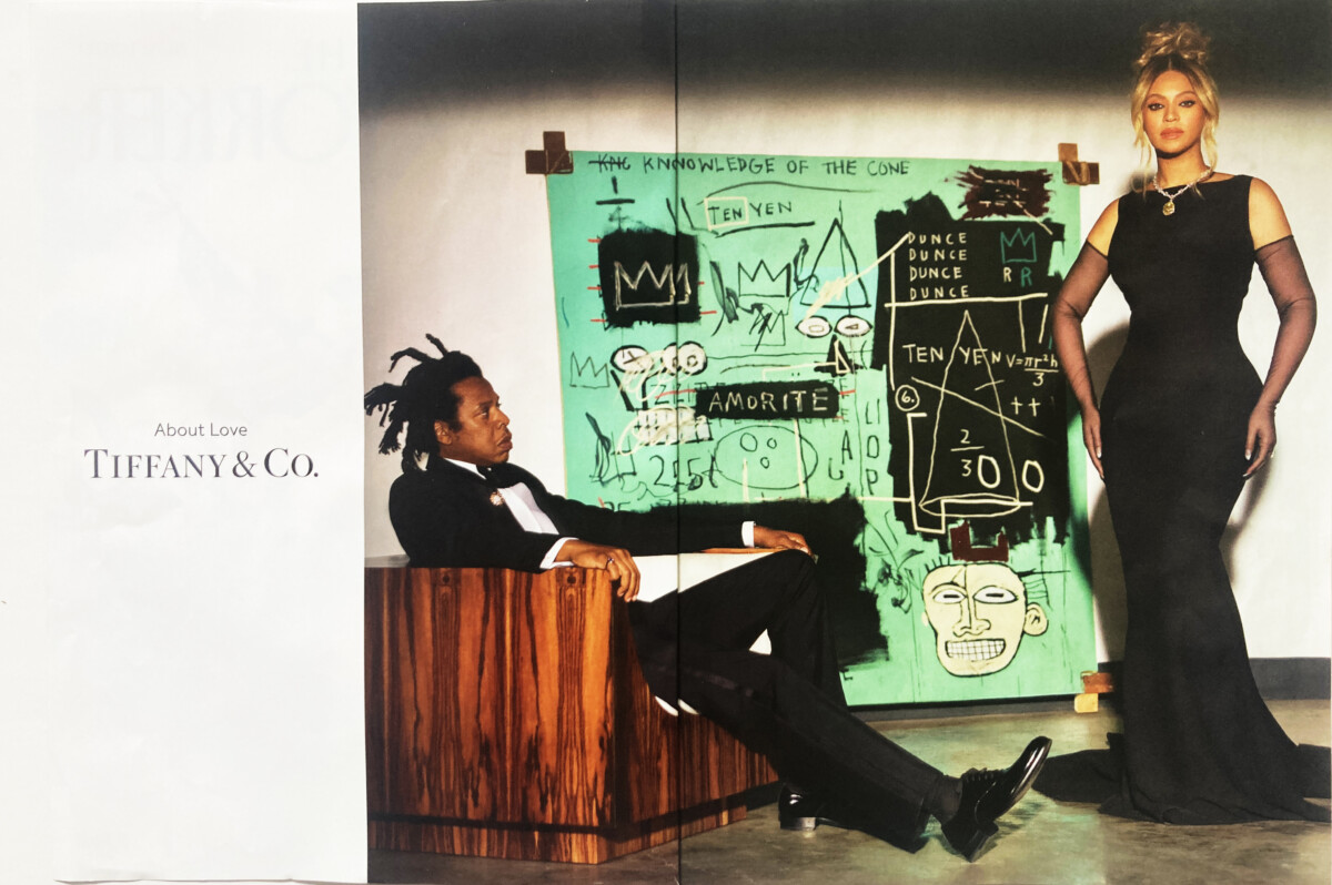
The above image is a spread that I came across in The New Yorker. I believe Tiffany & Co. is embracing the idea of blackness, in a positive way, through this ad, and ultimately attempting to reach a broader audience.

This image is a screenshot from a promotional email that I received from REI Co-op. I believe the choice to use two women, a man, and a woman of color as models was a very deliberate one. As a company REI seems to be making efforts to be more inclusive.


Leave a Reply
You must be logged in to post a comment.