1 thought on “Typeposter_digital_Deasia Grant”
Leave a Reply
You must be logged in to post a comment.

You must be logged in to post a comment.
Our goal is to make the OpenLab accessible for all users.
Our goal is to make the OpenLab accessible for all users.

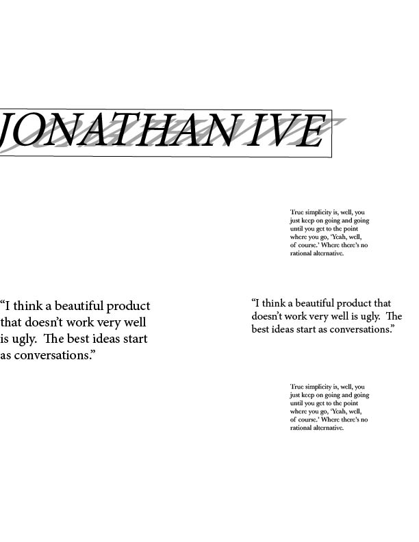

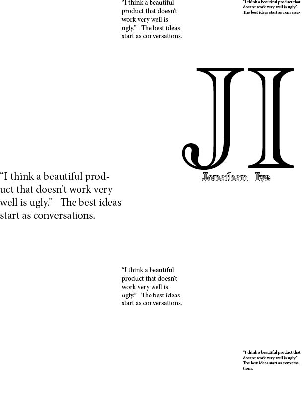
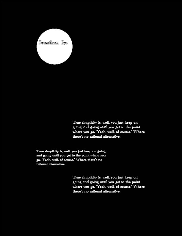
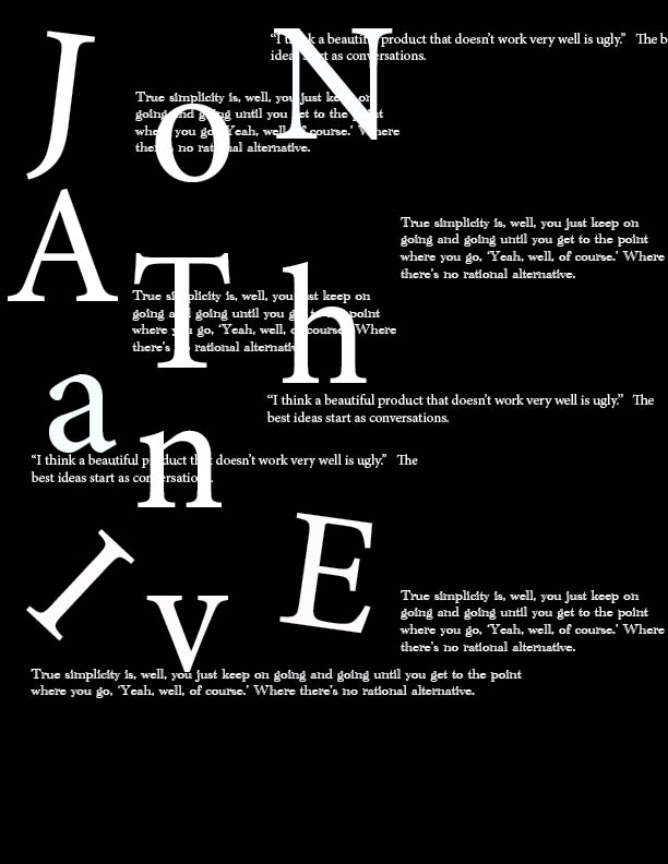
The 3rd design is my favorite. The alignment is spot on for the most part. I like the way you arranged the type in design 6. But did you intend for the text behind the large type to be read? In design 5, the alignment is there and the wide open spaces are effective, but the type face in the white circle does not work for me. Perhaps a different type face that is solid black instead to complement the beautiful blackness around it. The others need some structural tweaking.