1 thought on “Type Poster Digital_Cristofer_Rodriguez”
Leave a Reply
You must be logged in to post a comment.

You must be logged in to post a comment.
Our goal is to make the OpenLab accessible for all users.
Our goal is to make the OpenLab accessible for all users.
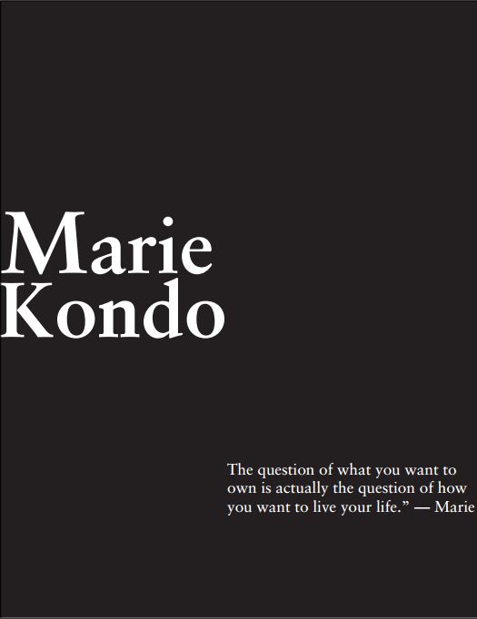
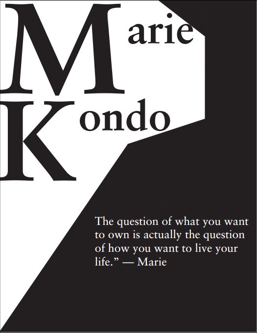

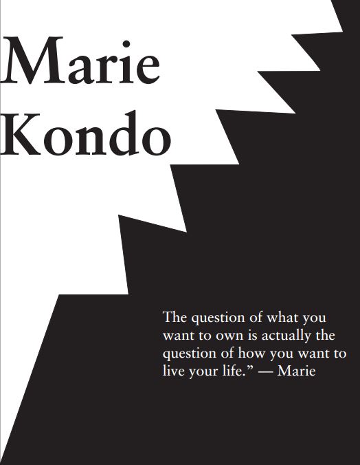
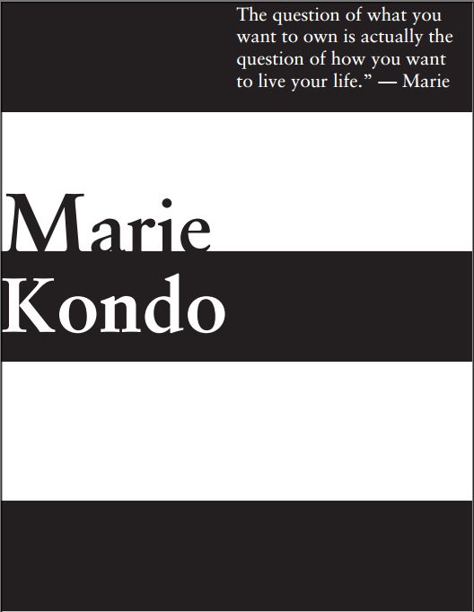
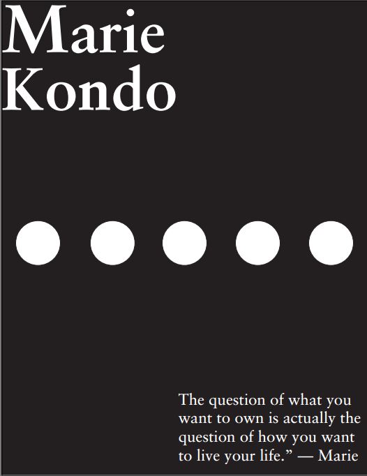
Christofer these are great! Hierarchy is visible throughout all your designs. There is definite evidence of gridded alignment . The only suggestion I would make is to tweak designs 2 and 3 to give more of a visual alignment. In design 2, the left aligned text at the bottom needed to be visually connected with right bottom edge of the M and the letter a directly above it. In design 3, the space between KONDO and the paragraph needs to be tweaked a bit more for a purer sense of alignment.