1 thought on “icons_Harry Chen”
Leave a Reply
You must be logged in to post a comment.
The OpenLab is an open-source, digital platform designed to support teaching and learning at City Tech (New York City College of Technology), and to promote student and faculty engagement in the intellectual and social life of the college community.


Harry you your designs in general are clean looking.
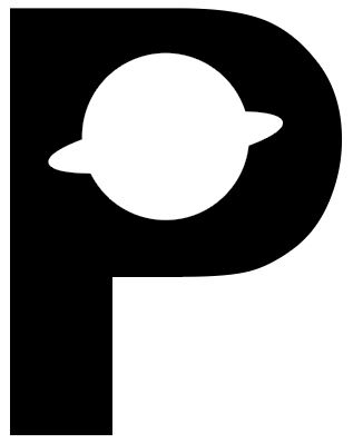
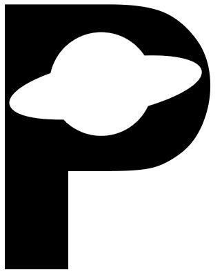
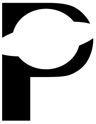
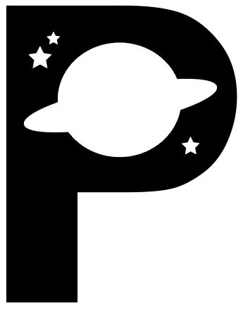
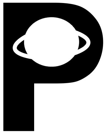
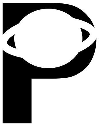
What is the icon? The Icon is a ringed planet packaged beautiful with the upper case letter P.
Does the icon use the negative space of the letterform? All six designs utilized the negative space in the letter form rather beautifully.
Which images fit the criteria? All of the images hit most of the criteria. Nothing was added to the P. In all instances it can be seen where subtractions from the P were made in order to use the negative space. Designs three and six demonstrate the principle of continuity.
Has the icon been simplified geometrically? The icon has been simplified geometrically.