Due: 11:30, Friday, October 1
Category: icon digital
To Do
-
- read
- make
- comment
1 read:
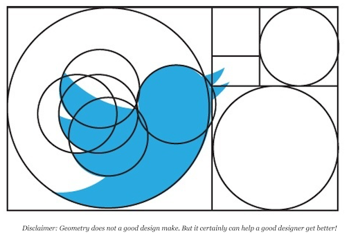
Start with simple, geometric shapes
![]()
The human eye can detect very slight variations in precision, human hand-eye coordination cannot always achieve a high level of precision.
Slight variations in the edges that result from being hand-drawn make an icon look less refined.
• Design icons the same way you draw sketches: by creating the rough shape of the major shapes with simple circles, rectangles, and triangles. • Start with the shape tools in Adobe Illustrator, even if my icon is going to end up being mostly organic in nature.
Starting with basic geometric shapes: • makes the edges more precise (especially along curves) • adjusts the relative scale of elements within a design quickly, • ensures following the grid and form.
2. By The Numbers: Edges, Lines, Corners, Curves, and Angles
Corners, curves, and angles should be mathematically precise, as much as possible without making your designs look overly mechanical and boring • follow the numbers and don’t try to eyeball or freehand the details • inconsistency in these elements can diminish the quality of an icon.
3. Angles
In most cases, stick to 45-degree angles, or multiples thereof.
Anti-aliasing on a 45-degree angle is evenly stepped (the active pixels are aligned end-to-end)—the results are crisp.
The perfectly diagonal nature of this angle is an easily recognized pattern, which the human eye likes very much.
It builds consistency and unity within a single icon.
If you must break this rule, try to do so in halves (22.5, 11.25, etc) or in multiples of 15 degrees so that the stepping in the anti-aliasing is still fairly even.
4. Curves
One of the most noticeable areas that can degrade the quality of an icon and make the difference between Premium/professional and amateur-looking are the curves.
Rely on shape tools and the numbers to create curves rather than try to draw them by hand. When you must create curves manually, use Adobe Illustrator’s constraint modifier key (Shift)
If you are interested, try VectorScribe and InkScribe by Astute Graphics for even more refined control over my bezier curves. They offer a free trial period.
2. make
criteria: Carve your icon from the letter—do not add to the letter
Combine one icon with one letter Carve your icon from your letter’s negative space Do not add to your letter Continue to focus on figure/ground, and balance in your studies Work in black and white Your images should “speak visually.” Your icon should relate to your letter.
-
-
- Create digital sketches of 2 icons
- Choose your best, copy it, and refine it.
- You should have a total of 3.
- Save in illustrator or pfd format so that you can continue to work on them later
- Save copies of your 3 icons as jpgs to upload to Openlab name post: “icon digital_firstName lastName” category: icon digital describe: When you upload, state if you carved the icon from the letter or if you added to the letter
-
Preparation resources
For icon reference, look at icons in The Noun Project for ideas: thenounproject.com
Use negative space in logo design; https://www.youtube.com/watch?v=wzvJWWLTuEM
Icon reference: https://www.pinterest.com/sharp/icon-inspiration/?lp=true
Symbol reference: https://www.designspiration.net/search/saves/page/1/?q=icon%20symbol
aaa How to quickly build shapes in Illustrator | Creative Bloq
aaa How to Use the Pathfinder Palette in Adobe Illustrator – Melissa Carter Design copy
aaa Simplify your logo design process _
2. comment: on 2 different students’ posts
What is the icon?
Does the icon use the negative space of the letterform?
Which images fit the criteria?
Has the icon been simplified geometrically?


Pingback: Agenda: 9/29 icon design | COMD1200_Graphic Design Principles II_Fall 2021
Pingback: Agenda October 1 | COMD1200_Graphic Design Principles II_Fall 2021
Pingback: Agenda October 6 | COMD1200_Graphic Design Principles II_Fall 2021
Pingback: Agenda October 8 | COMD1200_Graphic Design Principles II_Fall 2021
Pingback: Agenda October 13 | COMD1200_Graphic Design Principles II_Fall 2021