Hello Im Carmen Diaz
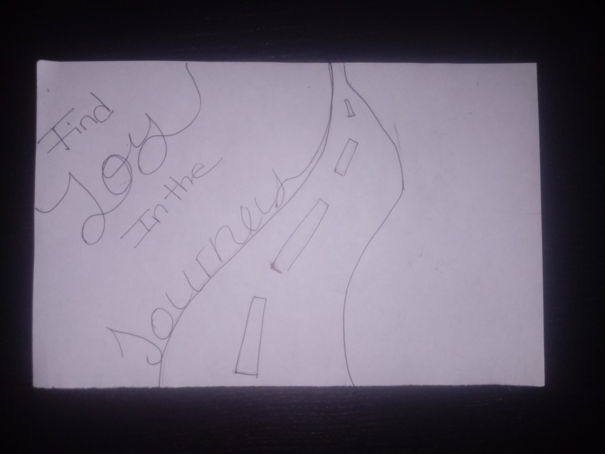
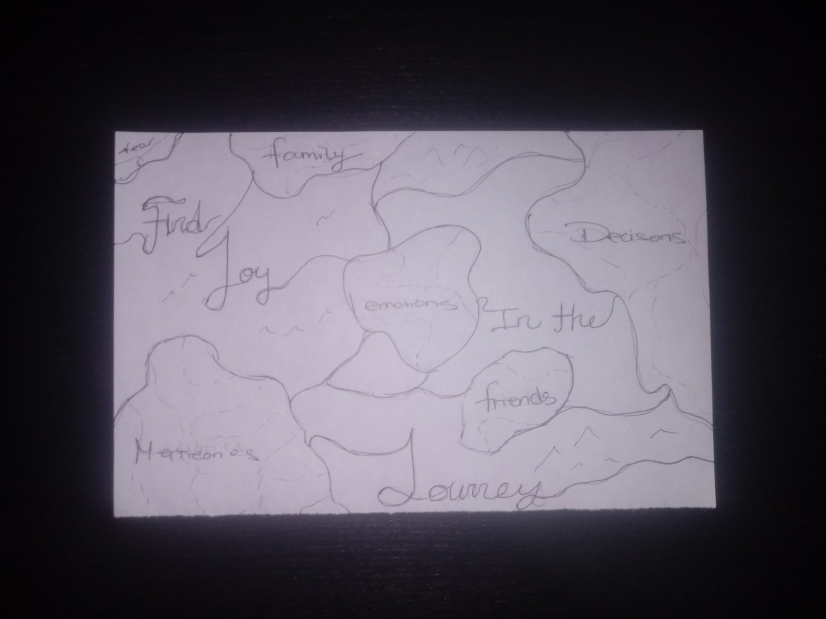
Find JOY in the journey
Hello Im Carmen Diaz
i have learned a lot this semester about graphic design. for instance learning about the graphic design principles like movement repetition texture and so on. learning about no window offices to having to present every single class!has taught me more or less whats it like the in real world. as frustrating it was learning about color i did learn that color is a very complicated topic and that its viewed differently among the eyes of many. but one thing i know for sure is that color is made up of three qualities hue, saturation, and value. when it came to the 2 final projects on color i was more focused on actually getting them done on time rather then understanding the meaning behind the project. i wish i could’ve paid attention more when learning about color because it was a bit confusing.overall it was a good semester met new people and learned a lot i know this is just the beginning of a long journey but im all for it and yes i will be keeping my design journal for future reference.
thank you professor for your time and patience.
“Tracking the rise of color”by Martha Schwendener published Aug, 6 2010
this article was about how through time color became popular. when reading the beginning it explained how three men were successful in their careers with just the basics black and white photos! which was around the 1930s-1950s. Then color came along in the 1960s and these men Robert Frank, Walker Evans, and Ansel Adams weren’t such big fans. instead it was attracted by a younger generation group known as the “starburst” ( ironic name ). Then the article goes into how color came into the world by a color process known as auto-chrome which was colored film which was made by the Lumière brothers . eventally it gets into how color made its way into film. the article was quit interesting.
source:http://www.nytimes.com/2010/08/08/nyregion/08artsnj.html
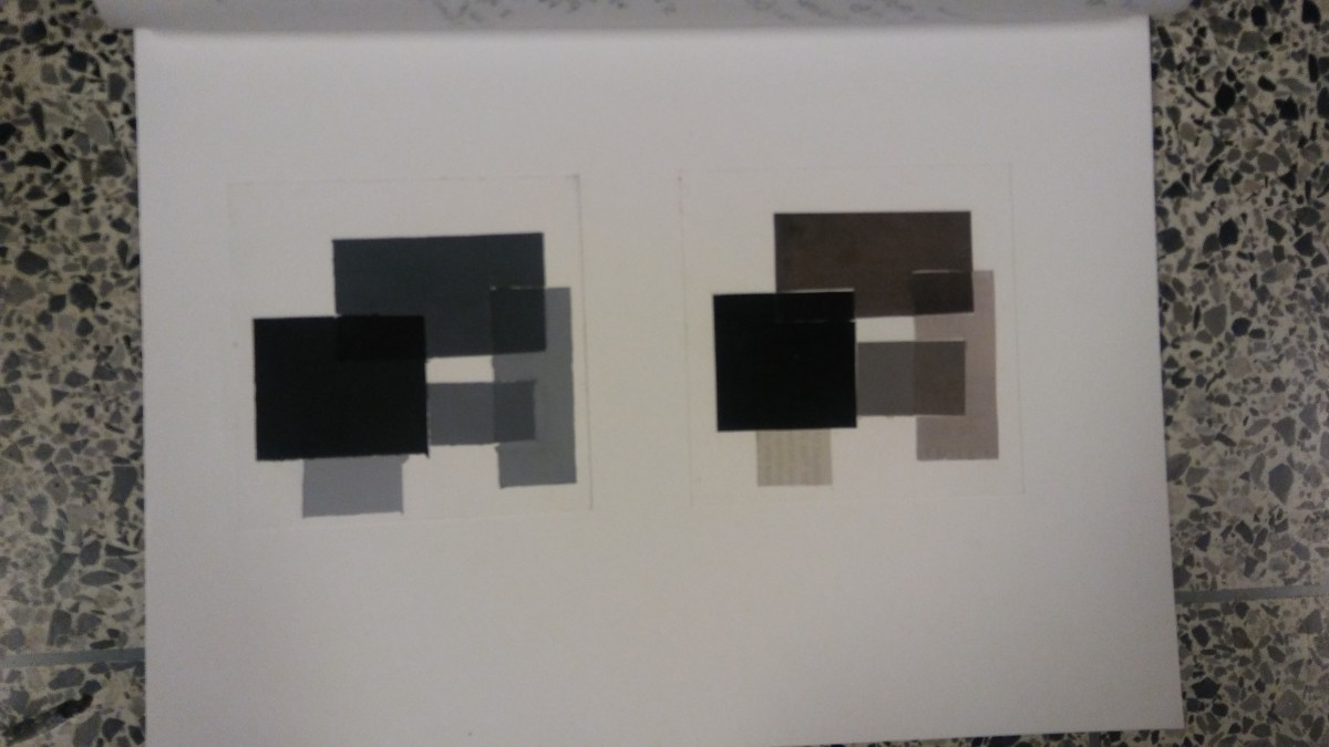
Because color results from reflected light waves transmitted through imperfect eyes and brains everyone sees color differently. color is made up of 3 main essential qualities related to our eyes which are hue, saturation, and value.
hue- a distinction between color identities as defined by their wave lengths.
saturation- the relative dullness or brightness of a color
value- whether a color appears light or dark.
source- reading assignment #20
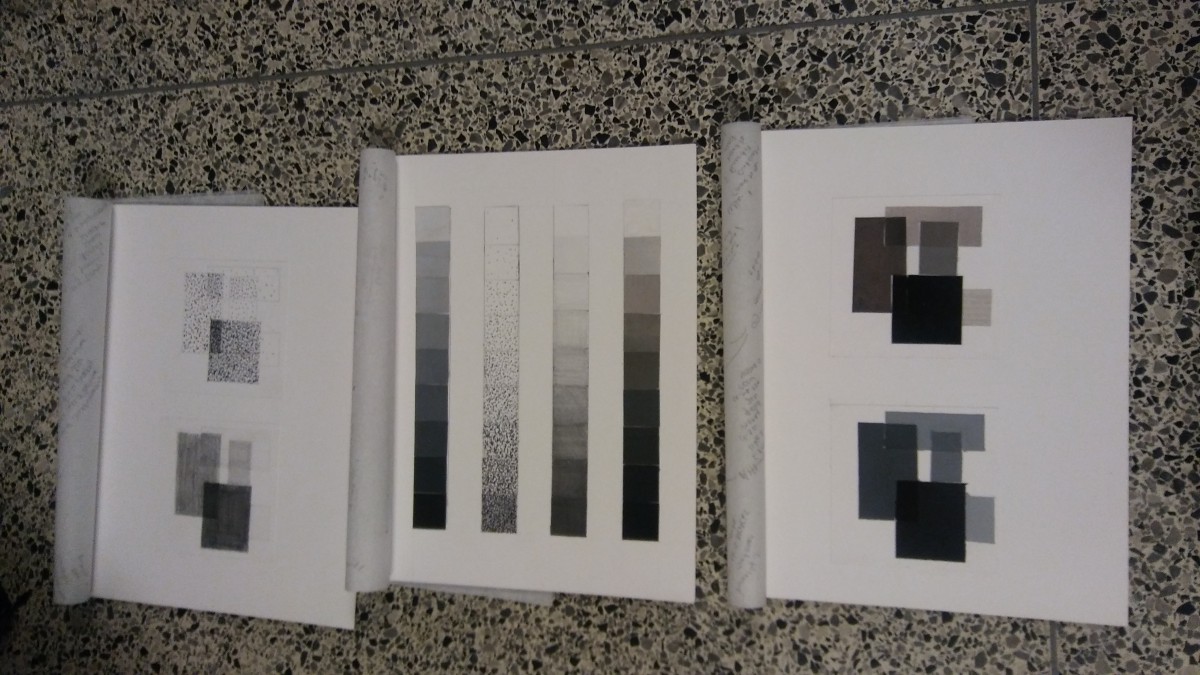
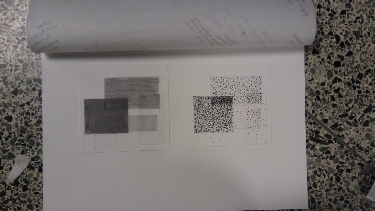

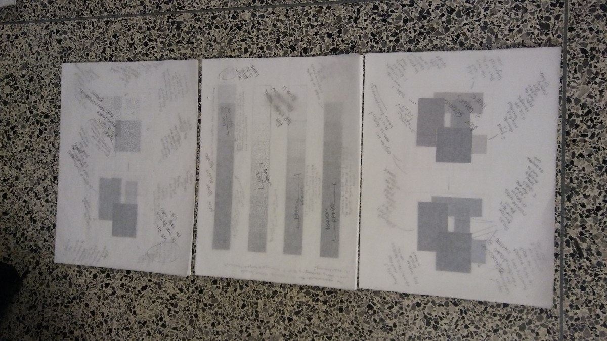
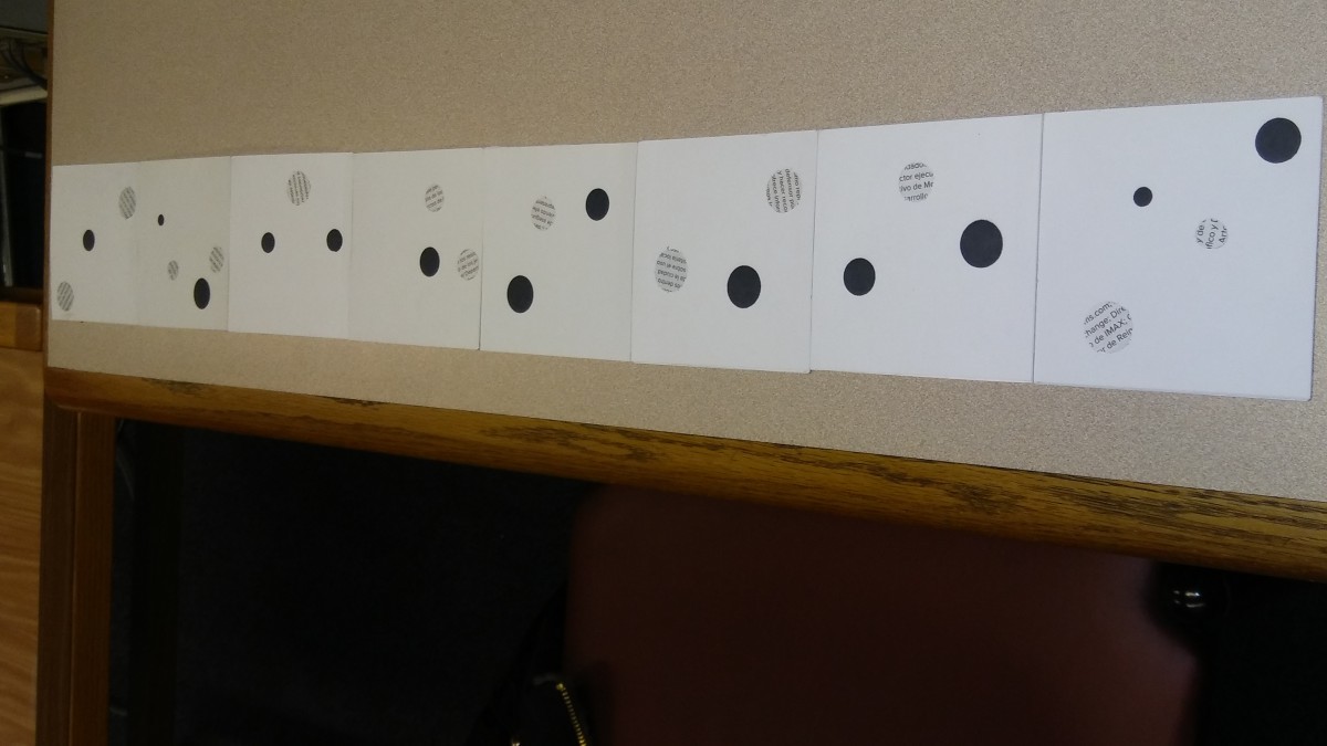
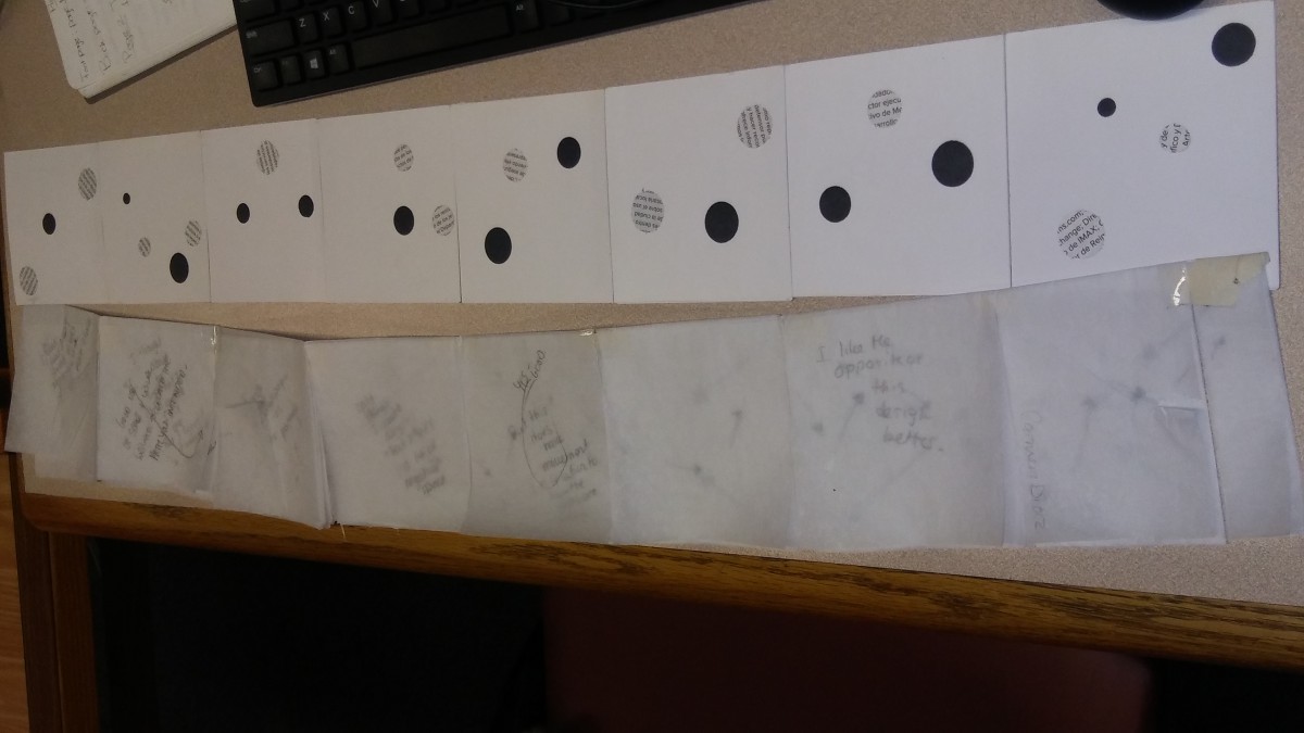
this project had a lot of components that needed to be done with patience and time. I for one felt like it was very difficult in terms of getting the proper value scale and getting the transparency to show. having to create 9 different shades from black to white made it harder to get proper magazine values that went well along the value scale. I found myself getting grays that looked too similar if not the same. also when doing the dots I couldn’t get a good visible difference between 6-8 on the value scale. they all looked basically the same in my eyes. maybe creating another design would’ve helped. overall it was difficult but a good experience in learning about how to create transparency without using any light source as well as learning a few things about paint.
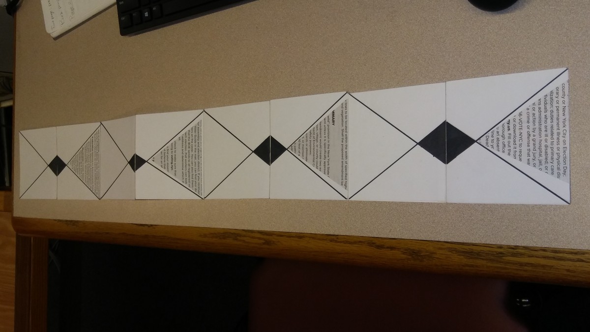
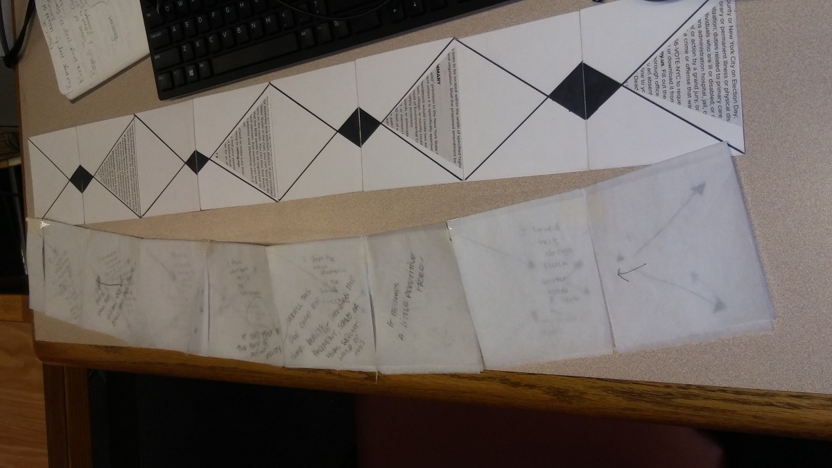
this project was one a project that was a bit frustrating when doing the movement and rhythm as well as creating contrast between both sides I couldn’t really find a better way of implementing all 3 components to the design. I honestly ended up just using a lot of repetition which wasn’t so much what we needed to do . I could’ve done much better in terms of requirements. I would have to say that my strongest point in this project was craftsmanship. Overall I need learn an extensive amount about movement and rhythm.
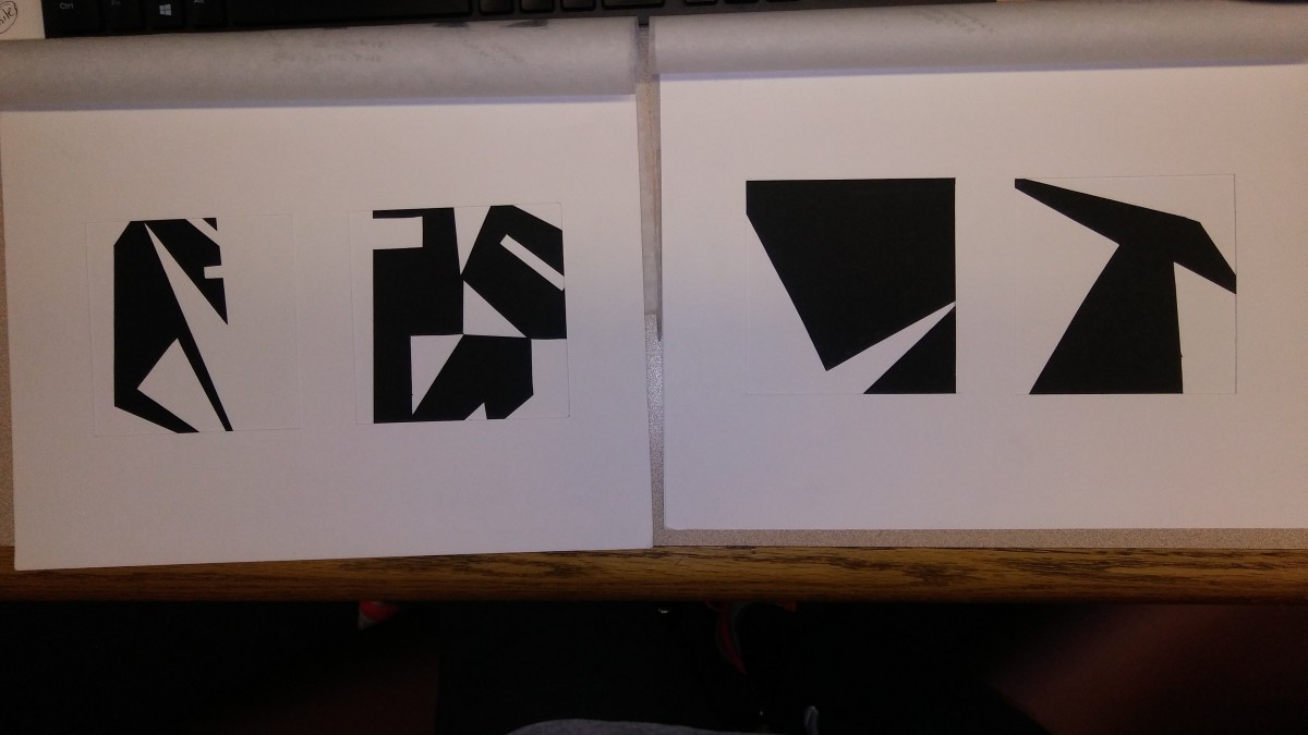
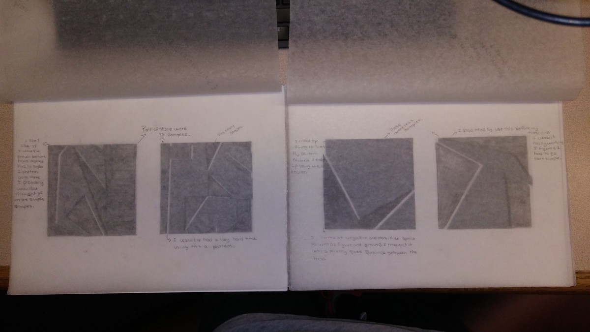
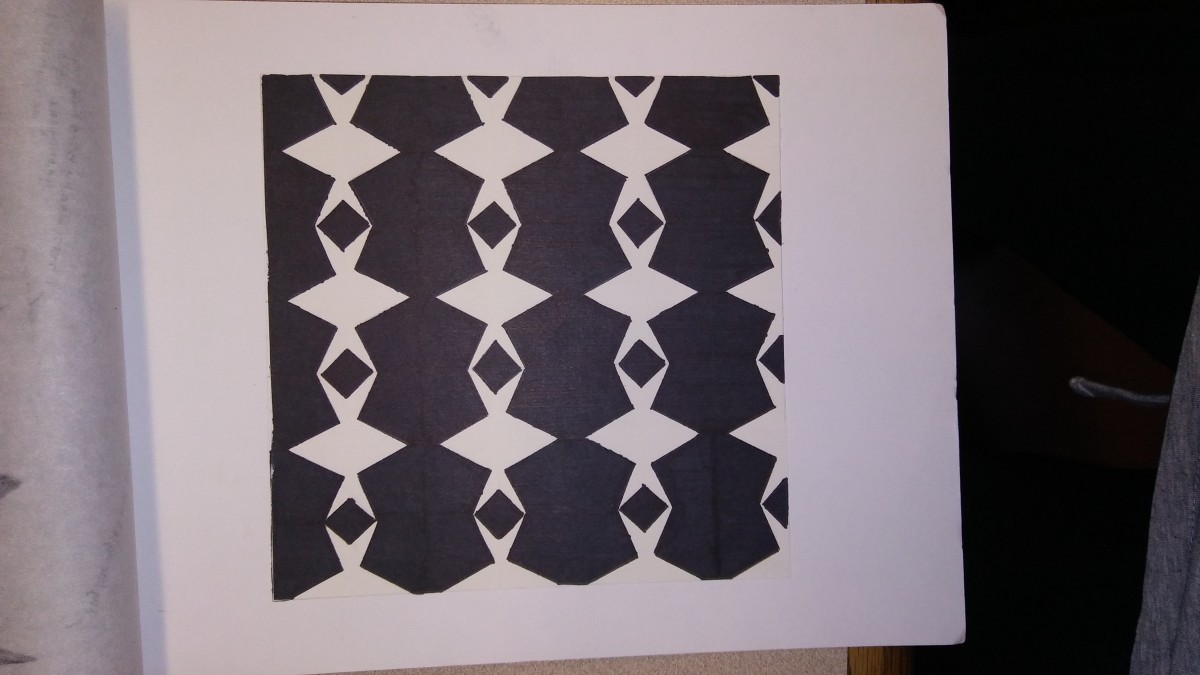
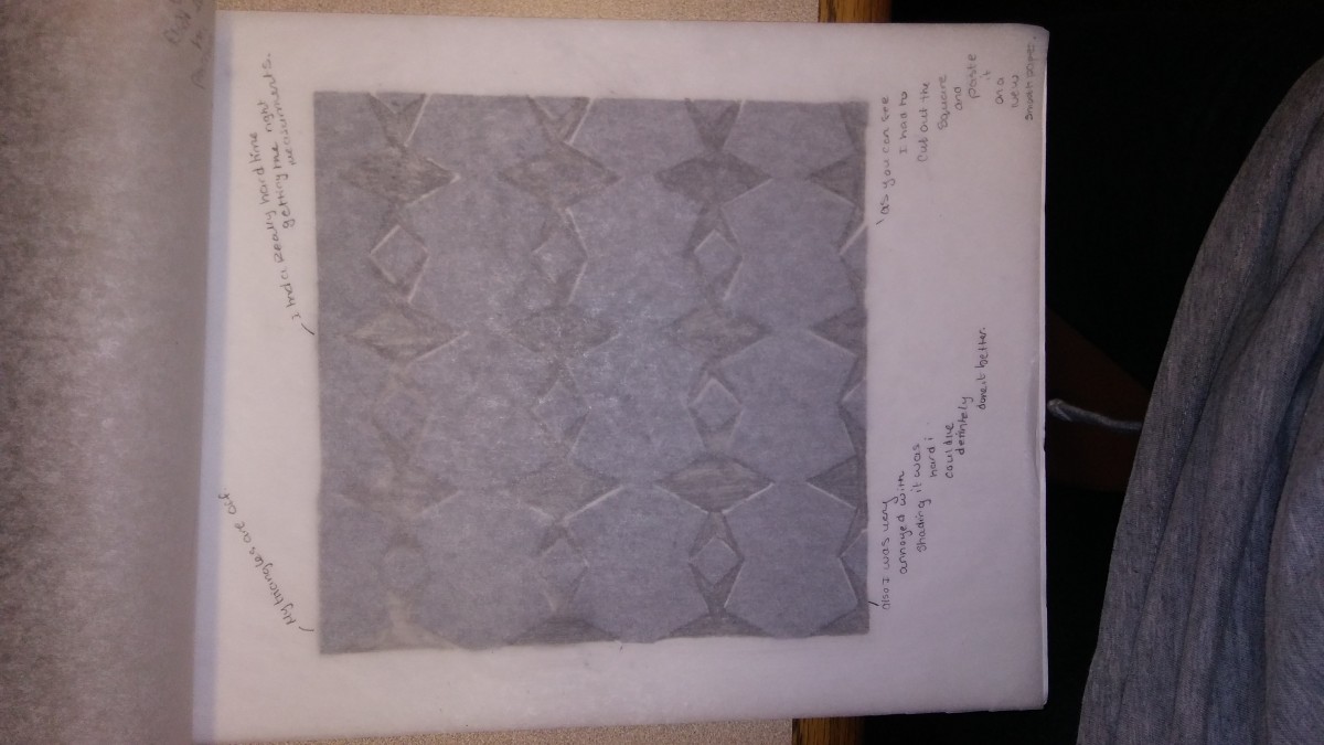
When doing this project I had a hard time using my knife and cutting out the pieces. When being told to keep it simple I now understood why it was said because simplicity was what I needed in order to create a pattern that wasn’t too difficult to re-due several times for the final part of the project. I learned that using the simplest forms of shapes can make a well drawn out pattern. Also that there doesn’t need to be any form of symbolism to create such a piece of art work. I never worked on a project that had no symbolism it was quit interesting. overall this project taught me more about cutting with a knife and also about craftsmanship which was a major component to this project.

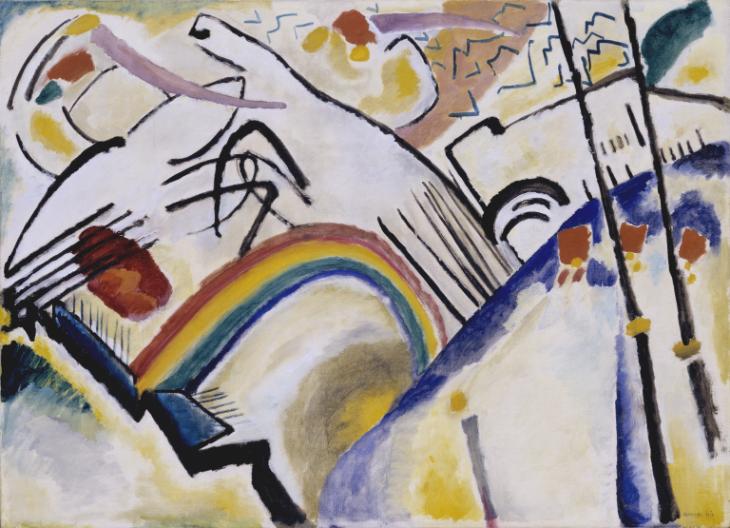
Cossacks 1910-1 Wassily Kandinsky 1866-1944 Presented by Mrs Hazel McKinley 1938 http://www.tate.org.uk/art/work/N04948
Cossacks 1910-1 Wassily Kandinsky 1866-1944 Presented by Mrs Hazel McKinley 1938 http://www.tate.org.uk/art/work/N04948
© 2024 carmen diaz's ePortfolio
Theme by Anders Noren — Up ↑
The OpenLab is an open-source, digital platform designed to support teaching and learning at City Tech (New York City College of Technology), and to promote student and faculty engagement in the intellectual and social life of the college community.

