Class 6 and 7 — Multiple Pages in InDesign and a Review of the 5 Families of Type

calligraphy

We have discussed the five families of type since the early days of the semester.  Sometimes these are referred to as type  categories. Make sure you learn to identify the differences.

Here is quick review:

Old Style: Garamond
(15th-17th century)

  • designed in France in 1615 by Jean Jannon (Claude Garamond was
  • given credit originally)
  • designed in a time when inks and paper were coarse and type
  • technology was still rather rough
  • relatively thick strokes and heavily bracketed or curved serifs
  • emulated classical calligraphy

Continue reading “Class 6 and 7 — Multiple Pages in InDesign and a Review of the 5 Families of Type”

Class 5 — Introduction to the Grid, Templates and the Type Book Project

typebook

Here’s a brief recap from Class 5. We had a quick introduction to the grid system and templates as they will be used with InDesign.

A grid is a non-printing system of horizontal and vertical lines which help the designer align the elements of the layout. This system of alignment helps to create a more organized layout. In multiple page documents, the grid assists in the consistent placement of design elements. Think of the grid as the skeleton of the layout—similar to the frame that you see on the construction site when a building or house is being built. We will go more in depth with grids a little later.

In InDesign we learned how to use a template, and how to name files before submission. We did this as we were introduced to the Type Book project.

We also covered using the line tool to create rules, strokes, and arrows in InDesign.


Continue reading “Class 5 — Introduction to the Grid, Templates and the Type Book Project”

Class 4 — Controlling Space, Leading, Tracking and Kerning

We covered three main topics during our last class that deal with spacing—tracking, kerning and leading. It is important to understand the difference between tracking and kerning.

  • Tracking deals with the adjustment of letter-space which will affect entire lines or blocks of text. By adding tracking, the letter-spacing, which is the amount of space between the characters, will be increased or decreased. The goal is to have consistently even space between all the characters
  • Kerning is often confused with tracking but kerning deals with the letter-space adjustments between a specific pair of letters. You only have to be concerned about kerning display or headline text. Certain letter pairs don’t fit well together, so the designer’s goal is to adjust the space so that letter-spacing looks consistent.
  • Leading is the amount of space between lines of text. It is measured from baseline to baseline. It is important that line-spacing is not too tight or too far apart.
  • All three of these—tracking, kerning, and leading—are important to the overall look and to make reading easier.

Continue reading “Class 4 — Controlling Space, Leading, Tracking and Kerning”

Class 3 — Variation in Type

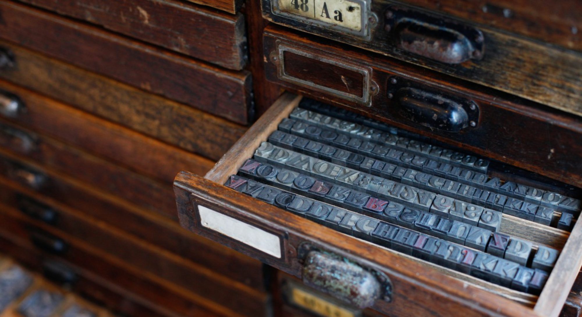
movable metal type

During our third class, we covered the Five Families of Type, but  we also reviewed the Variation in Type .

  • If you missed the lecture on the Variation in Type and the Five Families of Typography, you can download the slides Variation in Type. We learned how to identify the types of stress and the different styles.
  • Download the Type Anatomy sheet and keep it handy to help you identify the different parts of letters.
  • We watched several videos in class:

Continue reading “Class 3 — Variation in Type”

SoHo

This is SoHo, a historical district in lower Manhattan. As much as NYC is a fashion capital, everyone wants to get their brand out there and presentation is key. A crucial element that not only allows us to check in on what’s hip and trending at the moment, but something that is timeless as well as modern. SoHo, the name given because it is South of Houston, was well known for being home to many artists lofts and galleries embracing its own uniqueness. As it is not much in it’s artistic realm as it once was, it is still known to many as being the up-and-coming neighborhood to promote, well, anything really. So, aesthetics really do matter as well as something that will catch people’s attention with a right balance of flare. There are many brands out there and remembering how they look and how they all mesh well in Today’s modern world is very quintessential. 

My Name is…

Hi,

My name is Emilia. I have no idea what typography actually consist of, so I am hoping I will at least accomplish some basics out of this. I am in no way artistic so I at least hope I’ll learn some most common used fonts and lettering as we live in NY and aesthetics matter.

Far Rockaway Mott Ave


Far Rockaway is a very diverse area, its filled with many different cultures.  There are many businesses with the use of many different types of typography. Most of the typography used is in  San Serif. This allows the wording to be clear, clean, and, straightforward, making it easier for people to read. There are also some stores that use fancy, creative, and unique fonts to attract people. One example would be the liquor store seen in the image above. This store uses the Black Letter font, a font commonly used in newspapers, its text. At first, I thought this was odd, but through research, I later found out many alcohol brands use the black letter as their logo. I also found out that black letter is a font that has been used to give off a sort of rebellious attitude or vibe, it has been used in rap covers and rock band covers, it has also been used in many gang tattoos as well. Besides Black Letter, there were many other fonts that used a lot of curved lines, some stores made their text bold, making it hard to miss. A lot on the text used was mostly based on the type of business. Beauty salons or stores that sold hair products would tend to have their text in the script, and supermarkets would tend to have their text big and bold.  Based on the typography in my neighborhood, you could say that it’s a very diverse, bold, and busy neighborhood. You could also say that my neighborhood is flowing with lots of energy.

My Bay Parkway Neighborhood

My neighborhood is a boulevard/parkway in the west portion in Brooklyn, NY. The neighborhood is called Bay Parkway. Majority of the population is multicultural, but the most common ethnicity who live are Asians. The picture that represents my neighborhood is an Asian Market. It says “Dong Sheng Food.” The font looks like a san serif, Arial Bold font.

   I picked this picture because it represents how crowded and tight my neighborhood is. The location of that market is 1 block away from the train station and a bus stop that students take to Midwood High School. The market street is always packed with shoppers and people passing through. The market is usually crowded and I tend to avoid that block when I have to go to school. There are other stores on the same block that are popular. One of them is a liquor store and another one is a bubble tea. Ironically, there are two other Asian markets from a 1-2 block radius from each other. I never understood on why are there 3 markets. But, one of them closed recently. I picked this market because I find their products with more quality and people tend to come to this one more than the other one.


Along Eighth Avenue

As a New Yorker there is art everywhere you look. One of the most underrated forms of art is Typography on street awnings. We are constantly surrounded by words but we don’t really pay attention to why stores uses specific Fonts.

  When I think of my neighborhood I think of Manhattan as a whole. I grew up on the Upper West Side but now I live in Chelsea. Ever since I moved to Chelsea I have felt like the city is my backyard. I can explore as much or as little as I want.

  Chelsea got its name from an english man named Thomas Clarke. In 1750 he bought a ten square block-span of land near the water and named it chelsea after a soldier’s home in London. Since then it has expanded to what we still call Chelsea, 34th Street to 14th from 6th ave to the Hudson River.

   When I wonder up and down 8th Avenue it’s very commercialized. I see typography in the old style, traditional and modern (Didone and Bodoni). The majority of the commercial storefronts use the typeface San serif. However I notice that serif is on restaurants and things not owned by big corporations like salons, bars, pet stores, restaurants, and some pizza places. Serifs are used to make the word more decorative. I think Chelsea does that to remain true to the English style.

    The awning, Chelsea Apothecary shows use of two types of typography in my neighborhood. The chelsea is bold and in all caps with serifs. The word apothecary is all capital letters and no serifs (San serifs). I chose this awning because when I think of Chelsea I think of old combined with new. We have brownstones and five story apartment buildings representing the old. Throw in the high rises, street art on manholes, and newspaper stands (new). The word Chelsea is traditional and an old English word, keeping the identity of the area. Just like the word apothecary. That was a design choice. Instead of using the word pharmacy or medical practitioner.

These City Streets


These City Streets

I usually don’t get the chance to sit and observe the little things.  If I’m not up and out the house rushing to school, I can be found frantically maneuvering through commuter traffic on my way to work.  As a result, I don’t get to notice all the unique signs from businesses fighting for my attention. While attempting to capture fonts in the neighborhood I work in.  I found that most businesses and city signs carried a similar font. Now, I can understand the reasoning behind this. The font is definitely more legible and can be seen from a distance so those who are reading it can get the pertinent information they need regarding where they are allowed or are prohibited from parking.  Bold addresses that were clear enough for me to know that I have arrived at the destination that was traveling too. However this Helvetica-esque, Sans Serif font became boring and lifeless. It wasn’t until I stumbled on a building on 27th and 11th ave that locked my gaze and wouldn’t let me go.

The Terminal Warehouse gives a bit of historical insight into what New York City could have been like in its early developmental years.  You are almost transported to a time where the area could have been only warehouses and factories in that area. The hustle and bustle of today’s city slows down as you imagine old style cars and sharply dressed men and women coming in and out of this pre-war building.  Now this can be completely incorrect and this building could have been erected in more recent times but what makes it interesting is the way the typeface seems to be a hybrid of Egyptian and Sans Serif. This particular font speaks to the notion that the area was moving in a more modern and industrial direction even for its time.