On my trip to the Museum of the City of New York I saw the Paul Rand exhibit and visual quotes that relate to New York City.
These two exhibits are presented very differently. The Paul Rand exhibit had a lot of his work formed into a collage. Also some
of the work looked as if it was done right on the walls. The visual quotes were just stuff famous people said in the past about New York,
more specifically the culture, it’s people.
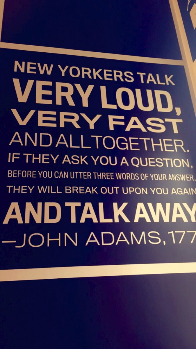
One quote John Adams said about New Yorkers was, “New Yorkers talk very loud, very fast and all together. If they ask you a question,
before you can utter three words of your answer, they will break out upon you again and talk away.” I think this perfectly describes the
people that live in this city. The type here is Sans Serif. ‘Very loud, very fast… and talk away’ is bold. The rest of the quote is regular or
light. Also this quote is written in all caps. The text is reserve type since the text is white and the background is black. (The background
only looks blue because I put a filter on it)
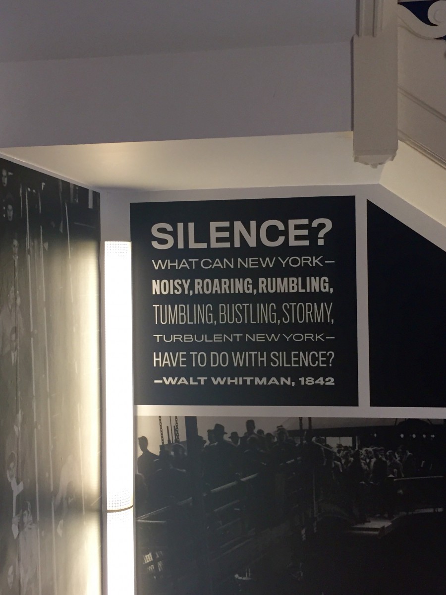
Another quote that was said by Walt Whitman, “Silence? What can New York- noisy, roaring, rumbling, tumbling, bustling, stormy,
turbulent New York- have to do with silence?” This is another very accurate representation of this city. There is always noise and never
any quiet. This quote is also in all caps and reserve type like the pervious one. ‘Silence’ and ‘noisy, roaring, rumbling’ and Walt Whitman
is bold. The rest of the quote is light. ‘Tumbling, bustling, stormy’ is condensed.
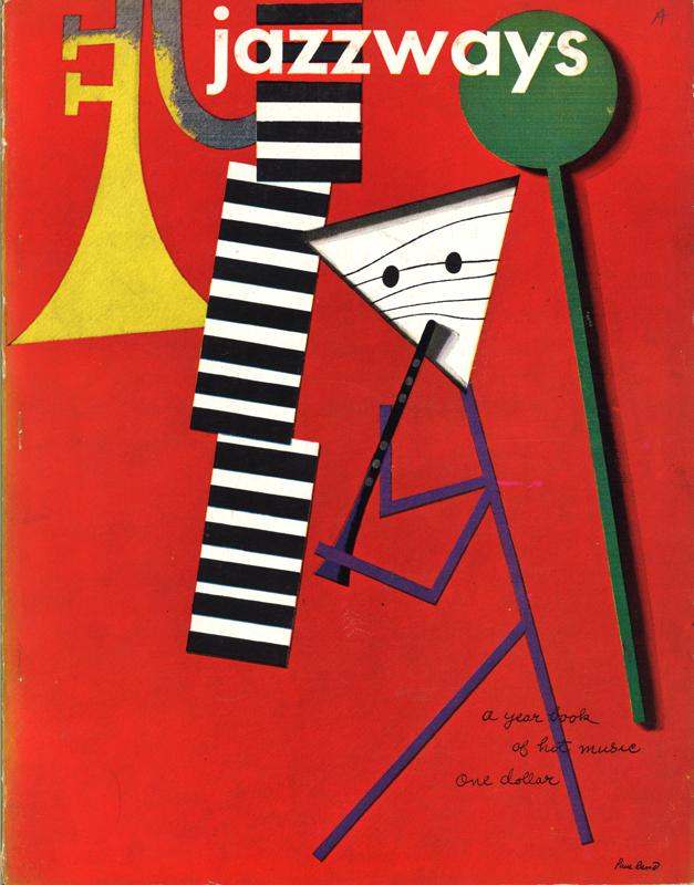
From the Paul Rand exhibit, there is a 1946 cover design of Jazzways Magazine that Paul Rand created. The background is red and
there is a stick figure with a black and white striped triangular head playing a clarinet. On the right of the stick figure is a green stick and on the
left there is a trumpet that is fading from yellow to gray. Next to the trumpet is three rectangles that have black and white stripes. I believe that
it’s supposed to be a xylophone and the green stick is what you use to play it. All of this creates a jazz-like feel which has to do with the magazine
hence the name Jazzways.
