
Category: COMD 1100
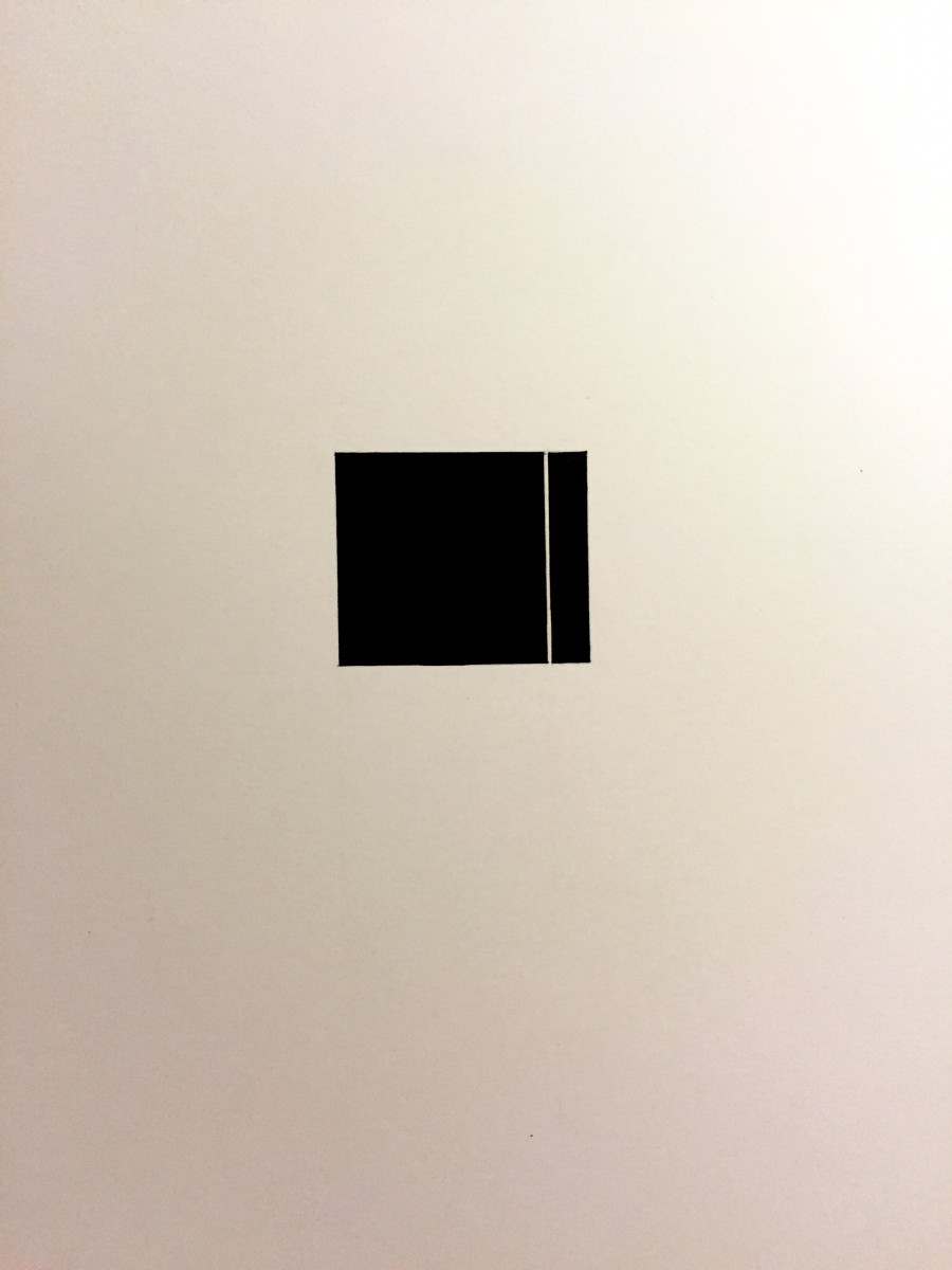
Each side looks equal the top, left and right sides are 5 5/16 in.
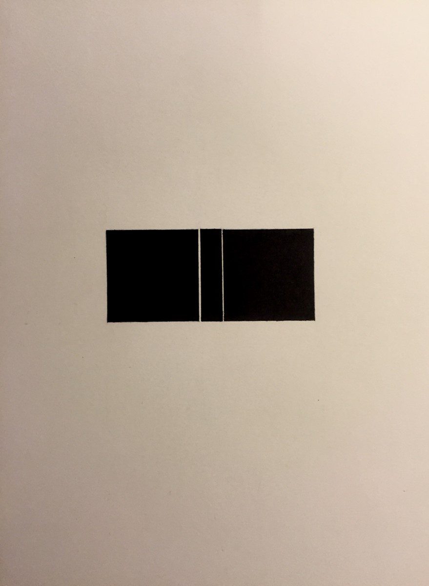
The space between the squares is 1/32 in and half of 1/32 in. The squares are 1 1/2 X 1 1/2 in.
Before starting this class, I thought we were going to work with the computers. I thought we were going to use Photoshop, InDesign and Illustrator. In Photoshop I thought we would work with colors, in InDesign, work with text and in Illustrator make graphics. I also believed this class would be similar to my color theory class that I took previously. This is because in color theory all we did was work with color and the class name ‘graphic principles’ led me to think we would do the same.
After beginning the class, I was a bit taken back with the first assignment (which was to draw a black square on a page) just before student samples were shown. Although, I liked the fact we had to draw by hand as it was something different, I liked doing this positive and negative space project because I like to draw. These assignments improved my drawing skills. I like to draw abstract drawings using shapes and anything that comes into my mind. When the assignment was explained, what I had in mind for how the result was supposed to look like was different from what was shown. I had to draw a perfect square. What helped, was that I saw exactly what was expected of me with the square as a focal point in a balance of positive and negative space.
When doing the critique, I didn’t think we would be speaking individually in front of the class explaining what needed improvement and describing the contrast, value, pictorial balance, etc. I thought we would just be all talking together and telling each other what we could fix as in my other class. Also I didn’t understand what draughtsmanship was until I looked it up. I’ve never heard of such a term to describe drawing. The critique helped me see what did not and what did work with a project. It helped improve my sensibilities.
I see advertisements in a whole different way. I never knew about “form follows function” or chiaroscuro. I never knew there was a word to describe a black background against a subject. I do not look at ads like a consumer anymore. When I looked at ads before, I used to ignore them and feel like it’s all a false image. I thought it’s a false image because it doesn’t represent ourselves or the masses. Now when I look at an ad, I analyze. I analyze everything from color, to what’s being sold, how the models are posed, and the company or designer selling the product.
I have noticed that I have become more sensitive to color than I have been before this class. Before, I already could tell when color changed but now my perception of color improved a lot. I took a color vision test from X-rite (which is a test that measures how well you see color). In the test you have three rows ranging from one color and slowly transitioning to another that you have to put in order to see if this was really the case and it is. The last time I took that test I had a score of 8 and now it’s a 3. The scores range from 0 (perfect score) to 100 (poor score). I see changes in tone and hues of colors much more clearly now.

