Table of Contents
Project 4 Slides
Principles of Color Slides
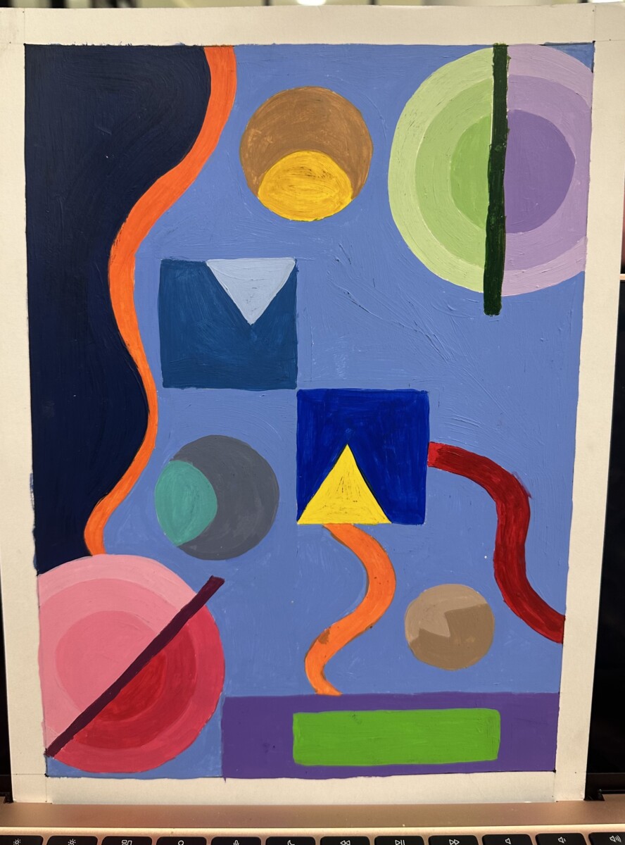
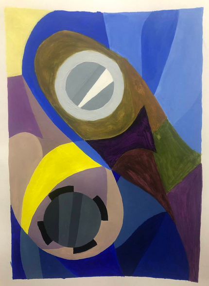
Problem: Create Abstract Painting Composition that expresses your personality, using principles of Color.
Materials: Sketchbook, pencils, Bristol Board 9×12″, acrylic paints, brushes, palette, rags, water container, scissors, exacto knife, ruler/t-square, glue/adhesive.
Concepts: Hue, Saturation, Pure/Prismatic Color, Muted Color, Desaturated/Chromatic Gray, Achromatic Gray, Luminosity, Primary Colors, Secondary Colors, Monochrome, Analogous, Complementary Colors, Warm, Cool, CMY, RGB, RYB color models/systems.
Technical Skills: painting techniques, Drawing, Thumbnail sketching, graphic tools.
Outcomes:
- Ability to recognize and define major color properties: hue, value and saturation (chroma)
- Ability to see individual hue in terms of it’s value, in relation to other hues.
- Ability to identify and create Gradation and Contrast in color relationships.
- Use of color palettes, including monochrome, analogous, complimentary, triads (primary, secondary) etc, .
- Comfortable with paint mixing, paint application, formatting page, using rulers and tape for edges.
Grading Rubric
Each project will be graded using the Project Rubric. Complete each part of the design process, following the due dates provided in each class meeting agenda.
Design Process
- Discover: Hand Portraits & Value Scale
- Define: Journalistic style Self Portraits
- Develop: Media Transformations – Paint and Pixel
- Deliver: Post and Comment
1. Discover
Discover:
- Research Color wheels, Bauhaus Color theory, including Paul Klee, Albers and Itten
- Photograph and post on Visual Library gallery of 4 examples of Color in nature or products:
- Notice color attributes, develop vocabulary: High Saturated, Neutral, Warm, Cool, Triad, Monochrome etc.
- Color Exploration with Paint
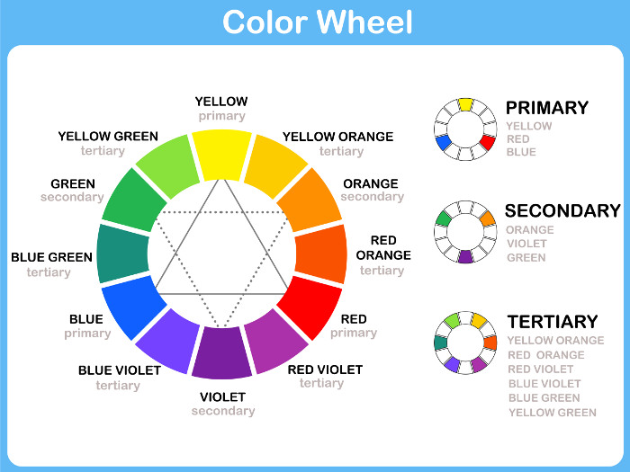
- Using a Compass or something else to create a circle. Split it into 12 triangles.
- Paint the 12 colors of the color wheel as seen below:
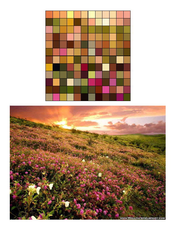
- Digital Exploration : Open Photoshop to explore Warm and Cool Nature imagery through Pixelated Filter.
- Choose 3 Nature images , from your own photos if you have, or others
- Open new document for each image. Copy layer and experiment with Filter-Pixelate- Mosaic; 200 pixel
- Crop and Save 3-4 details with distinctly Warm or Cool palettes.
- Challenge: Build your own small digital color grids using gradations and hues found from your pixelated photos:
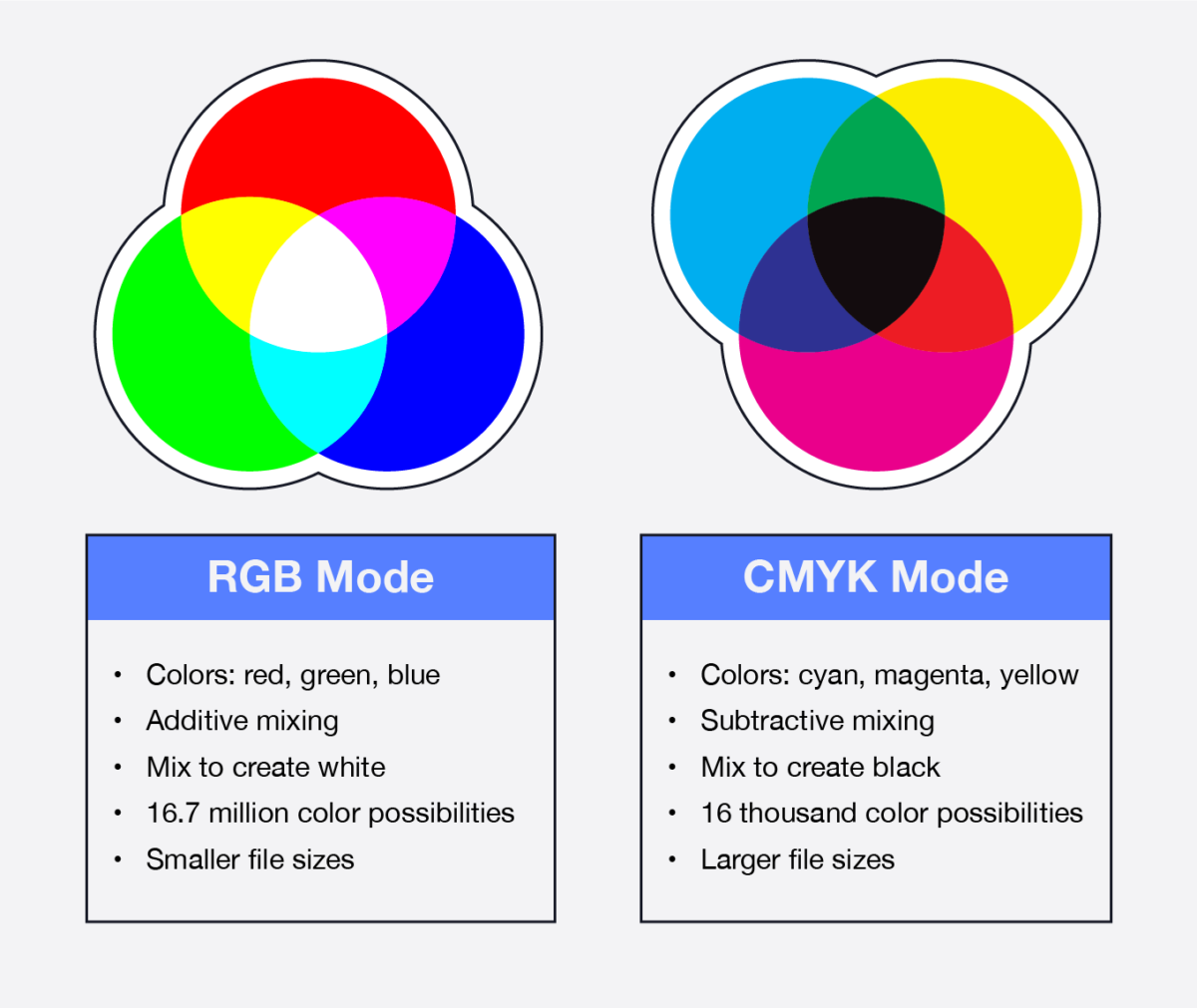
- Study additive CMYK and RGB numbers to correlate to your subtractive paint mixtures.
Paint Cool & Warm 4×4 squares
Paint Secondary colors with tints and shades
2. Define
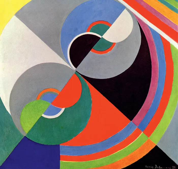
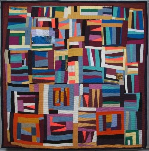
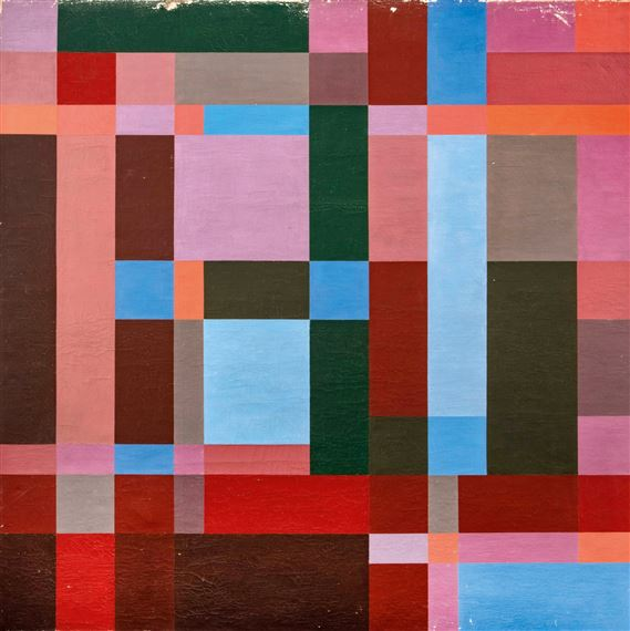
- Research for inspiration Modernist Artists Sonia Delauney and Johannes Itten and the vernacular Gees Bend Quilters, and others.
- Choose 3 images for Inspiration and post on Openlab Visual Library
- Look for compositions that interest you for color variety, color value relationships, and qualities of shape and rhythm.
- Analyze color properties throughout paintings. Warm, Cool? Analogous, Gradations..
- Write short paragraph for one or both paintings, color analysis
- These are for inspiration only; you won’t copy but will interpret in your own composition
- Thumbnail Sketching
- Sketchpaper – 3 large thumbnail sketches
- Use bars, stripes, circles, arabesque, triangles, and overlaps, repetitions, scale, with Ambiguous Figure/Ground relationships and an interesting dynamic.
- Use straight division lines to separate areas in which you may use different value keys and palette choices.
- Painting Process
- Decide best composition from sketches
- Redraw onto Bristol, leaving 1″ border all the way around.
- Use rulers and circle templates for precise edges
- Palette: Painting must show use of:
- Gradation (such as a hue changing incrementally to another hue or a darker value
- Contrast: larger changes from color to color or dark to light.
- Palettes: choose 5-6 colors amongst Monochrome, Primary, Secondary, Tertiary, Complementary, Achromatic, analogous. Consult Color wheels and Adobe Color for ideas.
- create color strips,( small scales) on sketch paper for each palette; choose 5-6 colors for the painting.
- Consider Value so you are making decisions where to go light or dark.
- make decisions that reflect personal interests.
- In divided areas, switch from Dark hues to Light hues, and palette to palette, so that there are clear separated areas, that will also serve to create contrast and unity for entire piece.
3. Develop

Painting Process
- Decide best composition from sketches
- Redraw onto Bristol, leaving 1″ border all the way around.
- Use rulers and circle templates for precise edges
- Gradation (such as a hue changing incrementally to another hue or a darker value
- Contrast: larger changes from color to color or dark to light.
- Palettes: choose 5-6 colors amongst Monochrome, Primary, Secondary, Tertiary, Complementary, Achromatic, analogous. Consult Color wheels and Adobe Color for ideas.
- create color strips,( small scales) on sketch paper for each palette; choose 5-6 colors for the painting.
- Consider Value so you are making decisions where to go light or dark.
- make decisions that reflect personal interests.
- In divided areas, switch from Dark hues to Light hues, and palette to palette, so that there are clear separated areas, that will also serve to create contrast and unity for entire piece.
Painting Tips
- Remember protect your painting with tracing paper as you work. Paint is delicate and can easily pick up the dirt and oils from your hands.
- Before you apply paint to paper make sure it’s completely mixed in the palette to produce a flat consistent appearance. We want flat, blocks of paint without streaks or brush marks.
- Keep two containers of water, use 1 for washing your brushes and 1 for adding water to paint.
- Wash your brush after each value is mixed and applied.
- Use a paper towel or rag to get excess paint and water off the brush before mixing a new value.
4. Document
When you are finished, scan your artwork using the available scanner in the classroom or computer labs. Or take a well lighted, well composed photograph. This image will be uploaded to class blog for critique and grading.
Use this guide to avoid common mistakes when photographing your work with a camera phone.
4. Deliver
Submitting in your work
Follow the How to Post Your Work guidelines and include the project-specific details below:
- Post Title: Abstract Color
- Written Project Reflection: Document your thoughts about this project. Think about what you learned, what you could have done better (planning, material use, craft), and how you will apply what you learned to your next project. Consider and respond to the comments made in class during the critique.
- Images: Organize your post to include all images from the three other Design Process phases for this project. (Discover, Define, Develop).
- Category and Tags:
- Category = Project #4 Posts
- Tags = Deliver, Value Portrait
Providing Feedback
Part of your Project grade is leaving well-written comments for your peer-critique partner and at least one other student. Follow the How to Comment and Critique guide for specific guidelines for leaving constructive feedback.
REMINDER: You will receive a grade and comments from the Professor on your posts and peer comments. Without your deliver post, you will not receive a grade.
Critique
- Bring all parts of this project to class: Discover, Define, Develop.
- When presenting your work, start with following: your name, the project title, the theme of the project, what you feel you did successfully, what you can improve on next time.
- Your peers and the professor will provide supportive, constructive feedback.
- You will have an opportunity to revise your work based on the feedback and improve your work and your grade.