This is my second revision of my Quotation Concepts:
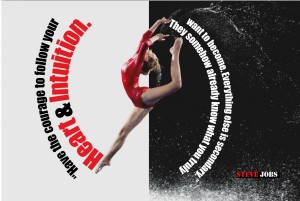
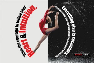
1-The first concept: Here I just did some resizing of the text box to be more fit with the photo background.
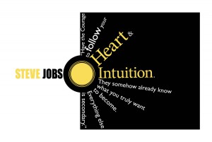
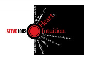
2-The second concept: I changed the font of the quote fro serifs to sans serif to give more contrast and more legible as well as i changed the color to yellow as sun shine.
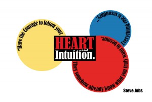
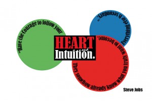
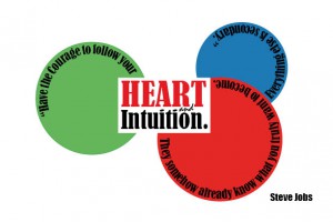
3-The third concept: Here i did more changes to make it legible and to give more clarity for the quote of beginning and end. As well as change and add more other colors.
4-The forth concept: just a little change I did to make it more like RGB color space.
The quote I picked up for my three concepts is for Steve Jobs:
“Have the courage to follow your heart and intuition. They somehow already know what you truly want to become. Everything else is secondary.
1- in my first quotation concept I used a gymnastics girl picture as a background for my quote http://www.scottmartinezphotography.com/photography/photography/gymnastics-photography_files/page17-1001-full.html
I like to use a few colors and two kinds of typefaces to show the contrast clearly. For this purpose also I used the black, red and white colors. The sans serif impact/regular typeface is used here for the quote and stencil/regular is used for Steve Jobs. Of course I pay attention to the alignment, which is very important in typography.
2-My second concept is more like the sun shining in darkness. I used the same three colors of red, black and white as well as two different typefaces to show the contrast and proximity.
For Steve Jobs name, I used the impact sans serif typeface while for the quote I used the minion regular serif typeface.
3-The third concept is more like playing with typography to show everything is circling around the HEART & Intuition, which are very important words here. Red, black and white colors are used here to show the contrast as well as the typefaces. Bernard MT condensed serif typeface is used here for the quote. Impact regular sans serif typeface is used for the name Steve Jobs.
