Author Archives: Alana Langyel
TYPE II Favorite Project from Type I
Something I look forward to seeing at the Cooper Hewitt
One of the main things that I would have looked forward to seeing at the Cooper Hewitt would have been all of the unique color patterns and compositions in the museum. I really like seeing color and it really can attract my attention to something. I would have liked to see just how the different artisits used and mixed the colors together in their compositions in their own unique way.
3 Pictures I would do a color inventory of

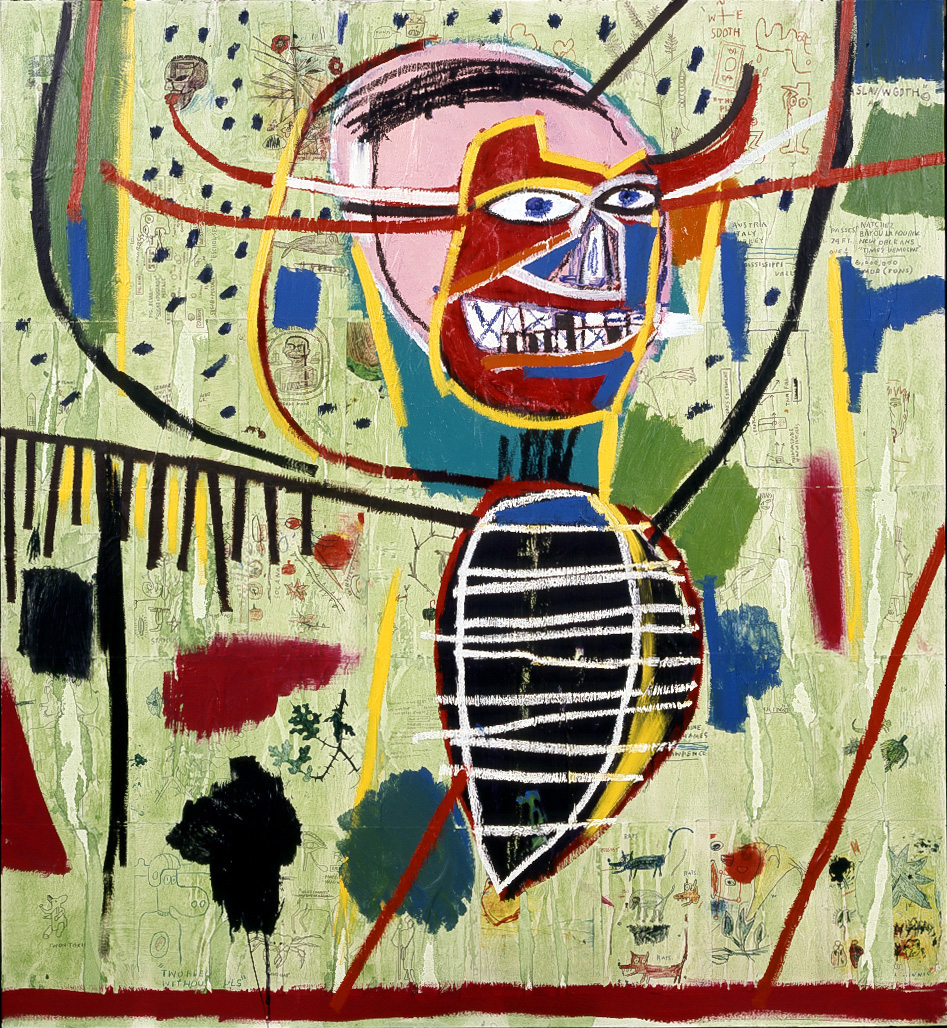
http://www.thebroad.org/art/jean%E2%80%90michel-basquiat
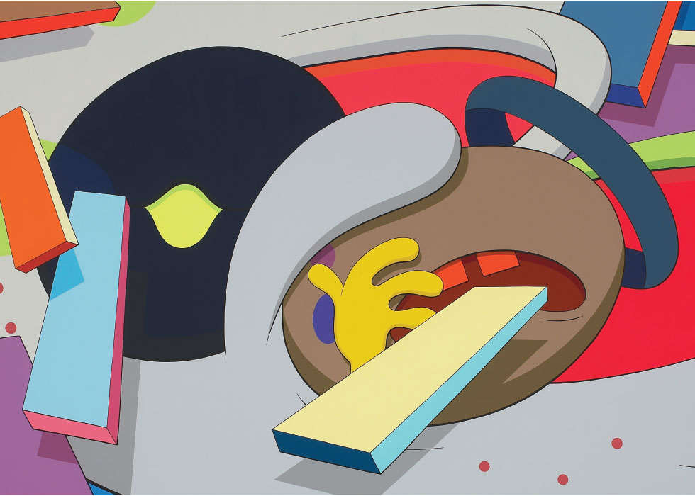
http://www.themodern.org/exhibit/kaws
Examples of the different color relationships in the Cooper Hewitt Collection

This composition is a good example of showing complementary colors because it is showing the complementary color set yellow/purple being across from each other and since they are next to each other the two colors I think tend to stand out more and appear to be more bold rather if they were not next to each other at all.

This composition shows a good example of a tetrad forming together from the color wheel. A tetrad is a group of four colors taken together from the color wheel usually including 2 complemetary colors. The tetrad of colors shown here are red, blue, green, and orange. Where red and green is one set of complementary colors and blue and orange are the other set.

This composition is a good example of showing the triad of primary colors which are red, blue, and yellow.

This composition displays a good example of analogus colors-which are colors closely related on the color wheel. The analogus colors represented here are blue, blue-violet, and violet.

This composition displays monochromatic colors which is a color showing the different tones of itself in addition to the ground hue. Here the green is seen as a solid green but then it also shows itself in different spots where it is either lighter or darker.
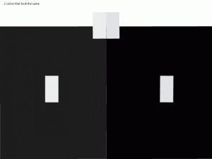
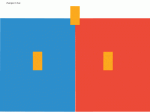
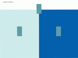
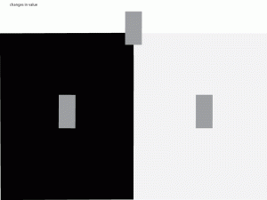
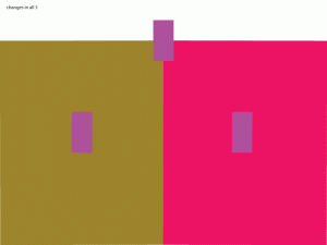
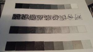
Showing changes in color,value,saturation
NY Times Article relating to color
The article that I found relating to color was about an art critic named Clement Greenberg that only found interest in “color field paintings” which is defined by Greenberg as ‘the lighter-then-air-abstract style with an emphasis on stain painting and visual gorgeousness.’ He also talks about how people like Jackson Pollock were big influences in this style and how during the 1970’s the style seemed to die down. However he is reviving it by showing and telling about his appreciation for color field painting and abstract expressionism and the works of the style hung up in museums.
http://www.nytimes.com/2008/03/07/arts/design/07colo.html
Project 3 Review
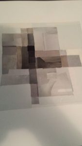
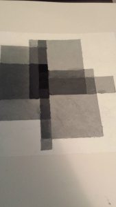
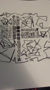
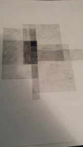
I have learned a significant amount of material from doing project 3. For starters I have learned mainly about how to apply transparency and layering to a composition. I knew about transparency and layering before this but I never personally used it or thought about it all that much. However since this project came about by doing transparency and layering in a composition 4 times I now have a better idea of how to go about it. Such as where to place things on the page, greyscale/value, where exactly to make things lighter/darker or adding a certain amount of white or black to each other. I also learned and got to explore the creativity used in transparency. thinking about what can go underneath a square, how many layers will be on it, how dark it will be etc. I feel like since I have done this project I will now have a better idea and format about transparency, layering, and value.
Funny Venn Diagram

3 examples of layering and transparency from the Cooper Hewitt collection
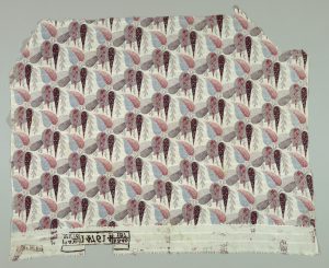
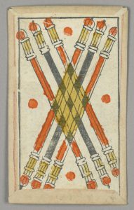
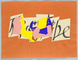
These 3 compositions that I found from the Cooper Hewitt collection online are what I believe to be good examples of transparency and layering in graphic design. The first and third compositions I think show good usage of layering. In the first composition, the tear drop like objects overlap each over while still showing the parts that are not covered pretty much consecutively resulting in this being a good example for layering. In the third composition the multi colored irregular shapes strategically overlap most of the letters in the background while still leaving what appears to be a ‘b’ and ‘e’ poking out so you can still tell that there is something behind the multi colored pieces which makes it a good example for layering. Lastly in the second composition, I think that it is a good example for transparency because the candle light figures are shown to be overlapping, however the composition still shows the part underneath that is overlapped and darkens the color of the objects underneath to give a sense of depth and transparency.


