
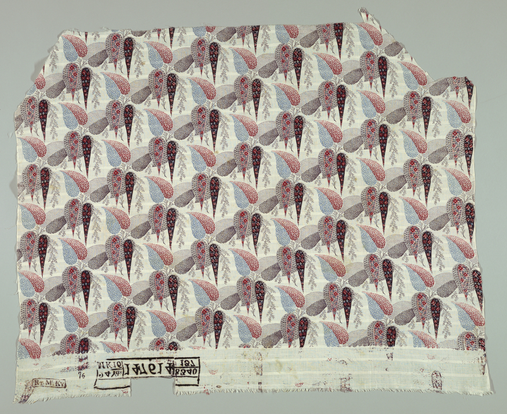
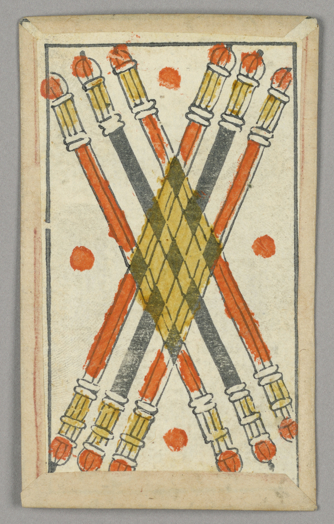
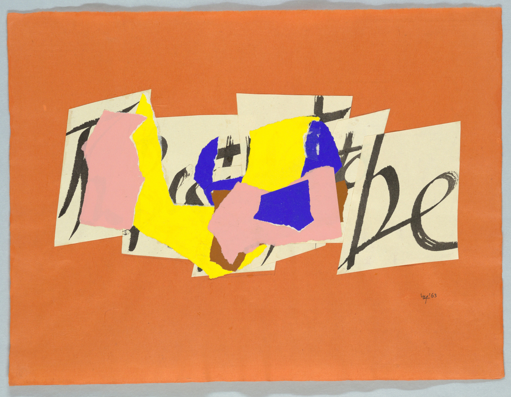
These 3 compositions that I found from the Cooper Hewitt collection online are what I believe to be good examples of transparency and layering in graphic design. The first and third compositions I think show good usage of layering. In the first composition, the tear drop like objects overlap each over while still showing the parts that are not covered pretty much consecutively resulting in this being a good example for layering. In the third composition the multi colored irregular shapes strategically overlap most of the letters in the background while still leaving what appears to be a ‘b’ and ‘e’ poking out so you can still tell that there is something behind the multi colored pieces which makes it a good example for layering. Lastly in the second composition, I think that it is a good example for transparency because the candle light figures are shown to be overlapping, however the composition still shows the part underneath that is overlapped and darkens the color of the objects underneath to give a sense of depth and transparency.

