
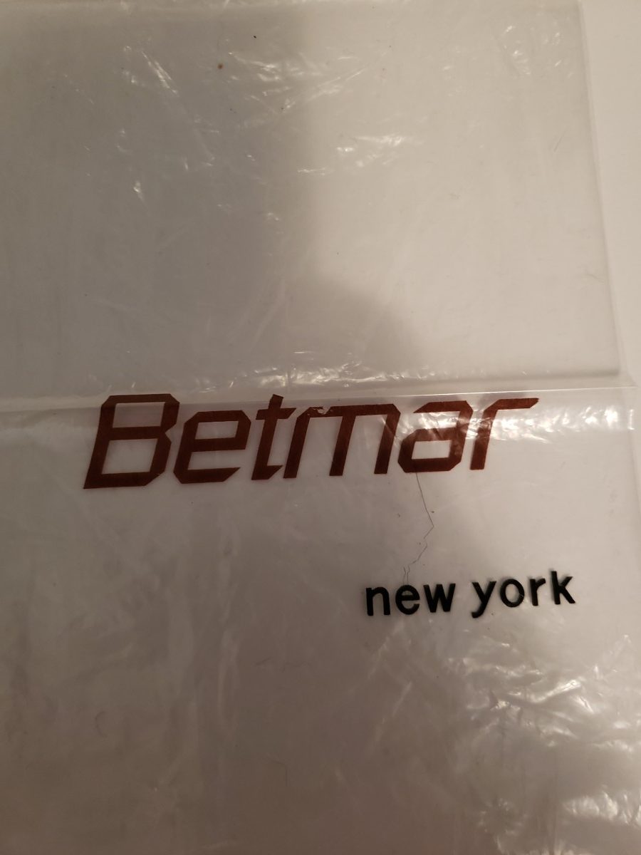
The original ‘Betmar’ logo font that Taradash was inspired by to create her name for her homepage
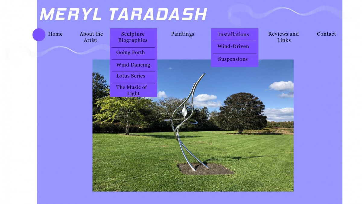
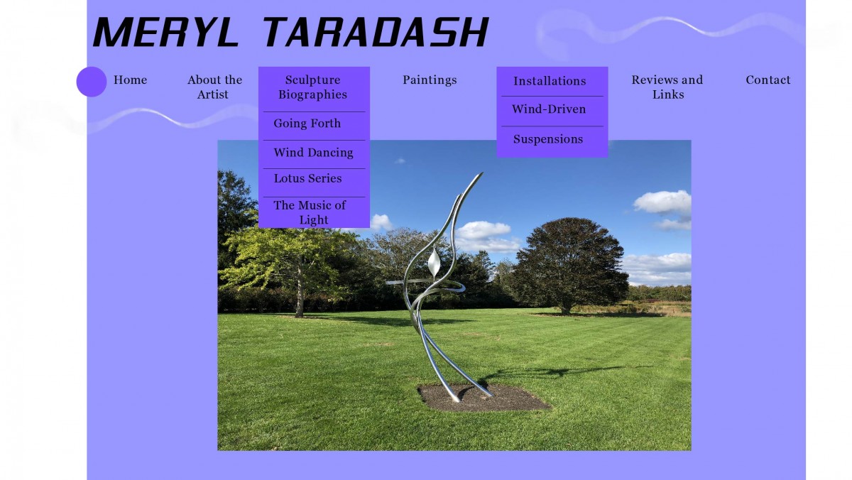
After the previous meeting the Professor and I had discussing the new updates I made to the site homepage and some of the critiques the Professor gave me, I went home and applied her advice that she had. I took time away from working on the site design and worked on some other projects to give myself some time to refresh and relax. I decided I wanted to go in and look at the site with a fresh and clear mind. And I wanted to approach it in a new perspective of design and layout and really live up to the expectations of the Professor and her critiques. So when we met back up on Sunday at her apartment, I showed her the new and improved layout of the site based on the critiques. The Professor was decently impressed with the improvement and changes to the site. I fixed up a decent amount from the site to the type to the graphics and the photo etc.
However the typography and fonts were still a bit of an issue and needed some work. We sat down and looked at everything in a new perspective and tried to figure out what the Professor really wanted. She had the idea of looking at an old logo from a hat making company that was a family business that she designed for briefly when she got out of college. The logo was on a small plastic bag that stored a pair of gloves in it and the company was called ‘Betmar’. The reason why she liked this font so much was because it showed a sense of movement and progression within the font and direction. I took this idea and went home with it. Unfortunately I could not find the official and original ‘Betmar’ font for their logo so I had to improvise for this one. I went on 1001fonts.com and tried to find a replica font or something that looks as similar as possible and found two potential options for this idea. I am meeting with the Professor again later this week so we should be able to distinguish which font choice she likes better.
During this time we also went through and sorted out the paintings that were potentially going to be displayed on her website. We went through her computer documents and sorted through which are the best paintings to be featured on her website. We went through many wonderful paintings but narrowed it down to at least 10 or so paintings. We were able to get that done and out of the way as well as accomplishing the sculpture biographies and narrowing down the top 10 best sculptures. We have finally managed to get the main content of the site out of the way and decided on, now all we have to do is design the layouts for everything.
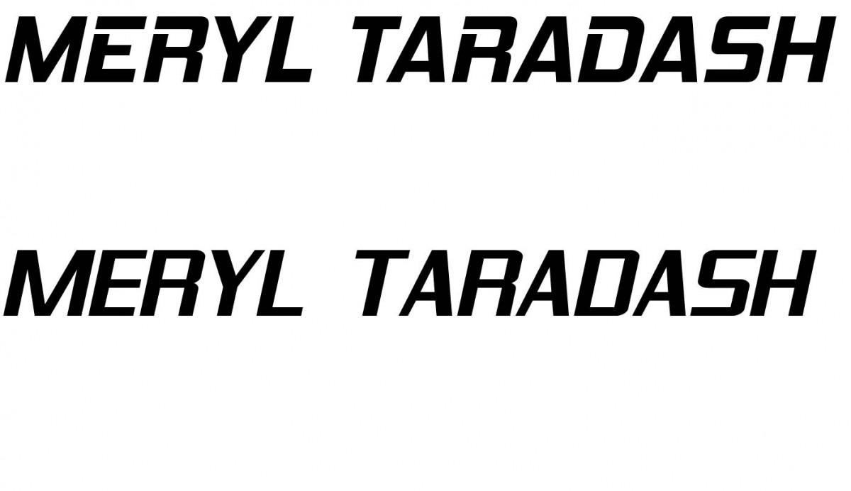


Sample font choices for Taradash’s name on the web homepage.

