Verdana in white Verdana in black

Myriad in black Myriad in white
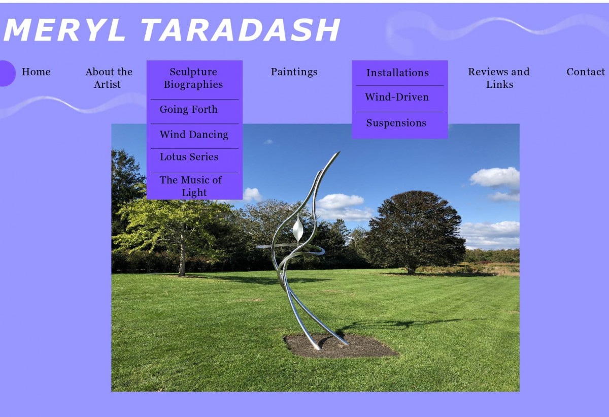
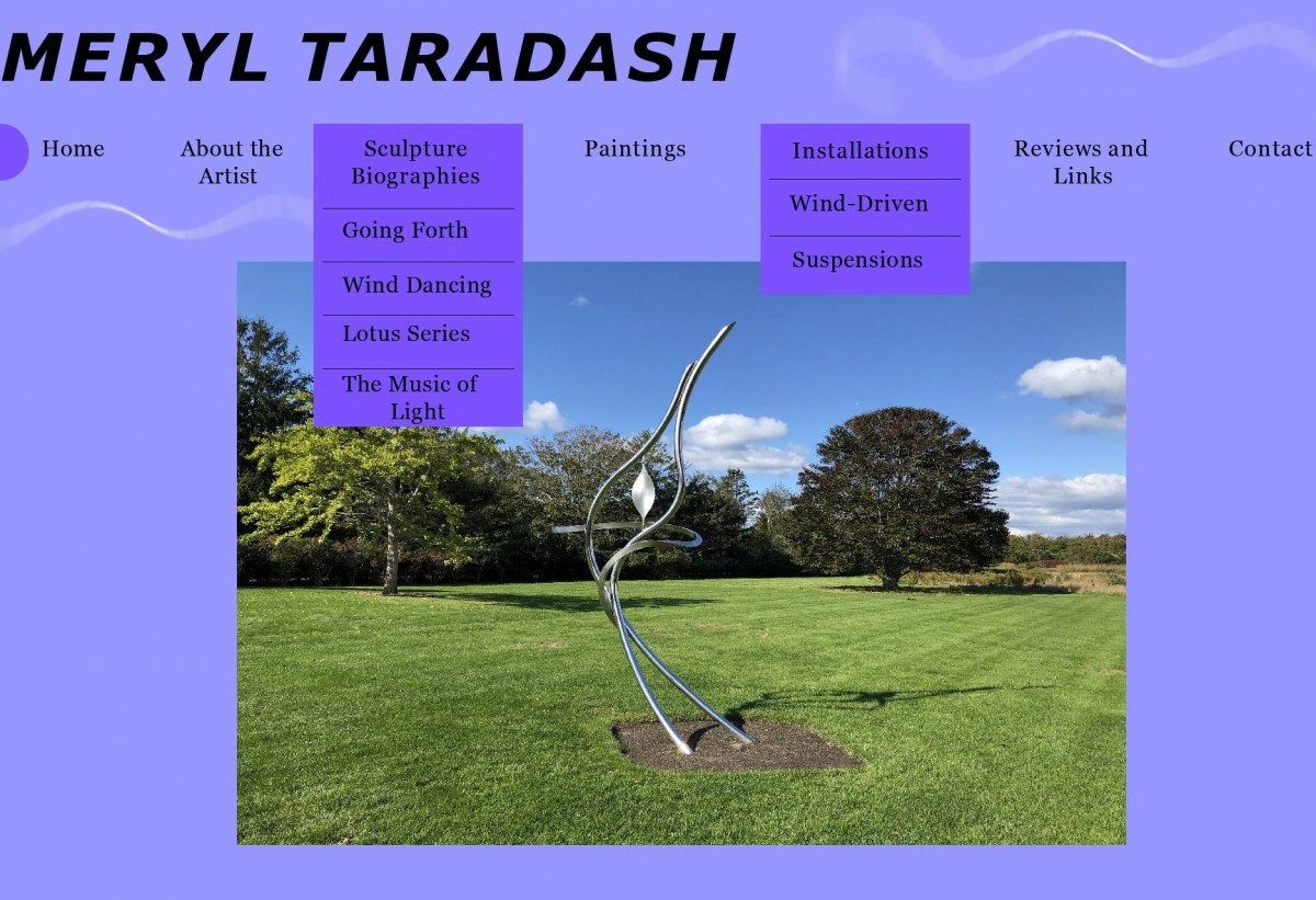
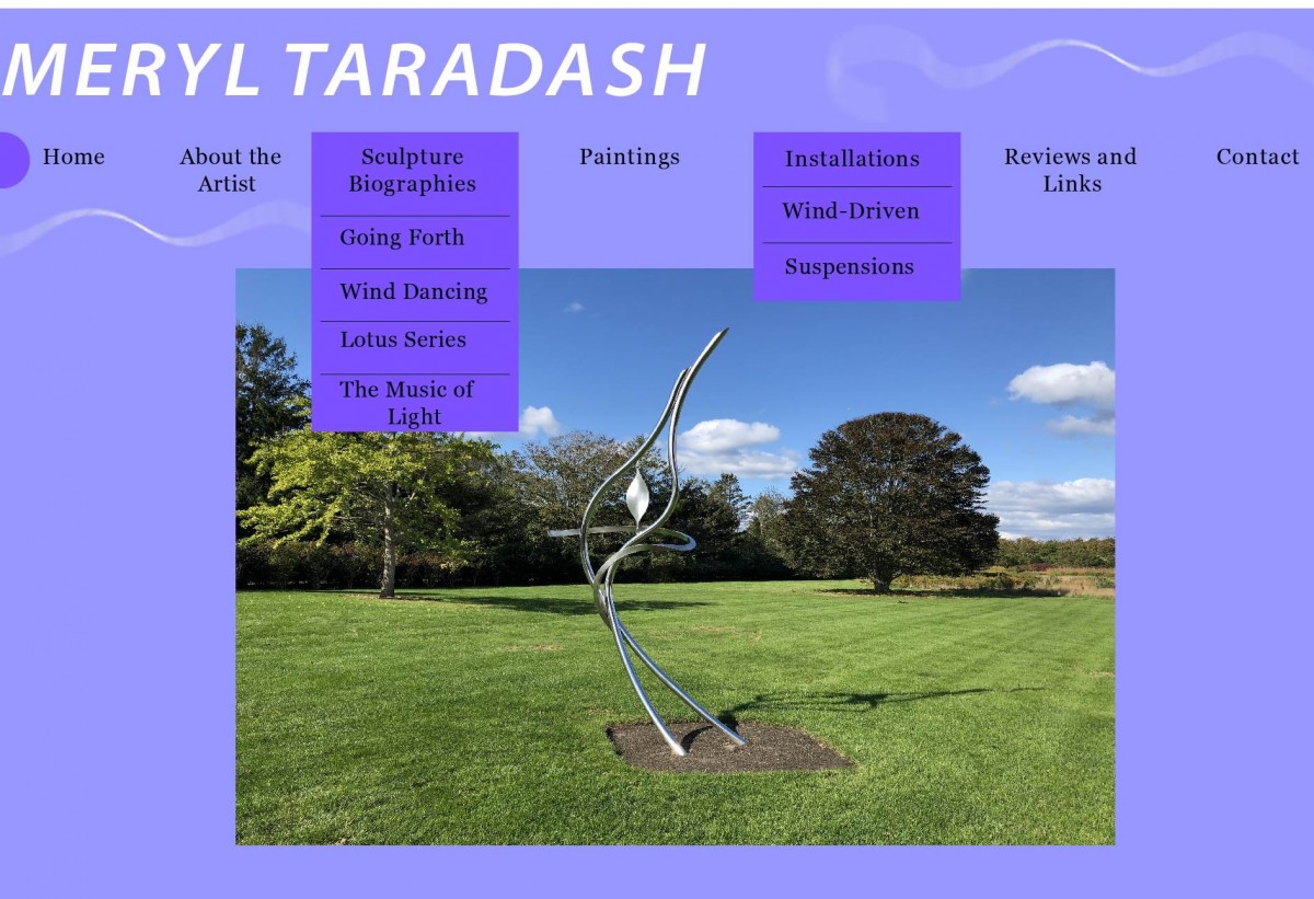
The Professor and I looked over the spreadsheet of fonts that I created and she was fairly satisfied with what I came up with. She looked over the different font proposals and decided that she liked Myriad Variable Concept- Semi Bold and or Verdana the best. We are not sure whether black or white font is better so I just decided to come up with mock ups for both fonts in both black and white for each. We then meet up again later in the week and I come back with the mock-ups to look over them with her. She was geared more towards the Myriad Pro in white, and I would also have to agree that Myriad in the white looked the best compared to black or Verdana. We also took the opinions from other students in her Drawing class as well as other colleges of hers and they would also have to agree that Myriad in white looked the best. We also wanted to hear an opinion from Daniel, who is the other person working for Professor Taradash and wanted to update him on the website process.
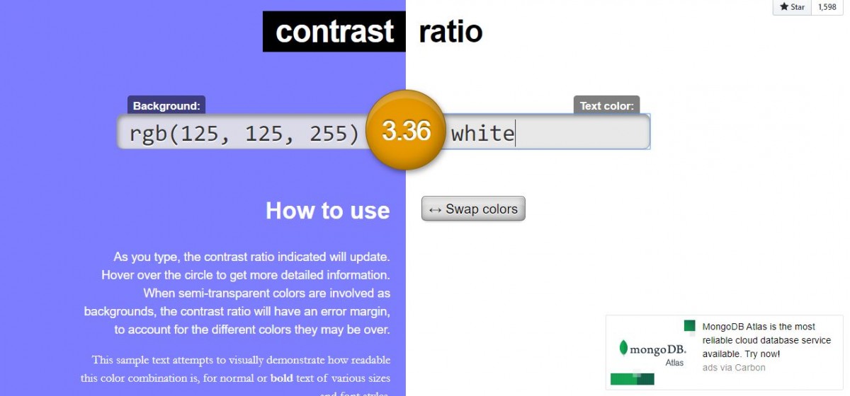
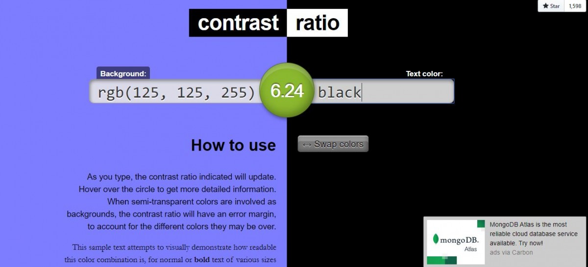
I emailed him the mock ups of the headers and he said that everything about the site looks really good so far. His only recommendation was to check the color ratio between the purple background and the white or black font. He recommended a site called contrast-ratio.com where you would enter the color code and it would test the two colors together and would tell you whether they would have a good contrast and appear well together on a website and a green score would be a good contrast. I tested this and interestingly enough, contrast-ratio.com signified that the specific purple background we have against white is not a good score while the purple against the black would be a good score. I was worried that this would affect the Professor’s opinion on the white font. However, we are still considering to go with the white font since it stands out the best from the other contents of the site and think it is a good match. Daniel agrees on this as well despite the contrast-ratio.com results. So we finally have our header for the Professor’s name now we are planning on moving onto the rest of the web pages starting with the sculpture biographies which I plan to make mock ups of based on previous notes.
Contrast-Ratio.com Results: