Monthly Archives: March 2014

A World of Its Own: Photographic Practices in the Studio

So far, as a studio photographer, I’d say that my experience has been somewhat challenging, usually precise, and of course, always fun. Although, I’ve taken a photography class before, I’ve never shot in a studio before, much less my OWN studio. For my first photography class, we were always going on trips. So regardless of the assignments – motion, near & far, or just shooting on our own time – I was always outdoors when taking pictures. However, for this photography class, shooting objects in a studio was a very different experience. Sometimes, it was a bit frustrating, especially in the beginning of the semester, where I was just starting to get the hang of positioning lighting. I’m actually still struggling to perfect lightning whenever I shoot in my studio since it kind of varies according to the subject matter. For our last in studio assignment, which was our midterm, lighting was the main key in having successful happy|sad pictures. The brighter and more defined the lighting was, the ‘happier’ my crayons looked. With less lighting and the positioning of the right light and right set up of crayons, the more ‘sad’ my crayons with look. Shooting in my studio up in my attic is very different from the art we saw in the photography exhibit at MoMA. These artists not only had much larger spaces, but also different mediums to work with, and of course were from a time without DSLR’s.

Although I’ve been to MoMA before, this was my first time visiting this photography exhibit. I found all the pieces to be beautiful in their own way. One piece that I found very interesting was a black and white piece done by Edward Steichen. It was done in 1931 of Charlie Chaplin. From further away, this piece looked like different shots of Chaplin one after the other going across the frame – and they were. However, as you got closer to the artwork you noticed that each shot of Chaplin was on a separate sheet of paper, in which the background was black, and that each of the four separate pieces of paper were placed precisely close enough together so that it wasn’t at all obvious to the viewer unless you got really close. Each piece of paper was cut straight and then midway diagonally down according to the shape of the seat Charlie Chaplin was sitting on. Another piece that I felt very strongly about was done by Peter Hujar in 1981, also done in black and white. They were two self portraits side by side of David Wojnarowicz. In the first one on the left side, he is smoking a cigarette. Adjacent to that, is a shot of Wojnarowicz with his eyes closed and a hand over the right side of his face. Both photos give off a strong feeling of tiredness. Professor Michals shared with me that these were taken before David Wojnarowicz died from AIDS; he and Peter Hujar were lovers. Aside from my love of photographs of people, what I found most beautiful about this piece was the story I learned behind it. Even if you’ve a minimal amount of materials to work with, a lot can be accomplished in the studio, including the mood and feelings your artwork portrays.

Reporter Roberta Smith says that MoMA’s photography collection, “A World of Its Own: Photographic Practices in the Studio”, ‘dazzles but often seems slow and repetitive.’ After reading this statement, I paused and thought about it. In my opinion, I felt that Smith said this because many of the photographer’s styles, methods were very similar to one another. However, I didn’t find the exhibit to be slow; every piece had a little something different to offer. On the third page of this article, Smith writes that, “There’s nothing by James Welling or Louise Lawler, nor any of Ms. Simmons’s small, intensely colored doll photographs from 1979, even though the museum owns work by all of them.” She goes on to discuss the omissions of other pieces as well. I do strongly agree with this point of view; if the museum has possession of work by other artists – they should display it so those artists can gain recognition and appreciation. Smith finishes her article with complimenting the chief and assistant curator on the show. All in all, I too found the exhibit to be satisfying.

MoMA: A World of Its Own exhibit – Arianna Bollers

During the MoMA exhibit, I felt that the experience has redefined studio photography for me because it has showed me how to take advantage of what I have and how I can use it. As my own experience as a studio photographer, I learned how light and composition can really make a difference in a photograph.

At the beginning of the semester, I knew about using tungsten light and natural light. What I didn’t know about each type of light was that you could do so much with it. You can definitely see the difference in my photos, before and after I was introduced to the concept of the egg and how light can transform the shape of the object and the shadow. It’s great to learn so much about what you can do with light and how it can really change the mood of a photograph. I relate the example of the egg to this concept to the MoMA: A World of It’s Own exhibit because of how many photographs I saw that changed the mood and/or created an amazing effect to picture. Harold Edgerton’s four photographs are a great example of that explanation. The way he uses his strobe light to capture the movement of the human form and everyday objects is completely amazing. Another great photograph, named Laboratory of the Future by photographer Man Ray, is truly amazing because how he photographs the mirrored sphere-shape perfectly so that we actually see his studio in the sphere, because photographing glass is hard. I’m sure when it is a mirrored object, it become so much more complex. But if he can execute it, its possible. I feel that these are a few of the many pieces from the exhibit that has inspired me to go above and beyond while photographing a subject. It also shows how much freedom you have when it comes to photography and what you can do in your own studio.

From Roberta Smith’s review from the New York Times about “A World of its Own” exhibit at MoMA, I agree that exploring the medium filled with “professional portraitists, commercial photographers, darkroom lovers” and more, presents a new way of looking at photography “not for a lack of a good idea”. I do share a sense of agreement and disagreement in the following statement, “ This exhibition uses a great collection to tell what should have been a fascinating statement, but it dwells too much in the past…” I personally love seeing old photographs and making a comparison to what has changed and coincidently, what has not.  I actually like the effect of the then and now sequence, just like Smith mentions that takes us two steps forward and one step back. I think it is suppose to remind us how much photographs are similar with a certain theme, even photographs from years past. I also think it’s interesting that she mentions how the show feels ahistorical. But I question if that is the atmosphere the curators wanted to create or not. I not sure if I would call the show ahistorical either but I do think it brings a certain comforting mood to the exhibit by bringing photos by studio portraitists together in one show. I’m not sure if I completely agree with that statement but I do understand what she is trying to explain. 

Meet the Pros – Joseph Rodriguez

Joseph Rodriguez interesting advice on creating your own story inspires me. He starts off discussing his past and how we was heading towards the wrong path several times. He began taking photographs of places in New York were danger was high and were displayed as crime areas in the newspapers. Rodriguez wanted to show more than just crime in the communities, he wanted to show the beauty and that there’s much more to those communities. Rodriguez focused more on family and capturing a hidden look that was meaningful and showed their true lives. The photographer tells us about his fascination of traveling to uncover stories and his near-death experiences. Every part of his photographs have to do with his story towards violence, life experiences, and family relationships. I really loved the part were he talked about the three wise monkeys (hear no evil, speak no evil, see no evil) he told us to ignore what people say if they don’t like your work. Just continue to create your own story and do your work the way you would do it and put a little piece of you in your work. Joseph Rodriguez is all about not giving up and whenever you see yourself in the wrong path steer yourself back in the right direction and pursue your dreams.

A World of It’s Own

Visiting MoMa was a pleasure as always. We saw the photography exhibit, “A World of It’s Own” and it was especially enjoyable because I am currently taking graphic design history and I knew a few of the artists we saw today, such as Eadweard Maybridge, Man Ray and Nadar. Seeing this exhibit redefined studio photography because there was such a wide variety of content/subjects displayed. There were chromolithography pieces, motion photographs, more modern and HD photos, colored/black & white pieces, portraits and objects; a wide array. Most of what I have photographed in a studio setting has been mostly simple and commercial rather than out-of-the-box ideas.  This exhibit really showed the evolution of photography as a whole which was very nice to see. My absolute favorite piece was Christian Marclay’s piece, Allover, which was a blue background with a white overlay of cassette tapes that were taken apart and strung, messily, across the whole piece. This was done recently (2008), which I found interesting because cyanotypes are sort of an out-dated photographic printing process, which I feel opens up a whole new, yet old, type of photography. For a little less than a century, all photographs were black and white and the first color photo wasn’t invented until the late 1800s.

The exhibit also had a few photos that had videos that went with them. These videos showed how the photograph came to be which was very interesting to see. Some of these photos didn’t look motion-oriented but the process of taking them was and the photo wound up being almost a screen-grab of that process. There was another video that showed a bunch of photos showing a cabinet in different positions, so that when they were strung together, it looked like the cabinet was moving in a flip-book kind of way. The video looked very grainy and was black and white so that indicates it is very old and could have been used then, to demonstrate how motion pictures work. These videos inspire me to want to photograph things in motion, which we have sort of touched upon in class with the colored water photo-shoot.

I completely disagree with the NYT article’s first line, that there was “not enough color.” In order to understand what you have now, you have to know where you come from, and photography is roughly 200 years old. Yes, this exhibit largely favors black and white/non-modern photos, but that does not diminish the meaning of it at all. I do agree that “the curators set out to trace the medium from inception to the present in a way that has never quite been done.” I also agree that the exhibition did “ignore(s) the great stream of images with which the Modern’s influential photography department has been most identified.” There was a lot of human interest/portrait and inanimate objects but little to no landscapes, animals, advertisements, urban life, etc. It does, however, accurately portray the different mediums of photography throughout the ages. Lastly, I feel like the fact that there was a lack in female photographers wasn’t entirely important. Sure, as a woman, I would have loved to have seen what women have brought to the photographic table, but this exhibit isn’t about a battle of the sexes. It is about showcasing photography, and I guarantee, from the time the camera was invented – 2014, photography is predominantly male.

Spring

For this week I venture myself on the cold of what is New York City. I decided to go to prospect park and get a few shot of the little green things that are starting to come out of the ground. Sadly theres not much at this time of the years but I did manage to get a few shots. When the climate changes so much not a lot of green is seen. I associate green to spring. Green is mostly the color of nature and it gives the feeling of something being alive.

Spring

I was really excited to work on this project because I really have a fascination towards nature and Spring, but I didn’t realize that it would be so hard since everything is basically dead! I decided to go to the Botanical Garden in Queens for the first time hoping I would see growing flowers and plants. I found some good pictures, but it turns out the light was pretty harsh in some images, so that was difficult for me. The other photographs I took at home in my living room which is filled with plants and flowers. Overall, I had a fun time getting out of the house and hopefully we get to go out more often for other projects!

Spring

This assignment sounded a lot more fun than it actually was. We didn’t have to be in our studios for this assignment or even photograph one specific object. Instead of using my usual camera, I used my phone, this way I could capture ‘Spring’ while I was on the move. Before taking my pictures, I made sure that my exposure and white balance were correctly set. I took these pictures on my way to and from school and basically whenever I left my house. My pictures aren’t as Spring-like as I would have liked them to be but they are all accurate of what could be found in this weather.

Spring

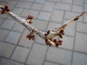
This weeks photo shoot was a welcome change from the indoor shoots we have done all semester. I shot in daylight/sunshine around my neighborhood and decided to focus primarily on nature. The only problem I encountered was that I was hoping to photograph budding flowers and such but even now, there wasn’t much of that and everything still seemed to be dead, and there were only a few minimal flourishes. My favorite photo from this shoot is:

IMG_6930

because it has a good contrast in color of the red bud against the dull cement,  and most importantly it show the budding that I was hoping for!

HW7: Mid Term Part 2 Diellza Kasimi

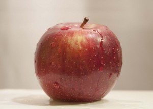
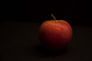
HappyApple Apple Sad copy

As you can see less is more. I’m truly proud of these two photos. I started with lots of fruits and ended up with just one apple. I took way to many pictures and had a hard time deciding which one to pick but with classmate’s and professor’s help I was able to pick these two. I have to say that Angelo’s egg was an inspiration for simplicity 🙂

HW6: Mid Term Part 1 Diellza Kasimi

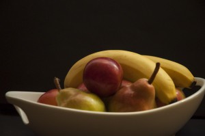
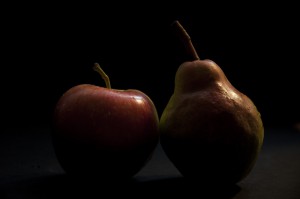
DSC_0015DSC_0035

I started working with several fruits and took pictures at night and during the day. Behind my studio there are large windows that have natural light coming in. The windows have white shades and also beige colored curtains. I worked with one light that was placed a little higher to the right. I would cover the light with different colored materials. I also used the hand lamp and would just play around to see what I could get. I took over 100 pictures and really really had a hard time picking from them. Sometimes I guess less is better!