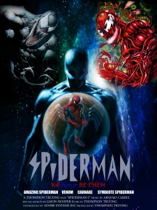
I made this poster for Raster & Vector. The logo was made in illustrator. All the images I got were separate and I masked them out and placed them together. At first I remember having a program with the format of the poster. As I worked on the project I came out with this placement of characters and I thought it came out pretty good. I am contemplating in making another piece and see how much I improved with my skills since making this poster.
Thompson Truong's ePortfolio
Just Another WordPress Site


I Love Spiderman..
thanks for sharing
Thank you, I don’t use my openlab eportfolio much anymore. Checkout my official wordpress at http://ttruong93.wordpress.com/ will be adding more content.
wooww the hero spiderman.. be i want wash again
What a great poster 🙂
you should practice everyday to make a better poster. Can you draw a poster of black widow? i love her 🙂