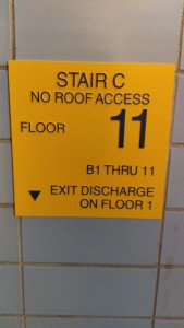
This sign displays good kerning. It properly gives enough space between the letters to be read nice and smoothly.
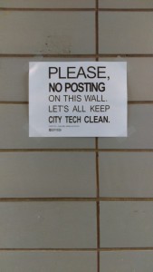
This sign displays bad kerning. Some of the letters are on top of each other like the TI in POSTING. Also the EA in PLEASE and CLEAN are really close together.


