Final Exam Reminder and Final Project

This is a reminder, but everyone should know by now that we are having our final exam on Monday, May 23. The topics will include everything we have covered this semester—including all reading assignments, all class discussions and whatever is here on our website, where many resources were made available throughout the semester.

Also, be sure to submit your final digital Chap Book. And remember:

  • Please name your files correctly: COMD1167_FirstInitialLastName_ChapBook2 (example: COMD1167_MBrown_ChapBook2) Do not use your full name. It will make the file name too long and it’s not necessary.
  • If you need to submit different versions to show all the functionality, create a FOLDER with your name and place your project files (corrected named as above) in the folder. If you have a SWF file that has video and/or audio files, you need to place all those items in a resource folder. Place this folder inside the folder with your final project. If these files are not added, I will not be able to correctly view your final SWF file.

Reminder: Chap Book Interactive Edition

I’ve been reviewing the printed Chap Books  and you have done a pretty nice job with the project. Now we have to convert the printed content into an interactive document for use on an iPad or other tablet device or web browser.

Homework Reminder – Due Monday, May 2, 2016

  • As a first step, set up an interactive document in InDesign.  You will find this option when you create a NEW DOCUMENT. In that option window under intent, select DIGITAL PUBLISHING. In the area for PAGE SIZE, select IPAD. See the image above.
  • Layout out your Chap Book to fit this new page shape. You can cut and paste the elements from your first Chap Book in this new layout.
  • For Monday, May 2nd class you should have your cover and one other page prepared for us to review.
  • By Wednesday, May 3rd we will begin completing the layout for all 12 pages.


Websites with beautiful designs

http://gentlemen-barberclubs.de/

Even though this website is a German website I love the way everything is set up. The typography and the choice of colors are amazing. The pictures speaks to the audience. Nothing it over crowded. It’s not basic like other website. This company decided to take the risk of trying something new and it’s working.

http://jh-behne.de/

i simply love this website. Everything is working together. They have little animations on their website which looks very cool. The creator of the website is a 27-years-old Designer/Animator from Hamburg, Germany. The work looks very sophisticated and simple. Even though the website has very little information you would still want to keep looking at it.

http://12musketeers.com/

I picked this website because Didot is one of my favorite font. I love the way everything is set. The background pictures and the articles matches with each other. Everything is very organized.

Graphic Design Websites

http://www.typographyserved.com/search

The above link is a good website to gain knowledge about typography. The website includes a gallery where people get to upload their works. It allows designers to see other people’s works and use new ideas learned in their own works of art, and also to give feedback to others. Also included in the website is a “jobs” section which shows jobs available for graphic designers.


https://collegegrad.com/careers/graphic-designers

The website Collegegrad is a good website to help with all careers. If you scroll to graphic designing it will show you all the requirements and everything you need to know about your graphic design career. It shows things such as duties, work environment, schedule, education, and pay. All these things can be helpful on deciding if this is the right career choice for you.


http://www.learnhowtobecome.org/graphic-designer/

This is also another website that is helpful in achieving your goal of becoming a graphic designer. Like the link before this, this too includes helpful information about what it takes to be a graphic designer. The website includes step by step directions on how to become a graphic designer.

Great Resources for Future Designers

Typophile: If you’re like me, you probably have a hard time remembering all the thousands of existing typefaces and fonts by name, and it’s always frustrating knowing exactly that perfect font to use, but not being able to find it simply because you do not remember what it is called. Typophile allows you to identify any specific fonts with online experts to help you out, simply by uploading the image of the typeface you want to identify. Now it won’t be a hassle trying to guess that name at the tip of your tongue.

www.typophile.com

2. Awwwards: This website is like the instagram of the design world. With over a thousand users, awwwards allows you to share all your personal work with other designers online, and receive constructive criticism based around a grade system. (design, usability, creativity, content). Helpful not only to receive feedback, but to be inspired for your own work upon the thousands of designs shared on the site.

www.awwwards.com

3: Adobe Kuler: One of the most popular and used sites by designers, Adobe, being the all powerful number 1 when it comes to design software, created Kuler. Kuler is an online digital color wheel tool that offers way beyond what a traditional color wheel can. Featuring thousands of available codes for that exact color for use in all your adobe programs, and other tools like  a theme creator, for pallets on ll your projects.

https://color.adobe.com/

3 Good Websites for Fonts!

Dafont (dafont.com)

Dafont.com, even though it looks shady or very untrusted, it actually has a variety of fonts that you can choose from. They show you fonts that are created by different artists and these fonts are all fonts for fun, meaning if you are going to need a font for some sort of theme that is not really that serious, this is it, this is the website you are looking for. My favorite font from the website is Zenzai Itacha.

/r/Typography (reddit.com/r/typography)

Reddit for Typography exists! Reddit is known very well because it is a blog kind of website where there is Reddit for everything, literally everything. In this Reddit I see people posting their own created fonts, you can also look for guides and videos related to typography, and people can help you by giving you ideas on the font, corrections, and even help you on your designs on some sort of project.

Psych & Psych (psychnpsych.com)

This website is really eye catching, it is inspiring for me. I really like how typography is used to give information and adding those little gif images there makes it more interesting. Since I like things related to psychology this makes it really interesting for me, typography plus psychology makes a pretty good combination apparently. This website although it has a lot of design, it is not focused on design elements but on psychology and mental health.

Research Homework Assignment – FINAL REMINDER

Due Monday, 4/11/16 — Each student is to research for three (3) websites that make good resources for graphic design students. The website can be about typography, graphic design, fonts, color or related information. For each site you are to write 1-2 paragraphs describing what the site is about and why it would serve as a useful resource for the students. This is to be posted to this website. Everyone should not use the same title, but it should be something interesting.

Remember, all homework assignments count.

Project No. 2: Chap Book

Now that the Type Book is finished, we are ready to begin the next project. We will began this project in class, but here are the details so that you can make certain you stay on track.

  • Your Chap Book project will be a 12-page booklet, including the cover.
  • It can be  autobiographical or on a topic of your choice that your interested in. Please have your topic cleared by me.
  • All of the content will be your own. You will do the writing and the photos or illustrations or graphic elements. Any content you find elsewhere must be properly created, otherwise that would be copyright infringement.
  • When you set up your pages in InDesign, the measurements are 5.5″x8.5″ (or 33picas x 51picas).
  • You will determine the number of columns for your grid system.
  • We will begin learning the anatomy of magazine pages, so you are expected to use these elements in your Chap Book design.
  • When the design is complete, you will assemble the layout for printing, then staple down the center of the spine to create saddle-stitching.
  • You may print in black and white to save money, but your design will be in color.
  • After the print version, you will be taking your design and adding interactive elements (video, music, etc) and producing the Chap Book that can be viewed on tablets as well as web browsers.


The project is on a tight deadline and I will try to keep you on track as much as possible. It may at times seem like I am rushing you. The print version of this project should be complete by the time we have our spring break.

Due Monday, 4/11/16: You should be finished with your cover design even though you may not have any idea about your coverlines yet—they can come later. The important thing is to have the cover design be finished with the suggested revisions from the critique. You should also begin layout for your interior pages. This means over the weekend, set up your master pages, paragraph and character styles. If you need help with these things, make use of the videos that I have already posted on this site.  This also means that you have already begun to collect the content for your project. In class on Monday we will continue to work on the interior pages.

Good and Bad Kerning/letterspacing

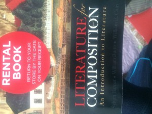
Eng Book Cover Bad Spacing

On this cover, in the word  “Literature” the letter “T” is a bit too far from the letter “A”, as well as the word “Composition” the letter “O” is too far from both the “I” or “N”

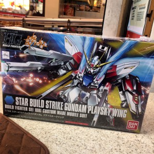
Gundam box

The type in this cover box has the perfect amount of space in between each letter, it makes them readable, it is maybe a little tight but they are large enough for easier reading.