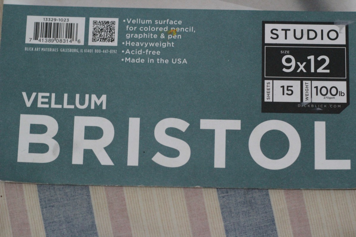
In my eyes this is a good example of typography because everything in the page is very organized. The first thing you see on the page is the word BRISTOL. This is the focus or the main character. There’s visual background, foreground and mid-ground created in the page by using the same font but different size.

In my eyes this is a bad example of typography because overall it’s look very messy. The block-type letters barely has any space between them. The kerning could be much better.

