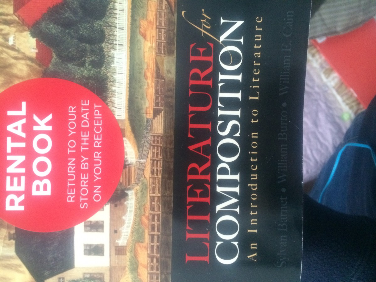
On this cover, in the word “Literature” the letter “T” is a bit too far from the letter “A”, as well as the word “Composition” the letter “O” is too far from both the “I” or “N”
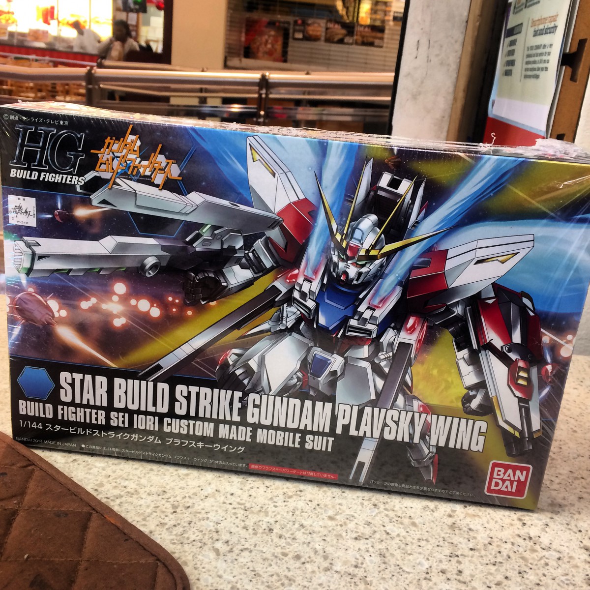
The type in this cover box has the perfect amount of space in between each letter, it makes them readable, it is maybe a little tight but they are large enough for easier reading.

